skip to Main Content

I have stuck with making a responsive, horizontally scrollable gallery. Namely, I have some issues with layout and responsiveness.

All images have the same fixed height – 1200px. The width is variable in 850px~1200px.

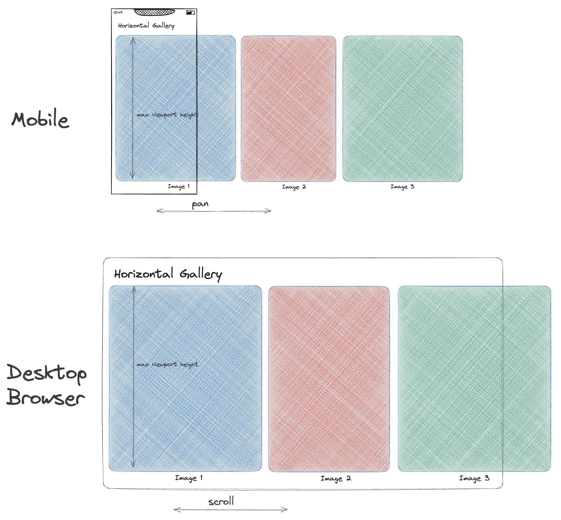
Problem is that – I want every image to have the maximum height the viewport allows while keeping the correct aspect ratio with a text title below that image. This iamge+title should be responsive, i.e. keep that behavior on both mobile and desktop Chrome/Safari

The result should look like
enter image description here

Here is a simple code to reproduce the problem:

body {
  display: flex;
  flex-direction: column;
}

.scrolling-gallery {
  min-height: 300px;
  width: auto;
  overflow-y: clip;
  display: flex;
  overflow-x: scroll;
  gap: 2px;
}

.image-container {
  display: flex;
  flex-direction: column;
  min-width: max-content;
}

.large-image {
  width: 1200px;
  height: 1200px;
}

.medium-image {
  width: 850px;
  height: 1200px;
}
<!DOCTYPE html>
<html>

  <body>
    <h1>Horizontal Gallery</h1>

    <div class="scrolling-gallery">
      <div class="image-container">
        <img class="large-image" src="https://temp-image-test.s3.us-east-2.amazonaws.com/distortion_matrix_1200_1200_blue.png" />
        <h2>Image 1</h2>
      </div>
      <div class="image-container">
        <img class="medium-image" src="https://temp-image-test.s3.us-east-2.amazonaws.com/distortion_matrix_850_1200_red.png" />
        <h2>Image 2</h2>
      </div>
      <div class="image-container">
        <img class="large-image" src="https://temp-image-test.s3.us-east-2.amazonaws.com/distortion_matrix_1200_1200_green.png" />
        <h2>Image 3</h2>
      </div>
    </div>
  </body>

</html>

I have made the part with the image but struggle to add the image titles. This is the website I’m working on: https://alisatrapsh.com/

Thanks for your help!

2

Answers


  1. I think using css clac() will help to manage the heights.

    I just modified the total height of gallery from 1200 to calc(100vh - 0px) but later you can set it to any other amount like calc(100vh - 50px) where 50 px is reserved for top title.

    The secret for image descriptios is also to use the calc(100% - 40px) for image height and 40px (or any other amount) for image description.

    body {
      display: flex;
      flex-direction: column;
    }
    
    .scrolling-gallery {
      width: auto;
      overflow-y: clip;
      display: flex;
      overflow-x: scroll;
      gap: 2px;
      height:calc(100vh - 0px);
    }
    
    .image-container {
      display: flex;
      flex-direction: column;
      height:100%;
    }
    
    .image-container img{
      height:calc(100% - 40px);
    }
    
    .image-container h2{
      height:40px;
      font-size:10pt;
    }
    <!DOCTYPE html>
    <html>
    
      <body>
       
    
        <div class="scrolling-gallery">
          <div class="image-container">
            <img src="https://temp-image-test.s3.us-east-2.amazonaws.com/distortion_matrix_1200_1200_blue.png" />
            <h2>Image 1</h2>
          </div>
          <div class="image-container">
            <img  src="https://temp-image-test.s3.us-east-2.amazonaws.com/distortion_matrix_850_1200_red.png" />
            <h2>Image 2</h2>
          </div>
          <div class="image-container">
            <img src="https://temp-image-test.s3.us-east-2.amazonaws.com/distortion_matrix_1200_1200_green.png" />
            <h2>Image 3</h2>
          </div>
        </div>
      </body>
    
    </html>
    Login or Signup to reply.
  2. I think a combination of the calc() function and svh units will give the best result.

    I used developer tools to get an approximate height for the page elements; this could be done via javascript, but it is probably easier to keep it static.

    It is best to use svh units because they take into account the space actually available on a screen, taking into account the navigation bars of different browsers.

    body {
      display: flex;
      flex-direction: column;
    }
    
    .scrolling-gallery {
      min-height: 300px;
      width: auto;
      overflow-y: clip;
      display: flex;
      overflow-x: scroll;
      gap: 2px;
    }
    
    .image-container {
      display: flex;
      flex-direction: column;
      min-width: max-content;
    }
    
    .image {
      height: calc(100svh - 50px - 40px - 35px);
      /* 50px => ~H1 height */
      /* 30px => ~H2 height */
      /* 35px => ~height of the scollbar (might change depending on the browser, but 35px should be the biggest)
      */
      object-fit: contain;
    }
    <!DOCTYPE html>
    <html>
    
      <body>
        <h1>Horizontal Gallery</h1>
    
        <div class="scrolling-gallery">
          <div class="image-container">
            <img class="image" src="https://temp-image-test.s3.us-east-2.amazonaws.com/distortion_matrix_1200_1200_blue.png" />
            <h2>Image 1</h2>
          </div>
          <div class="image-container">
            <img class="image" src="https://temp-image-test.s3.us-east-2.amazonaws.com/distortion_matrix_850_1200_red.png" />
            <h2>Image 2</h2>
          </div>
          <div class="image-container">
            <img class="image" src="https://temp-image-test.s3.us-east-2.amazonaws.com/distortion_matrix_1200_1200_green.png" />
            <h2>Image 3</h2>
          </div>
        </div>
      </body>
    
    </html>
    Login or Signup to reply.
Please signup or login to give your own answer.
Back To Top
Search