


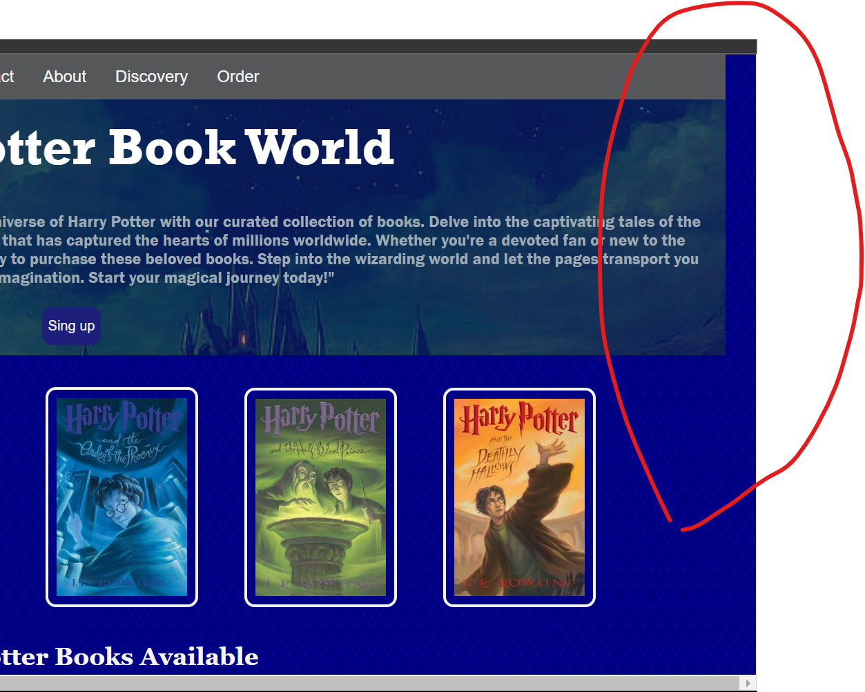
As you can see in the image my heders,dev,nav bar does not fit to my screen width i put margine and padding in to 0 but it is not working
this is my CSS code:
*{
    margin: 0;
    padding: 0;

}

body{
    background-color: rgb(9, 9, 143);
    width: 100%;
    height: auto;
    background-image: url('https://i.pinimg.com/736x/a1/99/f3/a199f37446cbe1cd6701c693963971c3.jpg');
    background-blend-mode: color-burn;
}

div{
  width: 100%;
  height: auto;
}
ul.navbar li a:hover {
  background-color: #918e8e;
}

/* CSS for the active button */
ul.navbar li.active a {
  background-color: #4CAF50;
  color: white;
}

.main{
    background-color: rgb(8, 8, 87);
    background-image: url('https://w0.peakpx.com/wallpaper/290/679/HD-wallpaper-harry-potter-harry-potter-and-the-chamber-of-secrets-hogwarts-castle.jpg');
    background-repeat: no-repeat;
    background-size: cover;
    background-blend-mode: lighten;
    display: flex-box;
    text-align: center;


}

h1{
    font-size: 50px;
    color: white;
    font-family: Rockwell;
    padding: 15px;
    width: 100%;
    height: auto;

}

p{
    color: rgb(158, 169, 179);
    font-family: Franklin Gothic Medium;
    padding: 20px;
}

.btn{
    padding: 10px 5px;
    background-color: rgb(30, 30, 123);
    color: whitesmoke;
    border:  1px solid transparent;
    border-radius: 10px;
    font-family:Arial, Helvetica, sans-serif;
    margin-bottom: 10px;
}
I hosted my web in google
here the link:https://myassessmentweb.netlify.app
**please give me a better solution for this issue. **
5
Answers
the solution is to add
box-sizing: border-boxto your global selectoryou can read more about box-sizing here: https://developer.mozilla.org/en-US/docs/Web/CSS/box-sizing
here the problem is in the paddind h1(delete padding in h1), it is he who stretches the width more than the visible area and the slider appears
You can use
width:100vw;wherevwis viewport width. Same goes for the height but instead of vw you usevh.For some of you that it still doesn’t work trymargin: 0px;because sometimes divs and other elements have default margins.In order to solve this problem you should either remove
width: 100%;from yourh1anddivstyles or add:Remove
width: 100%.bodyis a block element, it will take up 100% any way, but 100% doesn’t account for, for example the scrollbar.https://youtube.com/shorts/0-WRRh3ZXhw?feature=share