skip to Main Content

I want to achieve this effect:

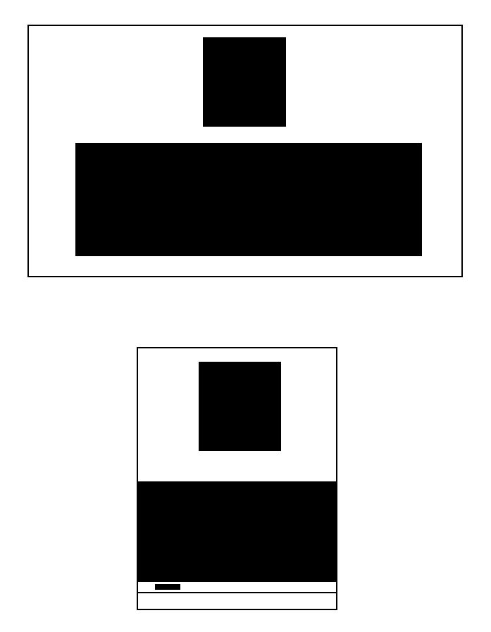
I have a panel that’s wide (its width is dynamic based on its content)

  • if the page is wider than the panel, I want it to be just displayed in the center of the page
  • if the page is narrower than the panel (ex. on a phone), I want the panel (not the whole page) to be scrollable.

I know it’s not an easy thing to do because nothing is fixed in this scenario, but I know it must be possible and I’m just missing something.

I’d greatly appreciate any help!

(For reference, a picture of what I want to achieve)

enter image description here

2

Answers


  1. body {
      margin: 0;
      display: flex;
      flex-direction: column;
      align-items: center;
      justify-content: center;
      min-height: 100vh;
      gap: 24px;
    }
    
    div {
      overflow-x: auto;
      max-width: 100%;
      white-space: nowrap;
      padding: 16px 0;
      border: solid 2px green;
      box-sizing: border-box;
    }
    <div>Lorem ipsum dolor sit amet, consectetur adipisicing elit?</div>
    <div>Lorem ipsum dolor sit amet, consectetur adipisicing elit. Cum, perferendis esse magni sit asperiores nam quod soluta odio vel in.</div>
    Login or Signup to reply.
  2. You can do it with a height static. Well, I dont know other form

    .container {
      display: flex;
      gap: 20px;
      flex-direction: column;
      justify-content: center;
      align-items: center;
    }
    
    .div1 {
      background: rgb(185 28 28);
      height:45vh;
      width: 400px;
    }
    
    .div2 {
      color:white;
      font-size: 2rem;
      background: rgb(0, 0, 255);
      height: 50vh;
      width: 45vw;
      overflow-y: auto;
    }
    <div class="container">
      <div class='div1'>
        1
      </div>
      <div class='div2'>
        <p>
          Lorem ipsum dolor sit amet consectetur adipisicing elit. Ullam expedita voluptatum quisquam unde optio totam, voluptas obcaecati vel mollitia veniam odit ex dicta, voluptate minima eos doloremque accusamus necessitatibus nihil.
        </p>
        <p>
          Lorem ipsum dolor sit amet consectetur adipisicing elit. Ullam expedita voluptatum quisquam unde optio totam, voluptas obcaecati vel mollitia veniam odit ex dicta, voluptate minima eos doloremque accusamus necessitatibus nihil.
        </p>
        <p>
          Lorem ipsum dolor sit amet consectetur adipisicing elit. Ullam expedita voluptatum quisquam unde optio totam, voluptas obcaecati vel mollitia veniam odit ex dicta, voluptate minima eos doloremque accusamus necessitatibus nihil.
        </p>
      </div>
    </div>

    View

    Login or Signup to reply.
Please signup or login to give your own answer.
Back To Top
Search