


I am stuck in setting the media query for different iPad devices. In my next Js code, I have created three cards (or divs) equally divided in a row (react-bootstrap grid system used for it). The cards can take up the whole width by default as a part of the grid system but I would like to limit their width to specific pixels.
For this, I am trying to set the width to a card class .post-card-main-wrapper using CSS media queries.
This is what I have done so far (adding only required codebase) :
CSS:
/* Default styles for all devices */
.post-card-main-wrapper {
  position: relative;
  margin: 0 auto;
  width: 320px;
}

/* Styles for iPad Pro */
@media only screen and (min-width: 1024px) {
  .post-card-main-wrapper {
    width: 400px;
  }
}

/* Styles for iPad Air */
@media only screen and (min-width: 768px) and (max-width: 1023px) {
  .post-card-main-wrapper {
    width: 220px;
    height: 350px;
  }
}

/* Styles for smaller screens (e.g., iPhone) */
@media only screen and (max-width: 767px) {
  .post-card-main-wrapper {
    width: 300px;
    height: 450px;
  }
}

/* Styles for the smallest screens (e.g., iPhone SE) */
@media only screen and (max-width: 479px) {
  .post-card-main-wrapper {
    width: 300px;
    height: 450px;
    margin: 0;
  }
}
HTML:
<div class="featured-articles-container row">
    <div class="col-sm-12 col-12">
        <div class="featured-posts">
            <div class="container-fluid">
                <div class="row">
                    <div class="col-xl-12 col-md-12 col-sm col-12">
                        <div class="ant-divider css-dev-only-do-not-override-1i536d8 ant-divider-horizontal ant-divider-with-text ant-divider-with-text-left ant-divider-no-default-orientation-margin-left" role="separator">
                            <span class="ant-divider-inner-text" style="margin-left:100px">
                                <h2>Featured Posts</h2>
                            </span>
                        </div>
                    </div>
                </div>
                <div class="justify-content-center row">
                    <div class="col-xl-4 col-md-4 col-sm col-10">
                        <div class="post-card-main-wrapper">
                            <div class="post-card-img-wrapper"><img src="https://yuma.sharkthemes.com/blog-one/wp-content/uploads/sites/3/2022/01/hand-person-girl-woman-hair-photography-78292-pxhere.com_-600x800.jpg" height="100%" width="100%"></div>
                            <div class="post-card-content-wrapper" style="background:white">
                                <span class="ant-typography css-dev-only-do-not-override-1i536d8">PHOTOGRAPHY, PORTRAIT</span>
                                <h3>Some Article Title Here</h3>
                                <span class="ant-typography css-dev-only-do-not-override-1i536d8">December 2, 2022</span>
                                <div class="ant-typography ant-typography-ellipsis ant-typography-ellipsis-multiple-line css-dev-only-do-not-override-1i536d8" style="font-size: 16px; margin-top: 1em; -webkit-line-clamp: 4;">Lorem ipsum dolor sit amet, consectetur adipiscing elit, sed do eiusmod tempor incididunt ut labore.</div>
                            </div>
                        </div>
                    </div>
                </div>
            </div>
        </div>
    </div>
</div>
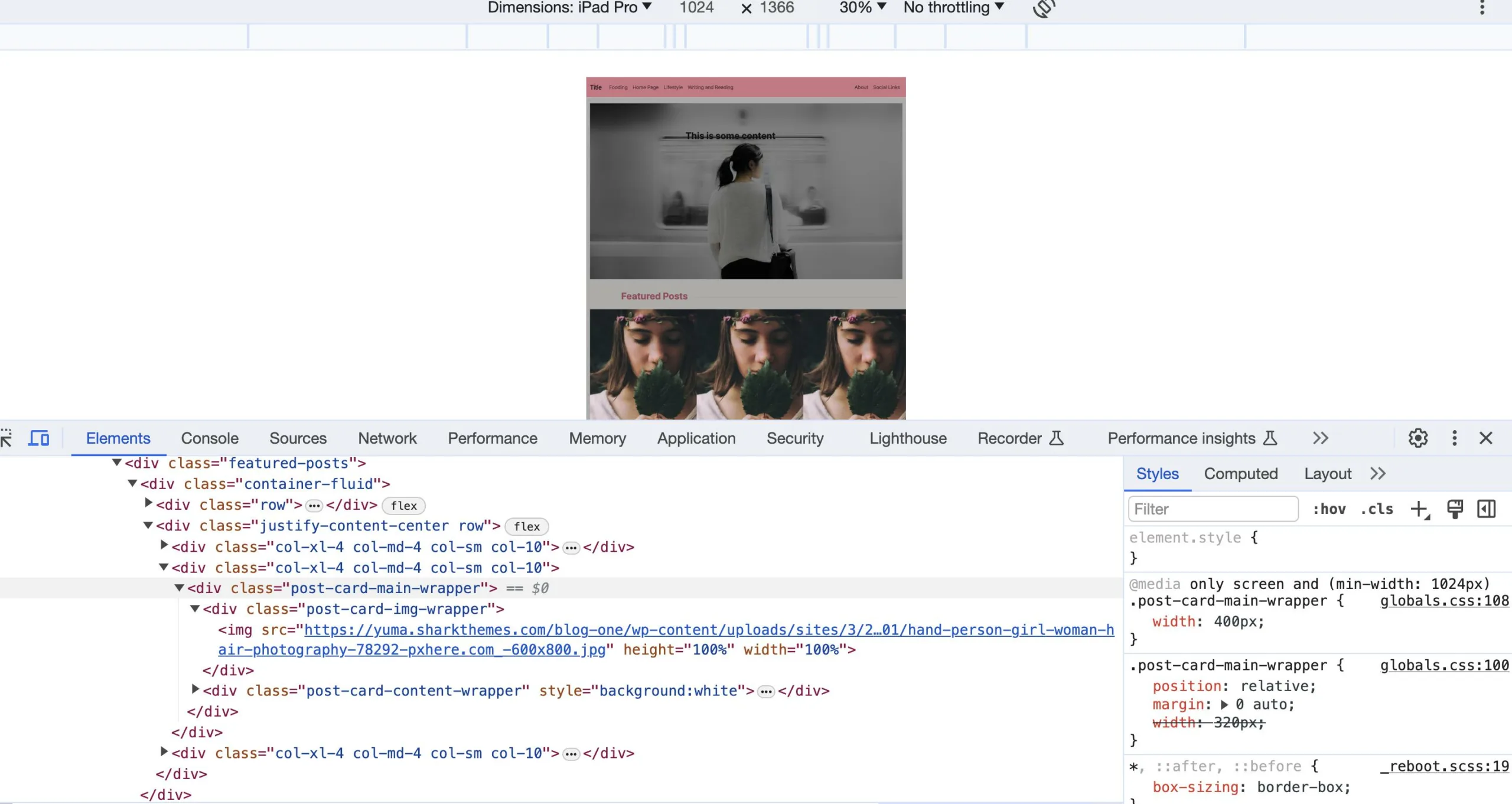
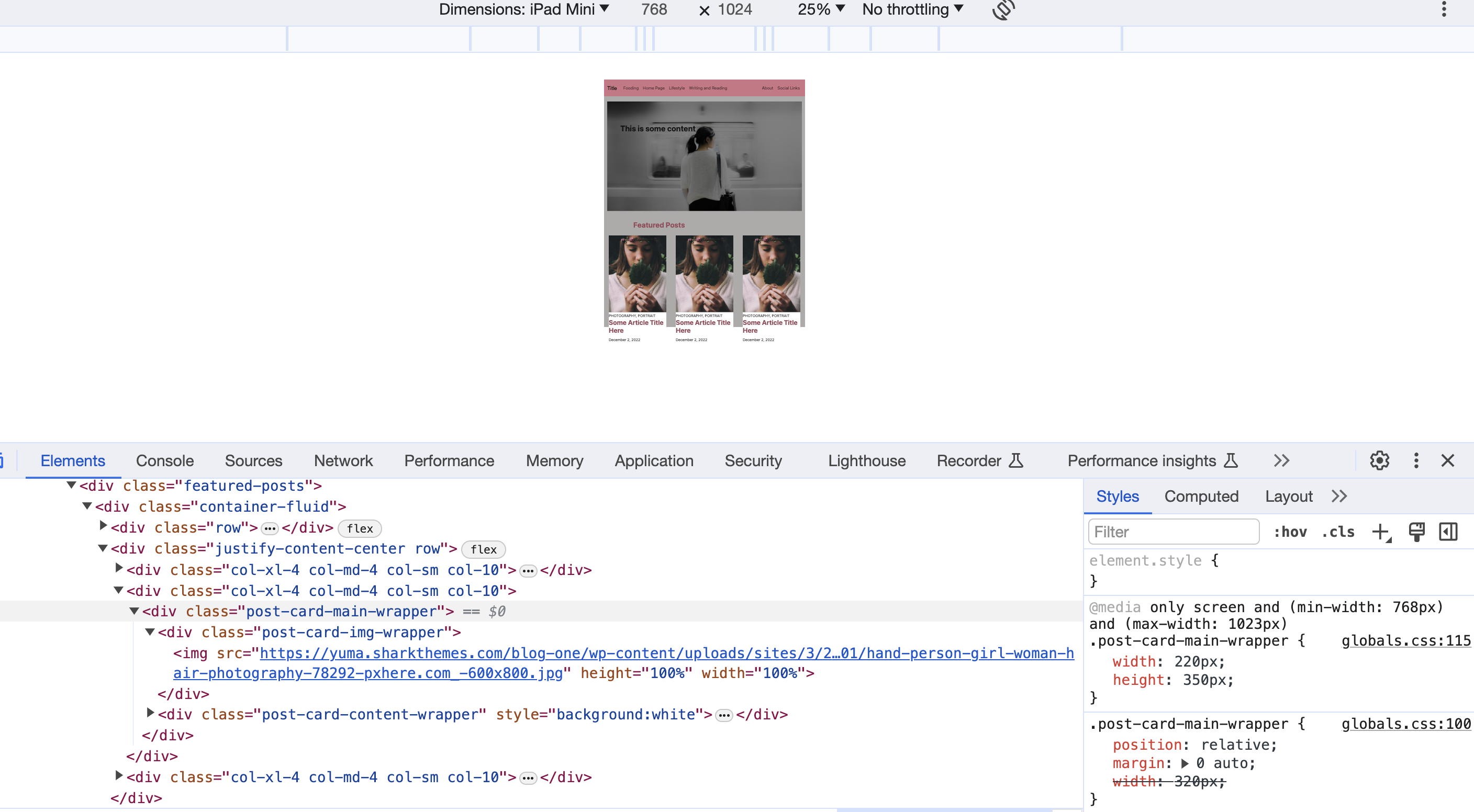
Adding the main desktop view (using iPad Air for development) screenshot as well:

Now the issue is that when I try to set the specific width of the cards to equally spaced
columns (or grid) for one device, it messes up the width for another device. Most of the time, it’s a battle between iPad Air and iPad Pro.
Query used for iPad Air, looks good with proper spacing and width for the cards. And even though I have tried to use a separate query for iPad Pro, it always picks the query meant for iPad Air, and the cards look completely squeezed together without any space.
Adding more screenshots for reference:


I am unable to figure out the proper approach to fix this for iPad as well as other not-so-common (real-life) devices. Any help and solution to use proper media queries for all current devices in Google Chrome’s dimensions and if there are any rules to follow while specifying the responsive CSS would be appreciated.
2
Answers
How about installing
.post-card-main-wrapper { max-width:100%; }?With your permission, I did not fix the html, but only removed your media requests in the css, reducing the code to two lines:
I’m giving you the mere idea so that you can code yourself.
Please see the css of the container-fluid class. If the display property of container-fluid is flex, then this three columns will appear irrespective of the screen size.
Or if the display property of col-xl-4.col-md-4 class is inline-block, and width has been mentioned to some percentage between 25% to 33% and each if each col-xl-4.col-md-4 class is given float:left,then this will happen. This practice was used before the advent of the media screen property.
Also don’t mention height so that height will be scaled automatically. And if you mention specific width, the size of the image remains same between two consecutive width-range in devices. So, you can mention a min-width to accommodate smaller devices. Apart from this, you should mention an actual width varying from 80% to 100% according to your requirement.