


I have a container div which holds a list of ‘cards.’ Currently, I am using display: inline-block to get things to list appropriately. It works well enough, but due to the size of the cards if there is not enough space for the card in the width there is extra white space to right of the container div. I would like to have it dynamically adjust the margin so it would spread out the cards in the center across the horizontal axis. Let me be clear, I don’t want to resize the cards. They should maintain their uniform size.
I’m using Angular for my app so I’ll provide the SASS, HTML and TS.
SASS
.card-container
    width: 90%
    margin-left: auto
    margin-right: auto
    padding: 5px

.card
    vertical-align: middle
    display: inline-block
    margin: 10px
    padding: 5px 10px 5px 10px
    border-style: solid
    border-width: 1px
    border-radius: 2.5px

.name
    margin: 5px 0 10px 0
    display: block
    text-align: center

img
    width: 245px
    height: 342px
HTML
<div *ngIf='loaded'>
    <div class="card-container">
        <div defer class="card" *ngFor="let poke of list; index as i;">
            <div class="name">{{list[i]["name"]}}</div>
            <img src="{{list[i]['images']['small']}}">
        </div>
    </div>
</div>
Typescript
import { Component } from '@angular/core';

@Component({
  selector: 'app-content',
  templateUrl: './content.component.html',
  styleUrls: ['./content.component.sass']
})
export class ContentComponent {
  list = [];
  item1: any;
  loaded = false;
  constructor() {
    fetch('https://api.pokemontcg.io/v2/cards?q=name:charizard', {
      headers: {
        "X-Api-Key": "APIKEY",
      }
    })
    .then((res) => res.json())
    .then((data) => {
      this.list = data.data;
      console.log(this.list);
      this.loaded = true;
    })
    .catch((err) => console.error(err));
  }
}
I’ve tried multiple different display settings yet inline-block is the closest to want I want. I don’t think table-layout is the right choice here, but I don’t truly know. It’s been awhile since I have done any web programming. Is what I am trying to accomplish too complicated for CSS/HTML alone?
2
Answers
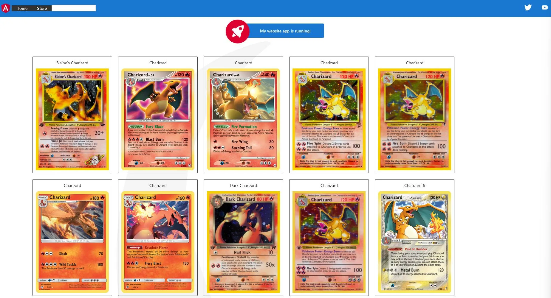
Ok, so I basically did as @Pieterjan suggested. Turned my container into an
inline-flexand usedjustify-content: space-evenly. Here are my SASS values that accomplished what I wanted. Also, for some reason if I don't set the width to 100% on the container there is unused space on the right side. It isn't much but a weird oddity.Is this the behavior you want then? (Just an image below, not sure I cropped it so it looks 100% centered, but it is the browser…)
HTML:
CSS: