This is my current state of code (minified, for explanation only)
index.html
<!DOCTYPE html>
<html lang="en">
<head>
    <meta charset="UTF-8">
    <meta name="viewport" content="width=device-width, initial-scale=1.0">
    <title>Document</title>
    <link rel="stylesheet" href="index.css">
</head>
<body>
    <div class="navbar-wrapper">
        <nav class="navbar">
            <h1 class="navbar-logo">
                Logo
            </h1>
            <div class="burger">
                Menu
            </div>
        </nav>
        <div class="menu">
            <div>Item 1</div>
            [There may be a lot of items in here, which
             may cause an overflow]
        </div>
    </div>

    <main>
        This is the main content of this
        <br>
        <b>Website</b>
        [This content may be very long or very small]
    </main>

    <script defer>
        const burger = document.querySelector(".burger");
        const menu = document.querySelector(".menu");

        burger.addEventListener("click", () => {
            if (menu.classList.contains("hidden")) {
                menu.classList.remove("hidden");
            }
            else {
                menu.classList.add("hidden");
            }
        });
    </script>
</body>
</html>
and these are my styles:
index.css
*,
*::before,
*::after {
  margin: 0;
  padding: 0;
  box-sizing: border-box;
}

body {
  height: 100vh;
}

main {
  background-color: lightblue;

  min-height: 95vh;
}

.navbar-wrapper {
  position: sticky;
  top: 0;
}

.navbar {
  display: flex;
  background-color: gray;
  align-items: center;

  min-height: 5vh;
}

.navbar-logo {
  margin-right: auto;
}

.burger {
  font-size: 2em;
  cursor: pointer;
}

.menu {
  background-color: lightgreen;
  position: absolute;
  right: 0;
  width: 200px;
  padding: 10px;

  max-height: 95vh;

  overflow-y: scroll;
}

.hidden {
  display: none;
}
My Navbar works as expected, my Menu works as expected, and my main content works quite good aswell.
However, when the content inside <main> gets too long, the navbar wont stick anymore, neither does the menu.
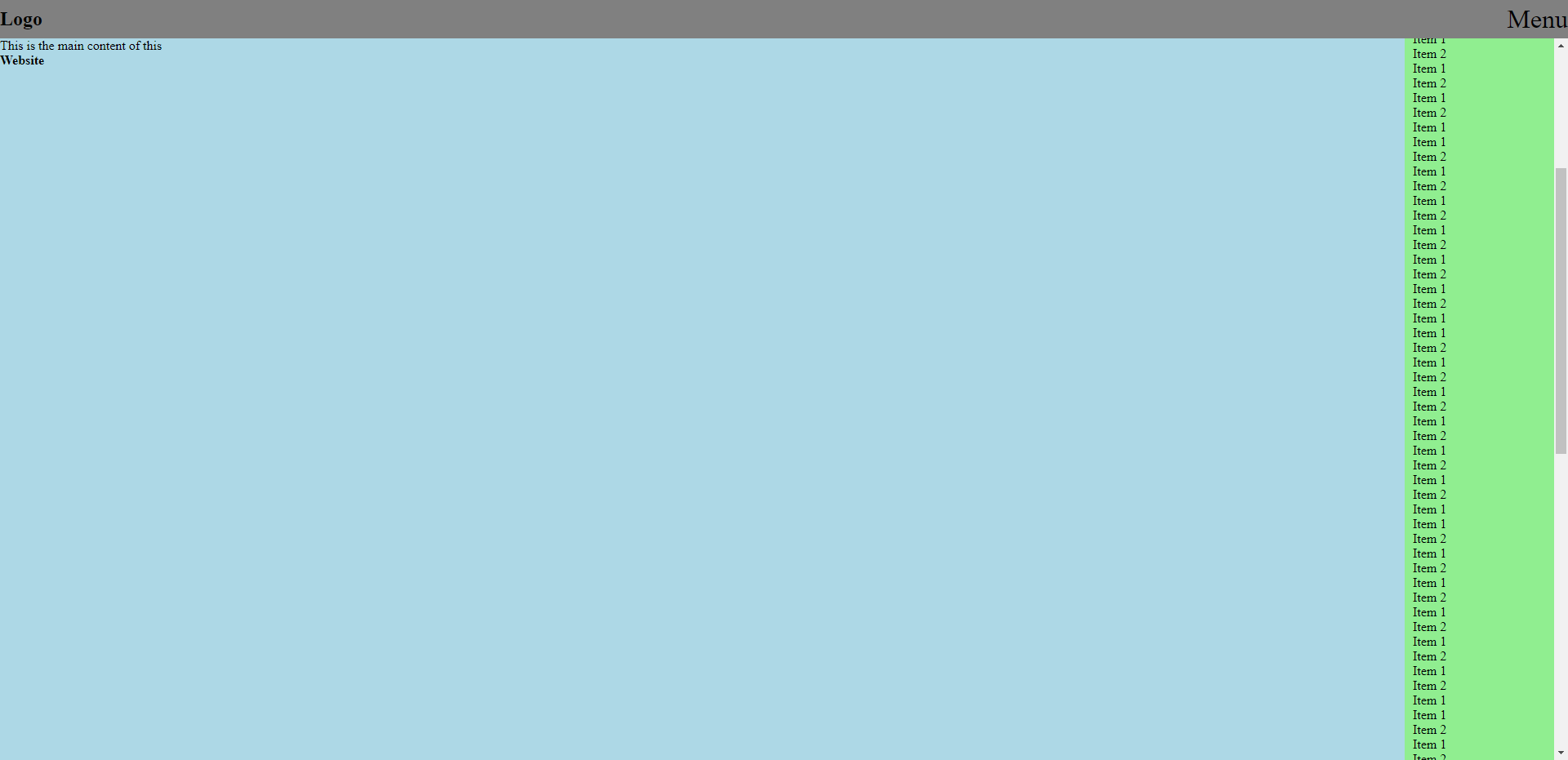
This is what it looks like with short main content:
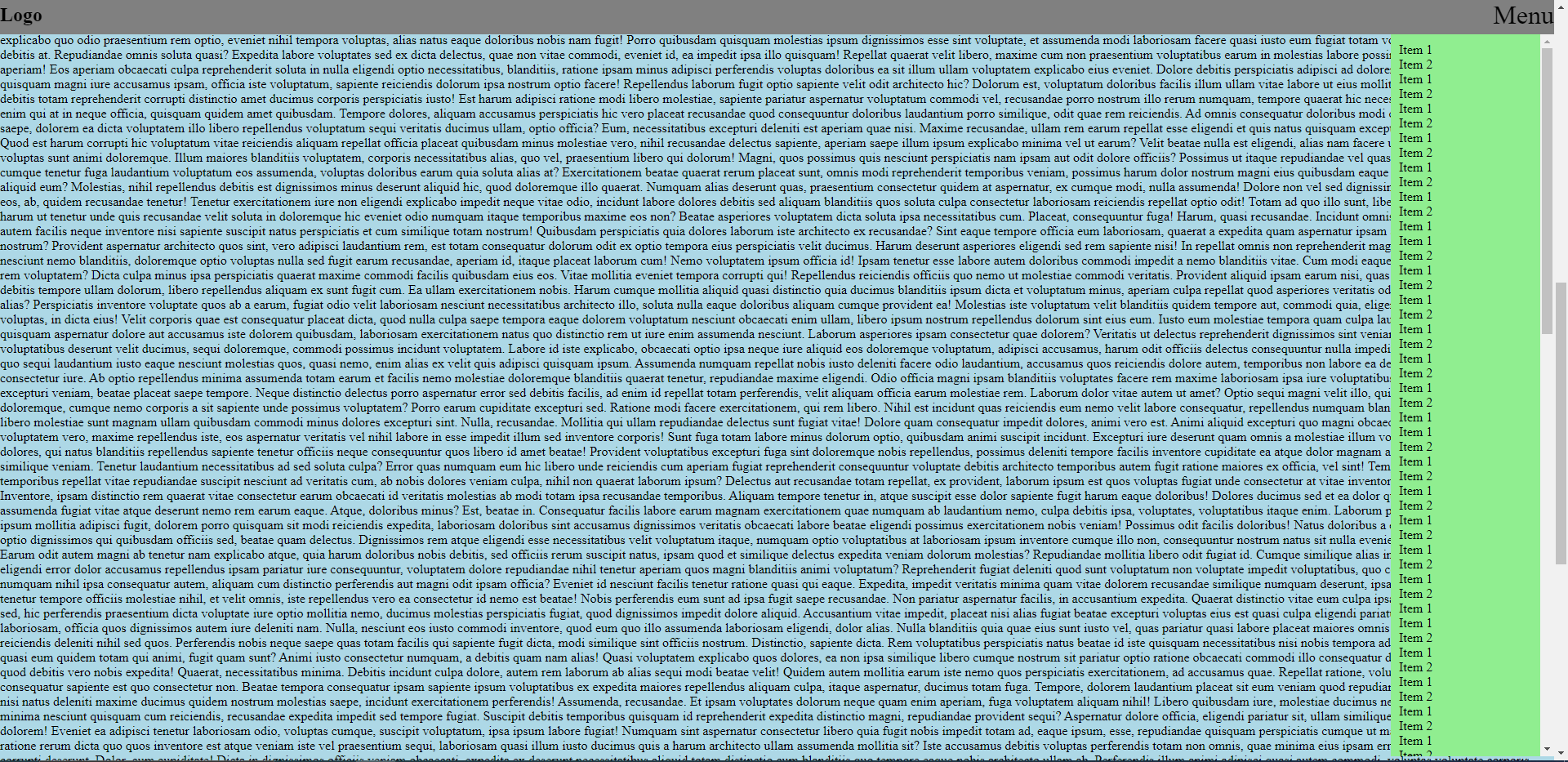
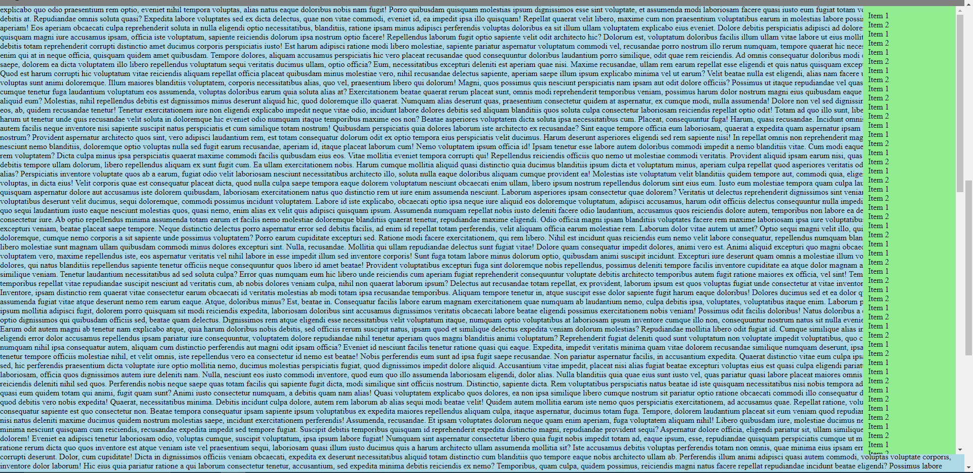
And this is how it looks when main content gets too long (it should rather be like the first picture, so that you can still scroll through the main content, but the navbar and menu should be sticky and not move)
It is especially weird, because it works perfectly up to a specific point (I believe when you scroll to half of the page), where it breaks.
Does anyone have a Solution to this? Or if there is another better approach, I would love to hear it!
[As a sidenote, this is a React Project with NextJS. I just wrote it in HTML and CSS for better understanding]


2
Answers
By changing the navbar and menu to position fixed you will get your desired look
code sandbox here
if this helps you plz vote my answer:

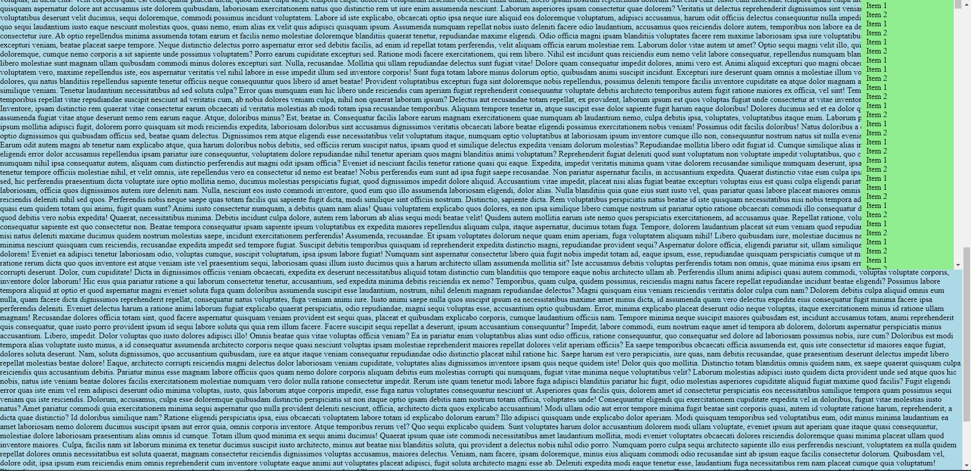
as you can see I am at the bottom of my page:
