


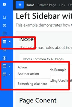
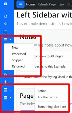
I’m creating a sidebar with Bootstrap 5 and using a "Dropdown" and "Dropend" menu using the respective Bootstrap classes.
My issue is when the Dropdown menu is open, the Dropend menu is not positioned correctly. Instead of being immediately to the right of the menu icon, there is a big gap (seemingly the size of the dropdown width). When the Dropdown menu, is closed it works fine.
See two images below. The first one shows the proper alignment with it immediately to the right. The second shows the issue when the Dropdown menu is open and the big gap.
Code:
<!doctype html>
<html lang="en">
<head runat="server">
    <meta charset="utf-8">
    <meta name="viewport" content="width=device-width, initial-scale=1, shrink-to-fit=no">
    <title>My Example</title>
    <link href="https://cdn.jsdelivr.net/npm/[email protected]/dist/css/bootstrap.min.css" rel="stylesheet" integrity="sha384-T3c6CoIi6uLrA9TneNEoa7RxnatzjcDSCmG1MXxSR1GAsXEV/Dwwykc2MPK8M2HN" crossorigin="anonymous">
    <link href="https://cdn.jsdelivr.net/npm/[email protected]/font/bootstrap-icons.css" rel="stylesheet">
    <link xhref="designs/css/style.css" rel="stylesheet" />
    <style>
        /* added this so that the dropdown menu would stay on top of content in the main area. */
        .not-bs-sidebar {
            z-index: 9999;
        }
        /* added so the main area fills the page width. */
        .not-bs-main {
            flex: 1;
        }
        /* set the size of the sidebar. */
        .not-bs-sidebar.active {
            width: 80px;
        }
        /* the rest is optional basic styling. */
        .not-bs-sidebar .nav-link {
            color: #FFFFFF;
            padding-left: 0px;
        }
        .not-bs-sidebar.active .not-bs-dropdown-menu {
            background-color: white;
            border: 1px solid #CCCCCC;
        }
        .not-bs-sidebar.active .not-bs-dropdown-menu a {
            color: black;
        }
    </style>
</head>
<body>
    <form id="form1" runat="server" class="container-fluid">
        <div class="row">
            <div class="col-md-2 bg-primary not-bs-sidebar active" id="sidebar">
                <div class="not-bs-sidebar-frame d-flex flex-column flex-shrink-0 p-3">
                    <div class="not-bs-sidebar-nav">
                        <ul class="nav nav-pills flex-column mb-auto">
                            <li class="nav-item">
                                <a href="default.aspx" class="nav-link"><i class="bi bi-house"></i></a>
                            </li>
                            <li class="nav-item">
                                <a href="#" class="nav-link"><i class="bi bi-speedometer2"></i></a>
                            </li>
                            <li class="nav-item dropdown">
                                <a class="nav-link dropdown-toggle" href="#" data-bs-toggle="collapse" data-bs-target="#dropdown-example" role="button"><i class="bi bi-table"></i></a>
                                <div class="collapse not-bs-dropdown-menu" id="dropdown-example">
                                    <ul class="list-unstyled">
                                        <li><a class="dropdown-item" href="#">Action</a></li>
                                        <li><a class="dropdown-item" href="#">Some other action here</a></li>
                                    </ul>
                                </div>
                            </li>
                            <li class="nav-item">
                                <a href="#" class="nav-link"><i class="bi bi-grid"></i></a>
                            </li>
                            <li class="nav-item dropend">
                                <a class="nav-link dropdown-toggle" href="#" data-bs-toggle="dropdown"><i class="bi bi-table"></i></a>
                                <ul class="dropdown-menu">
                                    <li><a class="dropdown-item" href="#">Action</a></li>
                                    <li><a class="dropdown-item" href="#">Another action</a></li>
                                </ul>
                            </li>
                        </ul>
                    </div>
                </div>
            </div>
            <div class="col-md-10 not-bs-main" id="main">
                <div class="row not-bs-body">
                    <div class="col">
                        <div class="bg-body-tertiary border rounded p-3">
                            <h2>Page Conent</h2>
                            <div style="height: 400px;"></div>
                        </div>
                    </div>
                </div>
            </div>
        </div>
    </form>

    <script src="https://cdn.jsdelivr.net/npm/@popperjs/[email protected]/dist/umd/popper.min.js" integrity="sha384-I7E8VVD/ismYTF4hNIPjVp/Zjvgyol6VFvRkX/vR+Vc4jQkC+hVqc2pM8ODewa9r" crossorigin="anonymous"></script>
    <script src="https://cdn.jsdelivr.net/npm/[email protected]/dist/js/bootstrap.min.js" integrity="sha384-BBtl+eGJRgqQAUMxJ7pMwbEyER4l1g+O15P+16Ep7Q9Q+zqX6gSbd85u4mG4QzX+" crossorigin="anonymous"></script>
</body>

</html>
EDIT
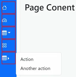
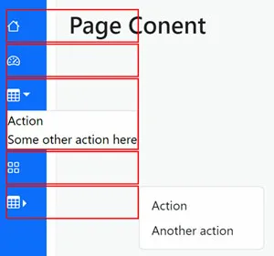
It appears the reason this is happening is because the widths of all the "li" tags in the navigation are expanding when the dropdown menu is open. So, the dropend menu is opening at the edge of the expanded "li". I added two more images with red borders around the "li" tags to demonstrate.
2
Answers
I found two solutions to my problem.
Solution 1:
The first solution is to set the width of "li" tag for the "dropend" menu item that has the issue. In this case, I set the width to desired width as shown below.
Code:
Result:
Solution 2:
The second solution is to change the bootstrap class that is being used with the "dropend" menu item that has the issue. Instead of using the bootstrap class "nav-link", use bootstrap class "btn-group". Interestingly, the width of the associated "li" tag still stretches, however, the "btn-group" class ignores it. If you investigate the differences between the two classes I assume you'll figure out the difference as to why. But, for now... this works.
Code:
Result:
FROM
TO