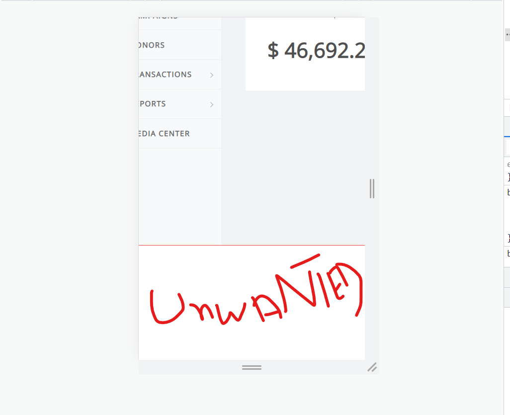
I am working on a dashboard layout with React and CSS. I have a header, sidebar, and a middle-area where all content resides for example charts graphs etc. I have a menu icon in the header that toggles the sidebar (from visible to hidden and vice versa). When I am on screen less than 768px, the sidebar is hidden by default, everything works up until now but when I click the menu icon to make the sidebar visible on mobile screens then I want the wrapper to overflow-x so that the user can see the middle-area content to the fullest. overflow-x is working but It is also generating an overflow-y scroll outside of the wrapper even though there is nothing outside the wrapper. This behavior is only seen with windows chrome and android chrome. The height of the wrapper is auto and the height of the dashboard (child of the wrapper and parent of the header and content-wrapper (content-wrapper includes sidebar and middle-area)) is 100vh.
I am facing this problem in Chrome (works fine on Edge) with overflow-y and height. The problem only occurs when the sidebar is visible. I do not my app to overflow-y but it does.
This is the behavior that I want (http://webapplayers.com/homer_admin-v2.0/index.html)
and
This is my app (https://donatenow-crm.web.app/)
use email: [email protected]
use password: hamzaanwar123$
I have a simple React JSX layout that works fine on Edge but not on chrome.
// sidebar toggled
const [sidebarToggled, setSidebarToggled] = useState(false);

// sidebarToggled(false) = sidebar visible
// sidebarToggled(true) = sidebar hidden

<div className={sidebarToggled?'wrapper':'wrapper toggled'}>
  <div className="dashboard">
     <Header />
    <div className="content-wrapper">
     <Sidebar />
     <div className="middle-area">
        <div className="middle-content"></div>
     </div>
    </div>
  </div>
</div>
Here is the CSS
.wrapper{
  width: 100%;
  overflow: hidden;
}

@media(max-width: 540px){
//If I comment out this code, overflow won't cause the issue, something is wrong with the wrapper and wrapper.toggled
  .wrapper.toggled{
    width: fit-content;
    overflow-x: auto;
    overflow-y: hidden;
  }
}

.dashboard{
  width: 100%;
  height: 100vh;
  display: flex;
  flex-direction: column;
  overflow: hidden;
}

.content-wrapper{
  width: 100%;
  height: 100%;
  display: flex;
  align-items: stretch;
}

header {
  background-color: #ffffff;
  display: flex;
  justify-content: space-between;
  align-items: center;
  padding: 0;
  border-bottom: 1px solid #eaeaea;
}

.sidebar{
  min-width: 180px;
  max-width: 180px;
  height: 100%;
  background-color: #f7f9fa;
  display: flex;
  flex-direction: column;
  transition: all 0.3s ease;
}

.sidebar.hidden{
  margin-left: -180px;
}

.middle-area {
  width: 100%;
  background-color: #f1f3f6;
  border-left: 1px solid #eaeaea;
  padding: 25px 40px 40px 40px;
  min-width: 320px;
}

.middle-content {
  display: flex;
  justify-content: center;
  align-items: center;
  height: 100%;
}


2
Answers
It seems that the issue you’re facing is related to the combination of overflow-x: auto; and overflow-y: hidden; on the .wrapper.toggled class in the media query for smaller screens. This combination is causing an unwanted vertical scrollbar to appear on Chrome browsers.
To address this issue, you can modify your CSS as follows:
By using width: calc(100% + 17px);, you create an offset that accommodates the width of the vertical scrollbar, preventing it from affecting the layout. You may need to adjust the value 17px based on your specific circumstances.
Additionally, it’s important to note that height: 100vh; on the .dashboard class could also contribute to the appearance of the vertical scrollbar. If your intention is to make the .dashboard element take up the full viewport height, you can try using height: calc(100vh – ); and set the appropriate value for to exclude the header’s height from the calculation.
the problem is that you use this code in the toggle option you told the browser to make an overflow-x
and this cause this overflow you don’t need this code just remove this code and everything will be okay