skip to Main Content

I’m trying to create a hover effect for an image whereby:

  1. A headline text is revealed
  2. This headline text acts a clipping mask over the image

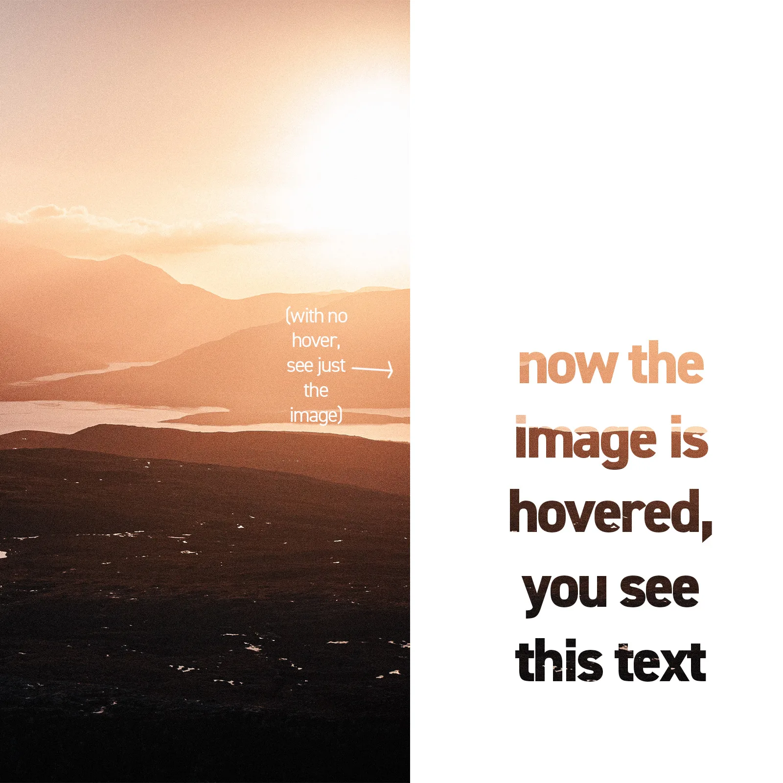
in this image, state 1 (no hover) is on the left. you just see the image. state 2 (hover) is on the right. text would appear as a clipping mask for the image, so you only see the image through the text when hovered.

This text would be a hyperlink to a different page

I’ve tried using css background-clip as described here to make this work, but I couldn’t get it so that the first state was just the image, no text outline.

Can anyone help?

I’d really love a whole grid of these images, acting as thumbnails for different blog posts!

thank you!

2

Answers


  1. You mean like this?

    It was necessary to have a parent div with the same background, and hide it on hovering.

          .container {
            width: fit-content;
            background: url("https://images.pexels.com/photos/20316373/pexels-photo-20316373/free-photo-of-antigo-antepassados-anciao-arqueologia.jpeg?auto=compress&cs=tinysrgb&w=1260&h=750&dpr=1")
              no-repeat;
          }
          .container:hover {
            background: none;
          }
    
          a {
            padding: 10px;
            height: 750px;
            width: 300px;
            font-weight: bold;
            display: flex;
            align-items: center;
            justify-content: center;
            font-size: 100px;
            position: relative;
            border: none;
            background: var(--i, transparent);
            -webkit-background-clip: text;
            background-clip: text;
            -webkit-text-fill-color: transparent;
          }
    
          a:hover {
            --i: url("https://images.pexels.com/photos/20316373/pexels-photo-20316373/free-photo-of-antigo-antepassados-anciao-arqueologia.jpeg?auto=compress&cs=tinysrgb&w=1260&h=750&dpr=1");
          }
        <div class="container">
          <a target="_blank" href="https://www.google.com"> NOW SOME TEXT </a>
        </div>
    Login or Signup to reply.
  2. Each item in the gallery can have a background image which covers the item and then on hover the background is clipped to the text.

    This snippet has the gallery as a CSS grid with square items, but of course alter this to whatever layout you require.

    This snippet gives this sort of effect:

    enter image description here

    .gallery {
      display: grid;
      grid-template-columns: 1fr 1fr 1fr;
      width: 100vw;
    }
    
    .gallery>* {
      width: 100%;
      aspect-ratio: 1;
      background-image: var(--image);
      background-repeat: no-repeat;
      background-size: cover;
      color: transparent;
      display: flex;
      justify-content: center;
      text-align: center;
      align-items: center;
      padding: 0;
      margin: 0;
      font-size: 8vw;
      font-family: sans-serif;
      font-weight: bold;
    }
    
    .gallery>*:hover {
      -webkit-background-clip: text;
      background-clip: text;
    }
    
    .gallery>*:nth-child(1) {
      --image: url("https://picsum.photos/id/1015/1024/1024");
    }
    
    .gallery>*:nth-child(2) {
      --image: url("https://picsum.photos/id/1016/1024/1024");
    }
    
    .gallery>*:nth-child(3) {
      --image: url("https://picsum.photos/id/1018/1024/1024");
    }
    
    .gallery>*:nth-child(4) {
      --image: url("https://picsum.photos/id/1019/1024/1024");
    }
    
    .gallery>*:nth-child(5) {
      --image: url("https://picsum.photos/id/1020/1024/1024");
    }
    
    .gallery>*:nth-child(6) {
      --image: url("https://picsum.photos/id/1021/1024/1024");
    }
    <div class="gallery">
      <a href="#">1st<br>IMAGE</a>
      <a href="#">2nd<br>IMAGE</a>
      <a href="#">3rd<br>IMAGE</a>
      <a href="#">4th<br>IMAGE</a>
      <a href="#">5th<br>IMAGE</a>
      <a href="#">6th<br>IMAGE</a>
    </div>
    Login or Signup to reply.
Please signup or login to give your own answer.
Back To Top
Search