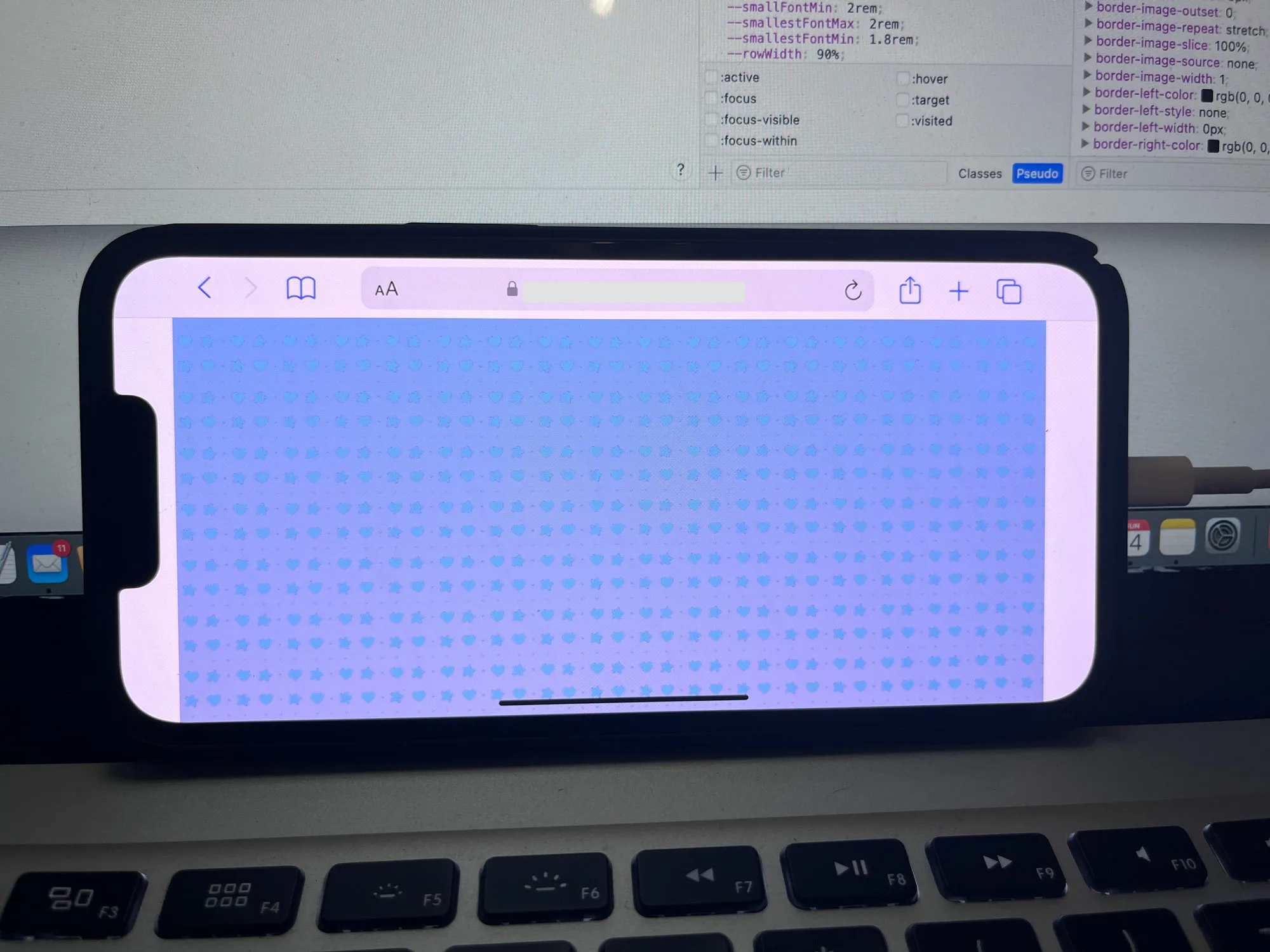
I am trying to get my website to fill the screen (notch) left and right sides when in landscape mode on IOS Safari but NONE of the solutions work.
I have added the meta tag <meta name="viewport" content="width=device-width, initial-scale=1, viewport-fit=cover"> and I have also added
@supports(padding:max(0px)) {
    body, header, footer {
        padding-left: min(0vmin, env(safe-area-inset-left));
        padding-right: min(0vmin, env(safe-area-inset-right));
    }
}
I have noticed that background color on the body tag does work but I have background images that need to fill the space.
Does anyone have any ideas or solutions?
UPDATE:
Here is a screen shot of what I am talking about
Here is the CSS
div.et_pb_section.et_pb_section_6 {
    background-position: center top;
    background-image: url(https://XXXXXX.com/wp-content/uploads/2023/05/[email protected]),linear-gradient(180deg,#80b6d7 0%,#d2c5de 100%)!important;
}


2
Answers
Figured out the problem. It was the two meta tags named viewport conflicting with each other and it was eventually found in my parent theme. So I was able to replace the function from the child theme.
viewport-fit=coverseems to work for me, but not when run as a snippet. You do not see the desired result when you run the snippet below on an iPhone. (I believe this is a limitation of snippets — even a snippet showing in full page is still within aniframe, so the scope of the meta tag is limited to thatiframe.)However, try this link which has effectively the same code as the snippet, and you can see that the image does fill around the notch area (when the phone is in landscape orientation).