 Question posted in


I’ve been trying to build a personal website for fun and personal art and the likes, but I have no formal education with coding anything. I’ve tried to do it on my own looking tutorials and even got a friend who helped me with it and despite it looking alright on my main screen, it breaks in other screens and specially on phone…
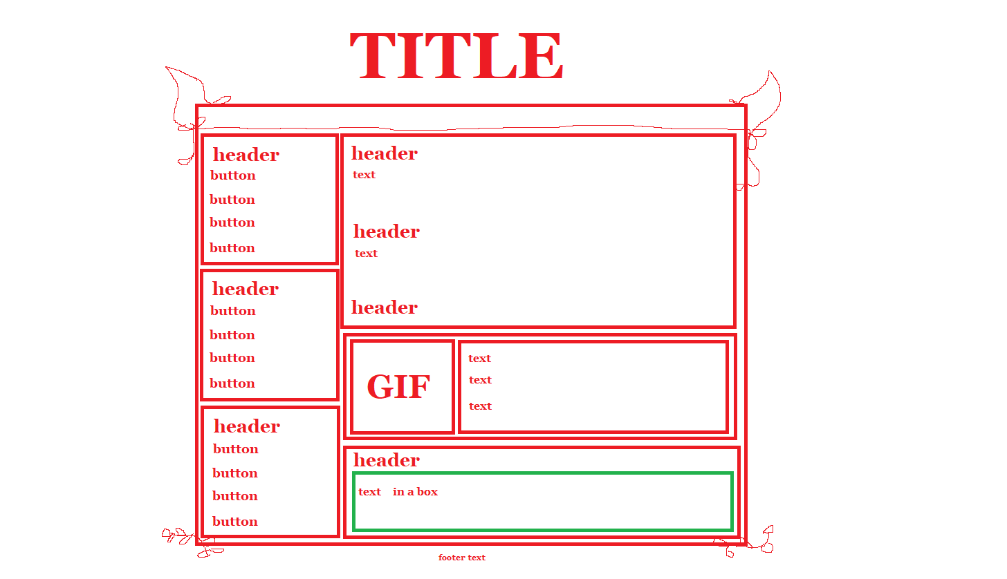
Here’s the structure of what I want to do
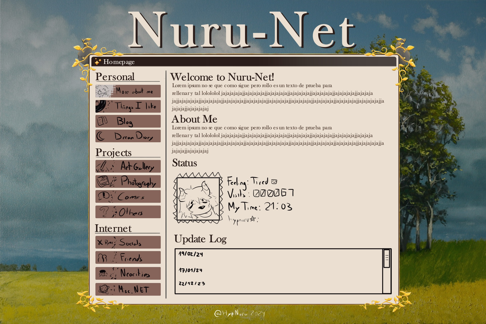
Here’s a mockup of what I want it to look like
My biggest issue is how to get the textbox decoration to work and overlap while maintaining the structure below it, and other stuff.
The problem I face with what I tried is that it breaks a LOT despite trying multiple ways to resize everything
Here’s what I tried using px (you can also see it on The website:
<!DOCTYPE html>
<html lang="en">
<html>
  <head>
    <link rel="icon" type="image/x-icon" href="/icon.webp">
    <meta charset="UTF-8">
    <meta property="og:image" content="/testbg.jpg"/>
    <meta property="og:title" content="Nurutest" />
    <meta property="og:description" content="idk man im focking working" />
    <meta name="viewport" content="width=device-width, initial-scale=1.0">
    <title>Wow!</title>
    <!-- The style.css file allows you to change the look of your web pages.
         If you include the next line in all your web pages, they will all share the same look.
         This makes it easier to make new pages for your site. -->
    <link href="/style.css" rel="stylesheet" type="text/css" media="all">
<style>
body {
 display: flex;
 justify-content: center;
 align-items: center;
 margin: 0;
 background-image: url('/bg.png');
 background-size: cover;
 background-position: center;
 background-repeat: no-repeat;
 background-attachment: fixed;
}

h3 {
   margin: 3px;
   margin-top: 5px;
}

.textboximage {
  pointer-events: none;
  position: absolute;
  z-index: 2;
  margin-top: 6%;
  overflow: hidden;
  width: auto;
  height: auto;
}

.textboxflair {
  border: 5px outset;
  border-color: rgba(0,0,0,0);
  text-align: center;
  overflow: auto;
  width: 1000px;
  height: 700px;
  gap: 5px;
  margin-top: 6%;
  box-sizing: border-box;
  display: flex;
  flex-direction: right;
  background-color: #eadfd1;
}

.buttonbox {
  border: 5px outset;
  border-color: rgba(0,0,0,0);
  text-align: left;
  width: 220px;
  height: 680px;
  top: 5px;
  left: 5px;
  position: relative;
  box-sizing: border-box;
}

.button {
  border: 5px outset;
  border-color: rgba(0,0,0,0);
  text-align: left;
  width: 200px;
  height: 220px;
  top: 5px;
  left: 5px;
  margin-bottom: 5px;
  position: relative;
  box-sizing: border-box;

}

.textbox {
  border: 5px outset red;
  text-align: left;
  width: 750px;
  height: 680px;
  position: relative;
  box-sizing: border-box;
  top: 5px;
  left: 5px;
}

.maintext {
  border: 5px outset red;
  text-align: left;
  width: 740px;
  height: 300px;
  position: relative;
  box-sizing: border-box;
  top: 5px;
  left: 5px;
}

.statusbox {
  border: 5px outset red;
  text-align: left;
  width: 740px;
  height: 180px;
  position: relative;
  box-sizing: border-box;
  top: 5px;
  left: 5px;
  display: flex;
  flex-direction: right;
}

.statuspic {
  border: 5px outset red;
  text-align: left;
  width: 170px;
  height: 170px;
  position: relative;
  box-sizing: border-box;
  top: 5px;
  left: 5px;
}

.statustext {
  border: 5px outset red;
  text-align: left;
  width: 600px;
  height: 170px;
  position: relative;
  box-sizing: border-box;
  top: 5px;
  left: 5px;
}

.updatelog {
  border: 5px outset red;
  text-align: left;
  width: 740px;
  height: 180px;
  position: relative;
  box-sizing: border-box;
  top: 5px;
  left: 5px;
}


</style>
</head>
<body>

<img class="textboximage" src="/textbox.webp">

<div class="textboxflair">

  <div class="buttonbox">
   <div class="button">
       <h3>Personal</h3>
   </div>

   <div class="button">
       <h3>Projects</h3>
   </div>

   <div class="button">
       <h3>Internet</h3>
    </div>
  </div>

  <div class="textbox">
    <div class="maintext">
    </div>
    <div class="statusbox">
        <div class="statuspic">
        </div>
        <div class="statustext">
        </div>
    </div>
    <div class="updatelog">
    </div>
  </div>
</div>


</body>
</html>
I also tried other things like this, but it doesn’t work.
<!DOCTYPE html>
<html lang="en">
<html>
  <head>
    <link rel="icon" type="image/x-icon" href="/icon.webp">
    <meta charset="UTF-8">
    <meta property="og:image" content="/testbg.jpg"/>
    <meta property="og:title" content="Nurutest" />
    <meta property="og:description" content="idk man im focking working" />
    <meta name="viewport" content="width=device-width, initial-scale=1.0">
    <title>Myah!</title>
    <!-- The style.css file allows you to change the look of your web pages.
         If you include the next line in all your web pages, they will all share the same look.
         This makes it easier to make new pages for your site. -->
    <link href="/style.css" rel="stylesheet" type="text/css" media="all">
<style>
body {
 display: flex;
 justify-content: center;
 align-items: center;
 width: 100%;
 height: 100vh;
 margin: 0;
 background-image: url('/bg.png');
 background-size: cover;
 background-position: center;
 background-repeat: no-repeat;
 overflow: hidden;
}

h3 {
   margin: 3px;
   margin-top: 5px;
}

.textboximage {
  pointer-events: none;
  position: absolute;
  z-index: 2;
  margin-top: 6%;
  overflow: hidden;
  width: 150vh;
  height: 105vh;

}

.textboxflair {
  border: 5px outset;
  border-color: rgba(0,0,0,0);
  text-align: center;
  overflow: auto;
  width: 100vh;
  height: 75vh;
  max-width: 1000px;
  gap: 5px;
  margin-top: 6%;
  box-sizing: border-box;
  display: flex;
  flex-direction: right;
  background-color: #eadfd1;

  position: absolute;
}

.buttonbox {
  border: 5px outset lightgray;
  text-align: left;
  width: 40%;
  height: 99%;
  top: 5px;
  left: 5px;
}

.button {
  border: 5px outset lightgray;
  text-align: left;
  width: 100%;
  height: 33%;
  top: 5px;
  left: 5px;
  margin-bottom: 5px;

}

.textbox {
  border: 5px outset lightgray;
  text-align: left;
  width: 100%;
  height: 99%;
  top: 5px;
  left: 5px;
}

.maintext {
  border: 5px outset lightgray;
  text-align: left;
  width: 100%;
  height: 45%;
  top: 5px;
  left: 5px;
}

.statusbox {
  border: 5px outset lightgray;
  text-align: left;
  width: 100%;
  height: 33%;
  top: 5px;
  left: 5px;
  display: flex;
  flex-direction: right;
}

.statuspic {
  border: 5px outset lightgray;
  text-align: left;
  width: 30%;
  height: 100%;
  top: 5px;
  left: 5px;
}

.statustext {
  border: 5px outset lightgray;
  text-align: left;
  width: 70%;
  height: 100%;
  top: 5px;
  left: 5px;
}

.updatelog {
  border: 5px outset lightgray;
  text-align: left;
  width: 100%;
  height: 22%;
  top: 5px;
  left: 5px;
}


</style>
</head>
<body>

<img class="textboximage" src="/textbox.webp">

<div class="textboxflair">

  <div class="buttonbox">
   <div class="button">
       <h3>Personal</h3>
   </div>

   <div class="button">
       <h3>Projects</h3>
   </div>

   <div class="button">
       <h3>Internet</h3>
    </div>
  </div>

  <div class="textbox">
    <div class="maintext">
    </div>
    <div class="statusbox">
        <div class="statuspic">
        </div>
        <div class="statustext">
        </div>
    </div>
    <div class="updatelog">
    </div>
  </div>
</div>


</body>
</html>
Is there a better way to do this? Maybe with grids or other css features? I’m following whatever I’ve gathered from a lot of posts, reading and my friend but that’s all I can do. Thank you in advance and sorry for my bad english and poor experience with coding.
2
Answers
The issue you’re encountering is that your website isn’t adjusting well to smaller screens. To make your website responsive, you should consider implementing a mobile-first design approach. Start by reading up on responsive design basics on w3Schools or mozilla.
But to answer your question directly, you’re searching for Media Queries:
by using this, u can set for a specific screen size, a design like mobile or iPads.
You can use media queries to switch the style, layout, and size of elements for specific screen sizes. That way, your page will become responsive and can be viewed on all devices (smaller monitors, tablets, phones, smaller/narrower phones, etc.). You’ve used a desktop-first approach. So, you need to add responsiveness for smaller screens. A simple example would be: