skip to Main Content

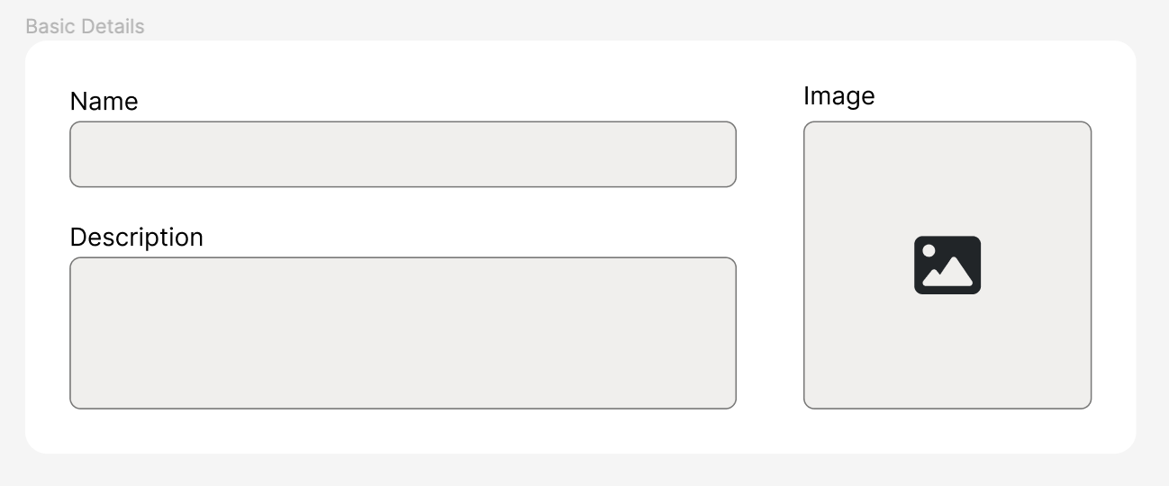
I am trying to make a grid which has two columns. The second column should contain an image input field which should be a square with a 1:1 aspect ratio. The square should be aligned with the bottom of the first column. Basically, the bottom of the image input should reach the bottom of the first column. I made a sketch of what I am trying to do in Figma (see the image).

Note: I cannot use the aspect-ratio property as it doesn’t have great enough support yet for my needs. I also want to avoid magic numbers and JavaScript.

What I’ve tried: Currently, I am using the width: 0; + padding: 0 100%; trick to get a 1:1 aspect ratio. However, the image input is not pushing the other grid column back like I want and is instead overflowing. Additionally, the input doesn’t seem to be getting a correct 1:1 aspect ratio either. Any help would be appreciated.

enter image description here

body {
  background: #eee;
}
section {
  margin: 2rem;
  padding: 2rem;
  background: white;
}
input {
  background: #eee;
  border: 0.05rem solid black;
  border-radius: 0.5rem;
  padding: 0.5rem;
}


.grid {
  display: grid;
  grid-template-columns: 1fr auto;
  gap: 2rem;
}
.form-item {
  display: flex;
  flex-direction: column;
  gap: 0.25rem;
}
.form-item ~ .form-item {
  margin-top: 2rem;
}


.image-input-container {
  position: relative;
  height: 100%;
  width: 0;
  padding: 0 100%;
}
.image-input {
  background: #eee;
  border: 0.05rem solid black;
  border-radius: 0.5rem;
  position: absolute;
  inset: 0;
  display: flex;
  align-items: center;
  justify-content: center;
  width: 100%;
  height: 100%;
}
<section>
  <div class="grid">
  
    <div>
      <div class="form-item">
        <label>Name</label>
        <input>
      </div>
      <div class="form-item">
        <label>Description</label>
        <input>
      </div>
    </div>
    
    <div class="form-item">
      <label>Image</label>
      <div class="image-input-container">
        <button class="image-input">+</button>
      </div>
    </div>
    
  </div>
</section>

2

Answers


  1. section {
      margin: 2rem;
      padding: 2rem;
      background: #eee;
    }
    
    .grid {
      display: grid;
      grid-template-columns: 7fr minmax(auto, 1fr);
      gap: 2rem;
    }
    
    .form-item {
      display: flex;
      flex-direction: column;
      gap: 0.25rem;
    }
    
    .form-item~.form-item {
      margin-top: 2rem;
    }
    
    .image_input_container {
      position: relative;
      width: 100%;
      padding-top: 100%;
    }
    
    .image_input {
      position: absolute;
      inset: 0;
      display: flex;
      align-items: center;
      justify-content: center;
      width: 100%;
      height: 100%;
      background: white;
    }
    <section>
      <div class="grid">
        <div>
          <div class="form-item">
            <label>Name</label>
            <input>
          </div>
          <div class="form-item">
            <label>Description</label>
            <input>
          </div>
        </div>
        <div class="form-item">
          <label>Image</label>
          <div class="image_input_container">
            <button class="image_input">+</button>
          </div>
        </div>
      </div>
    </section>

    Maybe you can use minmax for defining columns and padding-top:100% for keeping aspect ratio. Check it out the sample code, i hope that help.

    Login or Signup to reply.
  2. Maybe this will help, wrapped the 2 input forms and removed padding:100% and width:0

    body {
        background: #eee;
      }
      section {
        margin: 2rem;
        padding: 2rem;
        background: white;
      }
      input {
        background: #eee;
        border: 0.05rem solid black;
        border-radius: 0.5rem;
        padding: 0.5rem;
      }
      
      
      .grid {
        display: grid;
        grid-template-columns: 80% 1fr;
        gap: 2rem;
      }
    
      .input-divs{
        display: flex;
        flex-direction: column;
      }
      
      .form-item {
        display: flex;
        flex-direction: column;
        flex: 1;
        width: 100%;
        gap: 0.25rem;
      }
      .form-item ~ .form-item {
        margin-top: 2rem;
      }
      
      
      .image-input-container {
        position: relative;
        height: 100%;
      }
      .image-input {
        background: #eee;
        border: 0.05rem solid black;
        border-radius: 0.5rem;
        position: absolute;
        inset: 0;
        display: flex;
        align-items: center;
        justify-content: center;
        width: 100%;
        height: 100%;
      }
    <section>
        <div class="grid">
            <div class="input-divs">
                <div class="form-item">
                <label>Name</label>
                <input>
                </div>
                <div class="form-item">
                <label>Description</label>
                <input>
                </div>
            </div>
            <div class="form-item">
                <label>Image</label>
                <div class="image-input-container">
                <button class="image-input">+</button>
                </div>
            </div>
        </div>
    </section>
    Login or Signup to reply.
Please signup or login to give your own answer.
Back To Top
Search