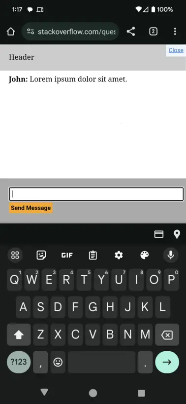
Consider the snippet below, where I’ve created a basic chat window.
The issue:
When you focus the input on a mobile device, the entire page is shifted up, pushing the header and messages out of view.
The goal: When you focus the input on a mobile device, the #messages section shrinks to accommodate the keyboard (similar to how the page behaves on desktop when reducing the window height).
(Images included below)
My attempts to resolve it: I’ve tried using height: 100% instead of 100dvh, I’ve tried moving the height declaration to the <body> instead of the <html>.
html,
body {
  padding: 0;
  margin: 0;
}

html {
  height: 100dvh;
  width: 100dvw;
}

body {
  height: 100%;
  width: 100%;
  background-color: white;
}

#content {
  height: 100%;
  display: flex;
  flex-direction: column;
}

#header {
  padding: 20px;
  background-color: #ccc;
}

#messages {
  margin: -10px 0;
  flex-grow: 1;
  flex-shrink: 1;
  overflow: auto;
}

.message {
  padding: 20px;
}

#footer {
  display: block;
  background-color: #aaa;
  padding: 20px;
}

input {
  padding: 5px;
  width: 100%;
  display: block;
}

button {
  border: 0;
  margin: 4px 0;
  padding: 4px;
  background-color: orange;
  font-weight: bold;
}
<div id="content">
<div id="header">Header</div>
<div id="messages">
<div class="message"><b>John:</b> Lorem ipsum dolor sit amet.</div>
</div>
<form id="footer">
<input>
<button type="button">Send Message</button>
</form>
</div>This is the current behavior. The header and messages have been pushed up out-of-view.
This is the desired behavior. The header stays in place and the messages div shrinks to accommodate the keyboard.
EDIT: It seems this is a browser-specific issue. Firefox on mobile handles this perfectly. Chrome and Safari are not accounting for the onscreen keyboard when calculating dvh.

 Question posted in


2
Answers
So, long story short, my code is actually fine. It's the browser behavior that needs to be manipulated.
Adding
interactive-widget=resizes-contentto my page's<meta name="viewport">tag solved the issue.Reasons below:
Here is the Chrome article detailing this change
I would of thought media queries would help with this: