skip to Main Content

I’m building an application which has a container with fixed size blocks and a search box on top of the block list.

I set up block wrapping (using flex wrap) to display the blocks into multiple columns when the screen factor is large enough.

I’d like to fix the search box to the width of the blocks container. Not the full width, but the width of the actual occupied space of the blocks.

To illustrate my goal:

enter image description here

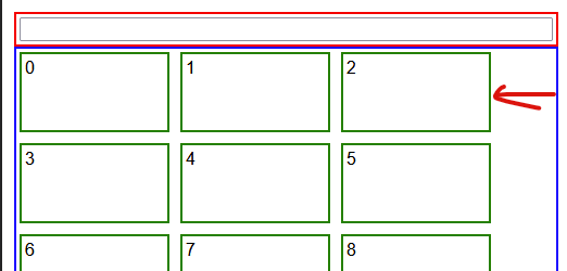
Blue is the block container, Red is the search container and Greens are my blocks.

The Red div is 100% width of its container (div default).

I want its right side to be aligned with the right side of the last column in the flex wrap.

How can I reach my goal ?

Repro:

const listEl = document.getElementById("list");

if (!listEl) throw new Error("boom");
for (let i = 0; i < 100; i++) {
  const block = document.createElement("div");
  block.className = "block";
  block.innerText = i.toString();

  listEl.appendChild(block);
}
div {
  padding: 3px;
}

#search {
  border: solid 2px red;
}

#search input {
  width: 100%;
}

#list {
  border: solid 2px blue;
  display: flex;
  flex-wrap: wrap;
  gap: 10px;
}

.block {
  width: 128px;
  height: 64px;
  border: solid 2px green;
}
<div id="container">
  <div id="search">
    <input type="text" />
  </div>

  <div id="list"></div>
</div>

2

Answers


  1. The best you can likely do here is to add justify-content: space-between;, which will put whitespace between your items so that the first and last item are aligned to the edges of the container and the items are evenly spaced.

    #list {
      border: solid 2px blue;
      display: flex;
      flex-wrap: wrap;
      justify-content: space-between;
      gap: 10px;
    }
    
    const listEl = document.getElementById("list");
    
    if (!listEl) throw new Error("boom");
    for (let i = 0; i < 100; i++) {
      const block = document.createElement("div");
      block.className = "block";
      block.innerText = i.toString();
    
      listEl.appendChild(block);
    }
    div {
      padding: 3px;
    }
    
    #search {
      border: solid 2px red;
    }
    
    #search input {
      width: 100%;
    }
    
    #list {
      border: solid 2px blue;
      display: flex;
      flex-wrap: wrap;
      justify-content: space-between;
      gap: 10px;
    }
    
    .block {
      width: 128px;
      height: 64px;
      border: solid 2px green;
    }
    <div id="container">
      <div id="search">
        <input type="text" />
      </div>
    
      <div id="list"></div>
    </div>

    Alternatively, you can ensure your container width is exactly a multiple of the width of your flex items.

    Login or Signup to reply.
  2. If you could change your HTML structure a little bit, with grid layout it is possible:

    const listEl = document.getElementById("list");
    
    if (!listEl) throw new Error("boom");
    for (let i = 0; i < 100; i++) {
      const block = document.createElement("div");
      block.className = "block";
      block.innerText = i.toString();
    
      listEl.appendChild(block);
    }
    div {
      padding: 3px;
    }
    
    #search {
      border: solid 2px red;
      grid-column: 1/-1;
    }
    
    #search input {
      width: 100%;
    }
    
    #list {
      border: solid 2px blue;
      display: grid;
      grid-template-columns: repeat(auto-fill, 128px);
      gap: 10px;
    }
    
    .block {
      border: solid 2px green;
      height: 64px;
    }
    <div id="container">
      <div id="list">
        <div id="search">
          <input type="text" />
        </div>
      </div>
    </div>
    Login or Signup to reply.
Please signup or login to give your own answer.
Back To Top
Search