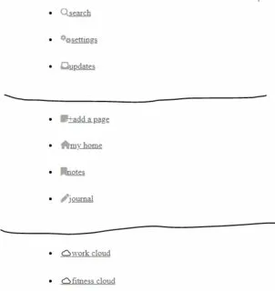
So I am making a sidebar with my code and want there to be a divider between some elements, to achieve that I used the hr tag but it behaves unexpectedly when I use it in my contextual code.
When I first added the hr element it didn’t show up at all there was just alot of extra space between the places which I added them hence the image-
So I went on codepen and isolated the issue to find out which element exactly was tampering with this very simple tag. I slowly took my CSS styling properties away and waited for a dramatic change to see which one was making the hr tag behave weirdly.
I found that it was my flexbox properties in my sidebar div class and I found that it was my display:flex properties this was my layout
sidebar{
  display:flex;
  flex-direction:column;
  justify-content: space-between;
All my properties tampered with it in some way when to take you through what happens
normal sidebar everything ok but I want to tweak the layout the hr tag is already there and functioning normally
I add display flex, as the default is not the vertical cross axis it makes my sidebar go horizontal the hr tag is still there
When I add flex-direction column the layout goes back to vertical but all my hr tags have gone and are now there’s a blank white space where there supposed to be
When I add justify content space between it gives me my desired layout but there are spaces between where I have added my hr dividers and its just now showing up
Here is my minimal reproducible example for the code
.sidebar{
 box-sizing: border-box;
 height:709px;
 width:634px;
 margin:0.5px;
 padding:10px;
 display:flex;
 flex-direction: column;
 justify-content: space-between;
}
<header class="title"> x's habit cloud</header>
<ul>
<div class="sidebar">
<li><a href="#"><i class="fa-solid fa-magnifying-glass"></i>search</a></li>
<li><a href="#"><i class="fa-solid fa-gears"></i>settings</a></li>
<li><a href="#"><i class="fa-solid fa-inbox"></i>updates</a></li>
<hr>
<li><a href="#"><i class="fa-solid fa-note-sticky"></i>+add a page</a></li>
<li><a href="#"><i class="fa-solid fa-house"></i>my home</a></li>
<li><a href="#"><i class="fa-solid fa-bookmark"></i>notes</a></li>
<li><a href="#"><i class="fa-solid fa-pen "></i>journal</a></li>
<hr>From the example you can see that if you remove the styling the hr tags come back
And if you cannot interact with the code to see it without the styling feel free to use my CXodepen link https://codepen.io/Adama-J/pen/GRzdapy to go ahead and interact with my code in any way seems fit to determine the issue from diffirent angles
If anyone has any insights or recommendations to solve this issue that would be warmly appreciated!
Image of what I want my hr to look like and where I want it to be


2
Answers
I’d suggest then that if you want groups in your menu/sidebar you use the appropriate elements, submenus for instance.
Then use borders and margin/padding to create separation.
divunderul.hrunder list item to make symmetry in yourHTML structure
Here is your updated
HTML&CSS