skip to Main Content

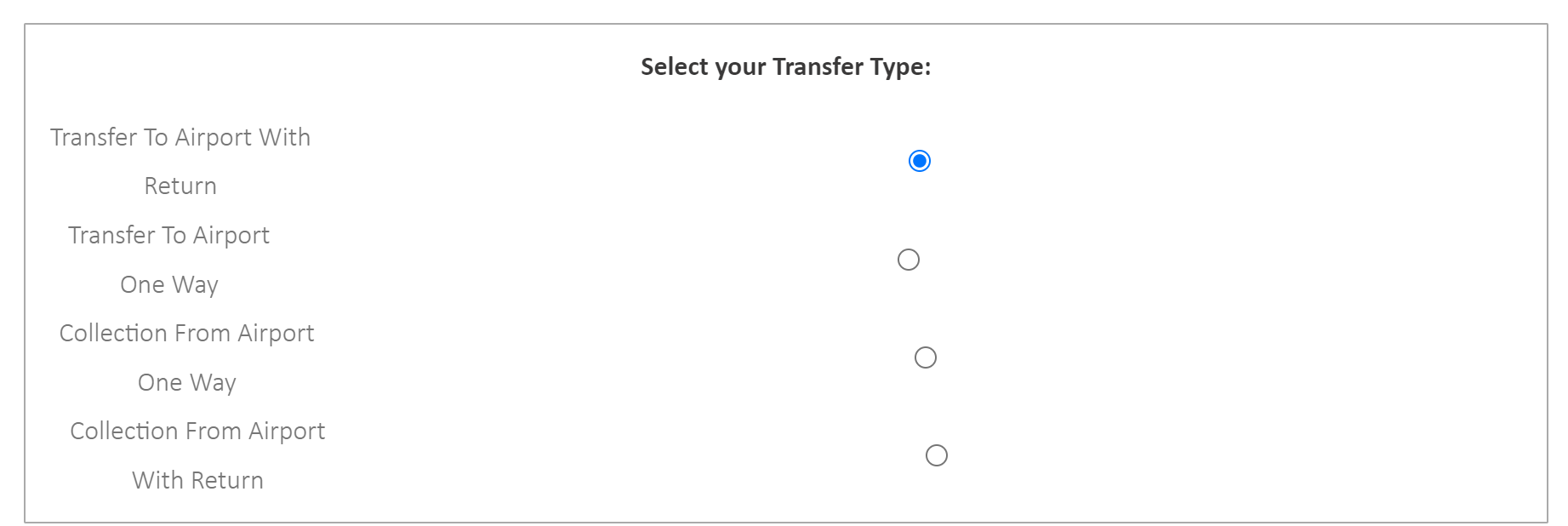
The radio buttons seem to be all skewed and not generally at the right of the labels. ideally i want the labels neatly in a column to the left & the corresponding radio button to the right of it.

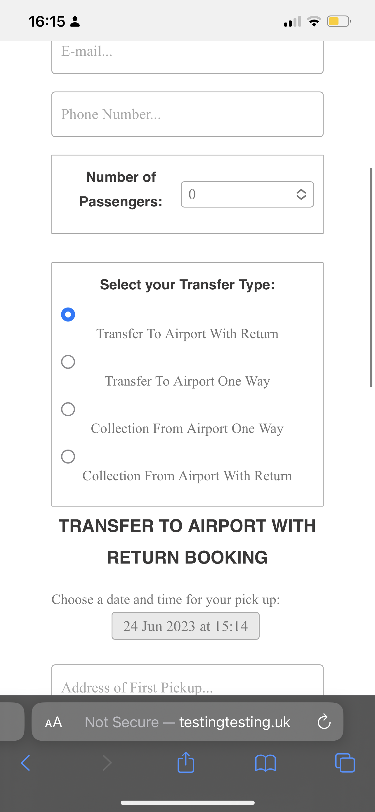
also on mobile view the buttons seem to be underneath the label & not to the right?

* {
  box-sizing: border-box;
}

body {
  background-color: #f1f1f1;
}

form {
  background-color: #ffffff;
  margin: 100px auto;
  font-family: Calibri;
  padding: 0px;
  width: 80%;
  min-width: 300px;
}

h1,
h2,
h3,
h4 {
  text-align: center;
  font-family: Calibri, sans-serif;
}

input,
select,
textarea {
  padding: 10px;
  width: 100%;
  font-size: 17px;
  font-family: Calibri;
  border: 1px solid #aaaaaa;
  border-radius: 4px;
  box-sizing: border-box;
}

input.invalid {
  background-color: #ffdddd;
}

.content {
  display: none;
}

label {
  display: flex;
  align-items: center;
}

input[type="radio"] {
  margin-right: 5px;
  vertical-align: middle;
  order: 2;
  /* Added to change the order of radio buttons */
}

input[type=submit] {
  background-color: #04AA6D;
  color: white;
  padding: 12px 20px;
  border: none;
  border-radius: 4px;
  cursor: pointer;
}

input[type=submit]:hover {
  background-color: #45a049;
}

.container {
  border-radius: 5px;
  background-color: #f2f2f2;
  padding: 20px;
}


/* Add the styled-box CSS class */

.styled-box {
  border: 1px solid #aaaaaa;
  padding: 10px;
  margin-bottom: 4px;
  border-radius: 1px;
  text-align: center;
  /* Center the content */
}

.custom-select {
  width: 200px;
}


/* Additional CSS code */

@media only screen and (max-width: 767px) {
  .styled-box label {
    display: block;
    margin-bottom: 10px;
  }
  .styled-box input[type="radio"] {
    display: block;
    margin-top: 5px;
    order: 1;
    /* Added to change the order of radio buttons */
  }
  /* Additional rule for datetime-local, date, and time inputs in mobile view */
  .styled-box input[type="datetime-local"],
  .styled-box input[type="date"],
  .styled-box input[type="time"] {
    background-color: white;
  }
}

@media only screen and (min-width: 768px) and (max-width: 1023px) {
  form {
    width: 60%;
  }
}
<div class="styled-box">
  <h4>Select your Transfer Type:</h4>
  <label>
        <input
          type="radio"
          checked="checked"
          name="radio"
          id="rad1"
          value="TransferToAirportWithReturn"
          onclick="showContent('content1')"
        />
        Transfer To Airport With Return
      </label>
  <label>
        <input
          type="radio"
          name="radio"
          id="rad2"
          value="TransferToAirportOneWay"
          onclick="showContent('content2')"
        />
        Transfer To Airport One Way
      </label>
  <label>
        <input
          type="radio"
          name="radio"
          id="rad3"
          value="CollectionFromAirportOneWay"
          onclick="showContent('content3')"
        />
        Collection From Airport One Way
      </label>
  <label>
        <input
          type="radio"
          name="radio"
          id="rad4"
          value="CollectionFromAirportWithReturn"
          onclick="showContent('content4')"
        />
        Collection From Airport With Return
      </label>
</div>

I know i’m a newbie so some or most of this code you’ll look at & think i’ve over/under done it. some things may not need to be there etc but i appreciate any help at all!

here are some screen shots too:

Radio buttons misaligned

This is what it looks like on mobile (iPhone 12 Pro Max)
mobile view

ideally id want them both to be centered equally but side by side

I’ve tried a few different versions of radio buttons from stack overflow, w3 schools but they all seem to have slightly different problems but not the result I desire.

I’ve also used chat gpt to build most of this booking form.

2

Answers


  1. You can add flex:0 to input radio button in order to avoid grow for this element:

    input[type="radio"] {
      /* ... */
      flex: 0; /* Avoid input grows */
    }
    
    * {
      box-sizing: border-box;
    }
    
    body {
      background-color: #f1f1f1;
    }
    
    form {
      background-color: #ffffff;
      margin: 100px auto;
      font-family: Calibri;
      padding: 0px;
      width: 80%;
      min-width: 300px;
    }
    
    h1, h2, h3, h4 {
      text-align: center;
      font-family: Calibri, sans-serif;
    }
    
    input, select, textarea {
      padding: 10px;
      width: 100%;
      font-size: 17px;
      font-family: Calibri;
      border: 1px solid #aaaaaa;
      border-radius: 4px;
      box-sizing: border-box;
    }
    
    input.invalid {
      background-color: #ffdddd;
    }
    
    .content {
      display: none;
    }
    
    label {
      display: flex;
      align-items: center;
    }
    
    input[type="radio"] {
      margin-right: 5px;
      vertical-align: middle;
      order: 2; /* Added to change the order of radio buttons */
      flex: 0; /* Avoid input grows */
    }
    
    input[type=submit] {
      background-color: #04AA6D;
      color: white;
      padding: 12px 20px;
      border: none;
      border-radius: 4px;
      cursor: pointer;
    }
    
    input[type=submit]:hover {
      background-color: #45a049;
    }
    
    .container {
      border-radius: 5px;
      background-color: #f2f2f2;
      padding: 20px;
    }
    
    /* Add the styled-box CSS class */
    .styled-box {
      border: 1px solid #aaaaaa;
      padding: 10px;
      margin-bottom: 4px;
      border-radius: 1px;
      text-align: center; /* Center the content */
    }
    
    .custom-select {
      width: 200px;
    }
    
    /* Additional CSS code */
    @media only screen and (max-width: 767px) {
      .styled-box label {
        display: block;
        margin-bottom: 10px;
      }
    
      .styled-box input[type="radio"] {
        display: block;
        margin-top: 5px;
        order: 1; /* Added to change the order of radio buttons */
      }
    
      /* Additional rule for datetime-local, date, and time inputs in mobile view */
      .styled-box input[type="datetime-local"],
      .styled-box input[type="date"],
      .styled-box input[type="time"] {
        background-color: white;
      }
    }
    
    @media only screen and (min-width: 768px) and (max-width: 1023px) {
      form {
        width: 60%;
      }
    }
         <div class="styled-box">
          <h4>Select your Transfer Type:</h4>
          <label>
            <input
              type="radio"
              checked="checked"
              name="radio"
              id="rad1"
              value="TransferToAirportWithReturn"
              onclick="showContent('content1')"
            />
            Transfer To Airport With Return
          </label>
          <label>
            <input
              type="radio"
              name="radio"
              id="rad2"
              value="TransferToAirportOneWay"
              onclick="showContent('content2')"
            />
            Transfer To Airport One Way
          </label>
          <label>
            <input
              type="radio"
              name="radio"
              id="rad3"
              value="CollectionFromAirportOneWay"
              onclick="showContent('content3')"
            />
            Collection From Airport One Way
          </label>
          <label>
            <input
              type="radio"
              name="radio"
              id="rad4"
              value="CollectionFromAirportWithReturn"
              onclick="showContent('content4')"
            />
            Collection From Airport With Return
          </label>
        </div>
    Login or Signup to reply.
  2. The reason "the radio buttons seem to be all skewed" is because you have width: 100% for input

    To achieve the desired result, I wrapped the labels and inputs in a div and gave it width: fit-content; margin: auto; to center the contents.

    With a mobile-first approach, I used a min-width media query to give the labels flex-direction: row-reverse instead of using order. (Mobile-first is easier and cleaner because you don’t need to overrule your styles back to the defaults.)

    body {
      background-color: #f1f1f1;
    }
    
    h4 {
      text-align: center;
      font-family: Calibri, sans-serif;
    }
    
    .wrapper {
      width: fit-content;
      margin: auto;
    }
    
    label {
      display: flex;
      column-gap: .5em;
      margin-bottom: 10px;
    
    }
    
    .styled-box {
      border: 1px solid #aaaaaa;
      padding: 10px;
      margin-bottom: 4px;
      border-radius: 1px;
    }
    
    
    @media (min-width: 768px) {
      label {
        flex-direction: row-reverse;
        justify-content: space-between;
      }
    }
    <div class="styled-box">
      <h4>Select your Transfer Type:</h4>
      <div class="wrapper">
      <label>
            <input
              type="radio"
              checked="checked"
              name="radio"
              id="rad1"
              value="TransferToAirportWithReturn"
              onclick="showContent('content1')"
            />
            Transfer To Airport With Return
          </label>
      <label>
            <input
              type="radio"
              name="radio"
              id="rad2"
              value="TransferToAirportOneWay"
              onclick="showContent('content2')"
            />
            Transfer To Airport One Way
          </label>
      <label>
            <input
              type="radio"
              name="radio"
              id="rad3"
              value="CollectionFromAirportOneWay"
              onclick="showContent('content3')"
            />
            Collection From Airport One Way
          </label>
      <label>
            <input
              type="radio"
              name="radio"
              id="rad4"
              value="CollectionFromAirportWithReturn"
              onclick="showContent('content4')"
            />
            Collection From Airport With Return
          </label>
      </div>
    </div>
    Login or Signup to reply.
Please signup or login to give your own answer.
Back To Top
Search