


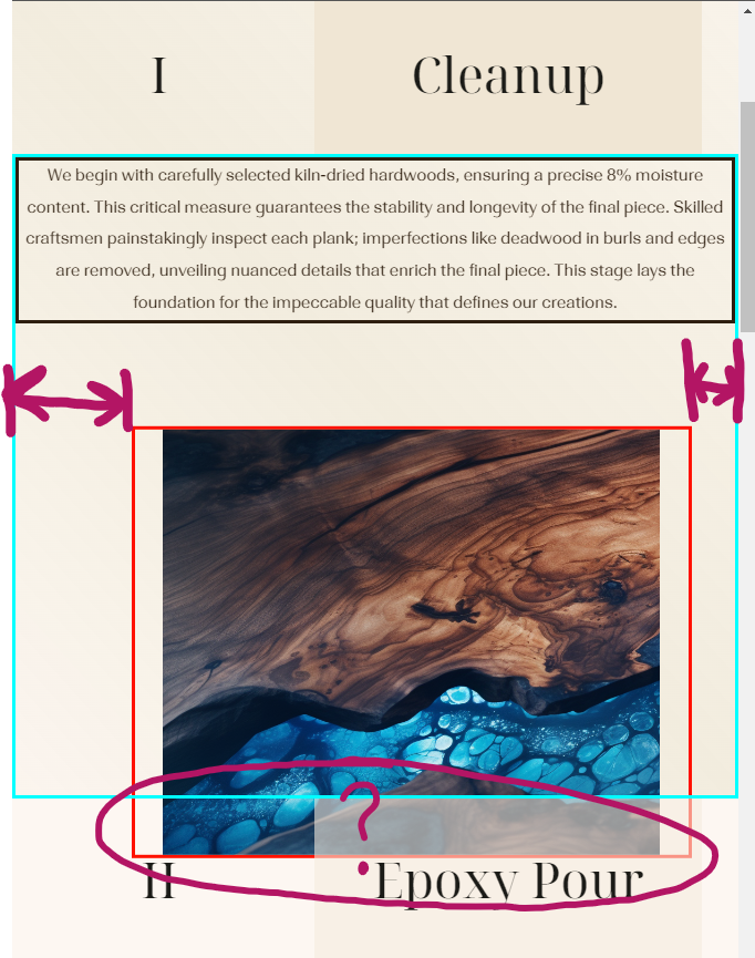
Hopefully the image i’ve marked up describes the issue easily enough. The red bordered figure conataining the image is not centered, despite the paragraph above centers fine. Both elements are in the same flexbox container. Seemingly the figure doesn’t obey its flexbox parent in anyway.
HTML:
.stepDescriptionContainer {
  position: relative;
  display: flex;
  flex-direction: column;
  align-items: center;
  border-style: solid;
  border-color: aqua;
  margin: 0px 0px;
  padding: 0px 0px;
}

.stepDescriptionContainer p {
  position: relative;
  margin: 0em 0em;
  padding: 0em 0em;
  text-align: center;
  font-size: 0.9rem;
  --fontOpticalSize: 23; /*Increase with increasing font size 8-144*/
  border-style: solid;
}

.stepImageFigure {
  position: relative;
  display: flex;
  flex-direction: column;
  margin: 0px 0px;
  padding: 0em 0em;
  width: 500px;
  border-style: solid;
  border-color: rgb(255, 17, 0);
}

.stepDescriptionContainer img {
  object-fit: contain;
  width: 100%;
}
<div class="stepDescriptionContainer">
<div class="triangle"></div>
<p>We begin with carefully selected kiln-dried hardwoods, ensuring a precise 8% moisture content. This critical measure guarantees the stability and longevity of the final piece. Skilled craftsmen painstakingly inspect each plank; imperfections like deadwood in burls and edges are removed, unveiling nuanced details that enrich the final piece. This stage lays the foundation for the impeccable quality that defines our creations.</p>
<figure class="stepImageFigure">
<img src="..imagesHomeWalnutBlueEpoxyResinTable Part1.png" alt="">
</figure>
</div>An important point which you cant see is that the CSS above is within a media quiery, whereby stepImageFigure goes from position: absolute to position relative. But i dont see how that would be causing the issue.
I’ve tried display: grid, and as many combinations of justifying and aligning you could imagine. Reshuffled the HTML with no success, cross checked all spelling. Spent about 5hr trying to find an answer or alternative.
The expection is for the figure to be centered and position accordingly to its flexbox parent.
Thanks for any help
2
Answers
Found the Answer myself:
As i said in the post, .stepImageFigure was positioned absolutely, before this bit of CSS that is wrapped in a media quiery, and changed to position: relative.
What i didn't know is before setting position: relative, you must first "reset" the position of the element. In my case, left: 0, before then overwriting that as position: relative below it.
The gap on the left is a consequence of a previously defined 5% margin property when it was positioned absolutely, and apparenty it will inherit that property by default even when you set the element to position: relative, and margin: 0.
The additional CSS specifc to my case is this:
Before later declaying this in the same media quiery:
Which solves the centering issue:
If you add justify-content: center and align-items: center, it will be placed to center position of the screen.