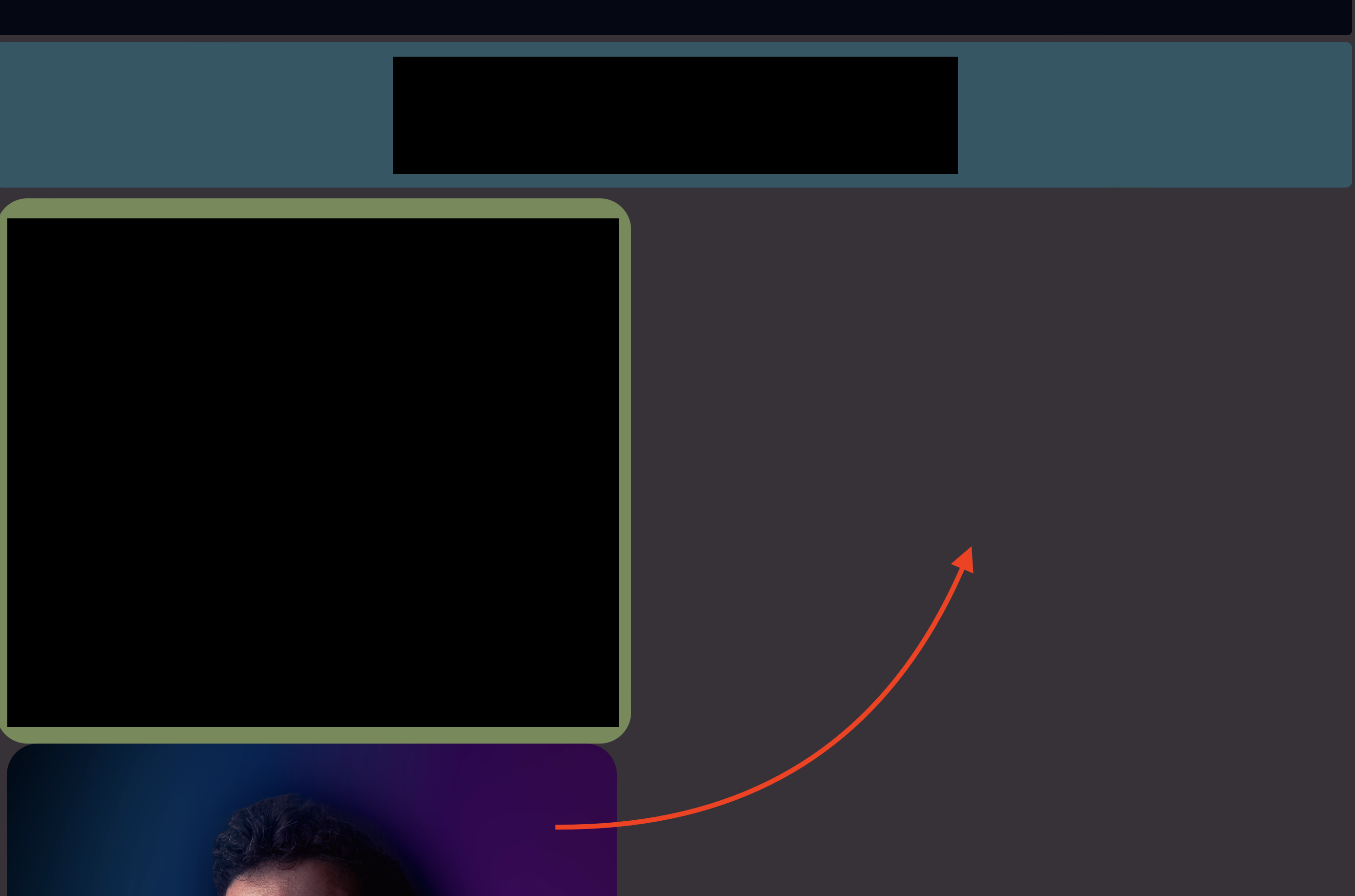
Why won’t my .summary and img items align next to each other? I have a div section with class="resume-container" containing three items. The first item "contact-info" should stretch the whole width of the screen, the second and 3rd items, summary and img, should be set side-by-side under the first item each taking up half the available screen space. I chose to use flex to make the site adaptable to differing screen sizes. Is there a better way to do this?
.resume-container {
  display: flex;
  flex-wrap: wrap;
  margin-top: 0.5%;
}

.contact-info {
  background-color: #206977ad;
  text-align: center;
  border-radius: .4rem;
  padding-top: 0.1rem;
  padding-bottom: 0.1rem;
  margin-bottom: .8%;
  align-self: center;
  flex-grow: 2;
  align-self: stretch;
  min-width: 95%;
}

.summary {
  max-width: 45%;
  background-color: #a1cd6c91;
  padding-right: .7em;
  padding-left: .7em;
  border-radius: 2rem;
  flex-grow: 1;
}

.summary p {
  font-size: 1.5rem;
  line-height: 1.25em;
  text-align: center;
}

.img-container img {
  max-width: 45%;
  margin-left: 0.8%;
  border-radius: 2rem;
}
<div class="resume-container">
<div class="contact-info">
...
</div>
<div class="summary">
...
</div>
<div class="img-container">
<img src="https://via.placeholder.com/100" alt="Picture not Found">
</div>I want the summary section and img to appear inline with each other. Why doesn’t this happen?


3
Answers
Add
flex-shrink: 1;to both containers that should be next to each other to allow them to shrink if necessary.The snippet shows them literally next to each other (given the viewport size).
On a big screen, the
summaryis next tocontactbecausecontactis only 95% wide. This is because of themax-width: 95%.summaryhas no real width declared thats why it slips up. Its (non existing) content fits in there. Declaring only amax-widthonsummaryandimg-containerdoesn’t set a real width, it just tells "not further than this".Give proper widths to your containers.
Regarding the width: when you have 50/50 and add margins, apply them evenly to the inner sides, to make it truly centered. You then also have to subtract the width of the margin from the width of the containers, otherwise they will be bigger than 50%.
I suggest for mobile screens to change add a media query where the direction of the flex is set to
column(standard isrow) and make the containers 100% width.See all in snippet below:
It’s possible that the .summary and img elements are not aligning side by side due to some styling properties in your code. In the code you provided, I don’t see that you’ve defined an .img-container class. Instead, you should apply the class to the container element surrounding the image, as shown in the corrected code below:
Furthermore, in your CSS, you’re applying the style max-width: 45% to both the .summary class and the image within .img-container. This causes both elements to have a maximum width of 45%, which could be preventing them from aligning side by side correctly.
A better way to achieve the desired layout is to apply a fixed or relative width to each of the .summary and .img-container elements and then use flex-grow to control how the available space is distributed. Here’s a corrected version of the CSS:
I hope this information is very useful to you 🙂 Greetings from the Exsis Digital community!