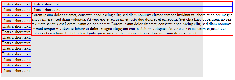
I am using flexbox to structure my entries column-wise and then, if no further vertical space is available, wrap them to the next "column".
My code:
<div style="width:800px;display:flex;flex-wrap:wrap;flex-direction:column;background:rgb(230, 230, 230);height:300px;">
  <div style="border:1px solid red;">
    <div style="border:1px solid blue;">Thats a short text.</div>
  </div>
[...]
  <div style="border:1px solid red;">
    Lorem ipsum dolor sit amet, consetetur sadipscing elitr, sed diam nonumy eirmod tempor invidunt ut labore et dolore magna aliquyam erat, sed diam voluptua. At vero eos et accusam et justo duo dolores et ea rebum. Stet clita kasd gubergren, no sea takimata sanctus est Lorem ipsum dolor sit amet. Lorem ipsum dolor sit amet, consetetur sadipscing elitr, sed diam nonumy eirmod tempor invidunt ut labore et dolore magna aliquyam erat, sed diam voluptua. At vero eos et accusam et justo duo dolores et ea rebum. Stet clita kasd gubergren, no sea takimata sanctus est Lorem ipsum dolor sit amet.
  </div>
</div>
What I expect:
The wrapped flex element just fills the remaining space.
What I get
The wrapped flex element overflows its parent container.
I tried several combinations of flex-grow, flex-shrink, word-wrap and so on, but without a success.
Although there are mass of threads regarding flexbox issues, I haven’t found a thread that deals with my problem. Is this really a limitation of flexbox or did I miss something?


2
Answers
Flexbox is probably overkill for this depending on what you are trying to do. For example, you could just use columns:
You can use margin-right: auto; on all the containers of short text or you can use CSS class or SASS variable to not repeat code. Flexbox1
However, if you want to vertically align the below Lorem paragraph too, you can see flexbox-vertical1 where I used 2 different containers (container1 for short text and container2 for Lorem paragraph). I removed flex-wrap from parent container and added this to container1 style="display: flex; flex-wrap: wrap; flex: 0 1">
Flexbox-vertical1
Added flex growth, shrink, & width too in flexbox-vertical2, but not ideal unless you know the percentage of space the containers take. I removed flex-wrap from parent container. Added this to container1 style="display: flex; flex-wrap: wrap; flex: 0 1 70%".
Flexbox-vertical2