skip to Main Content

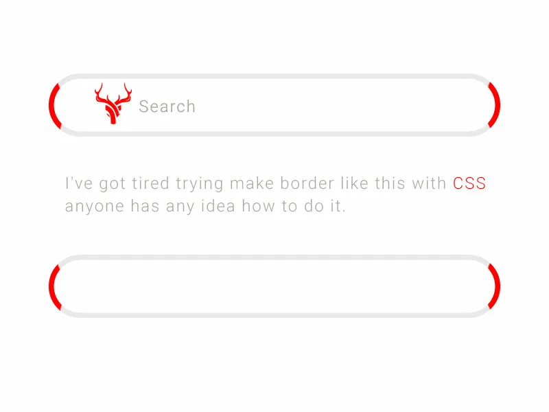
I’ve got tired trying make border like in the design with CSS, anyone has any idea how to do it.

i try :

  • border-image
  • after & before (pseudo-elements)
  • i try many tricks but nothing.
  border-radius: 40px;
  border-left: 2px solid red;
  border-right: 2px solid red;
  border-left-style: inset;
  border-right-style: outset;

here the image border design

is this possible !?

thanks for interesting.

3

Answers


  1. I don’t know if I understand correctly, see if this approach helps you in solving your problem

            .search-box {
                border: 3px solid #ccc;
                border-left-color: red;
                border-right-color: red;
                padding: 5px;
                width: 400px;
                height: 50px;
                box-sizing: border-box;
                font-size: 18px;
                outline: none;
                border-radius: 40px;
                background-image: url('https://img1.gratispng.com/20180516/w/kisspng-electric-light-copyright-free-incandescent-light-b-5afbadc7aee409.3907345415264434637164.jpg');
                background-repeat: no-repeat;
                background-position: center;
                background-size: auto 80%;
                padding-left: 20px;
            }
    <!DOCTYPE html>
    <html>
    <head>
        <title>Exemplo</title>
    </head>
    <body>
        <form>
            <input type="text" class="search-box" placeholder="Search">
        </form>
    </body>
    </html>
    Login or Signup to reply.
  2. As a real border, I don’t believe that it really is possible. But using multiple div’s I got what you wanted, or at least quite close to it.

    I used the following:

    .bar {
      border-radius: 100px;
      background-color: white;
      box-shadow: inset 0 0 8px #e7e7e7;
      position: relative;
      overflow: hidden;
      display: flex;
      align-items: center;
    }
    
    .red-dot, .white-dot {
      border-radius: 50%;
    }
    
    .red-dot {
      background-color: red;
      height: 84px;
      width: 84px;
      z-index: 1;
    }
    
    #red-1 {
      position: absolute;
      left: 0;
      margin-left: -42px;
    }
    
    #red-2 {
      position: absolute;
      right: 0;
      margin-right: -42px;
    }
    
    .white-dot {
      background-color: white;
      height: 84px;
      width: 84px;
      z-index: 2;
    }
    
    #white-1 {
      position: absolute;
      left: 8px
    }
    
    #white-2 {
      position: absolute;
      right: 8px
    }
    <div class="bar" style="width:650px;height:100px">
      <div class="red-dot" id="red-1"></div>
      <div class="white-dot" id="white-1"></div>
      <div class="red-dot" id="red-2"></div>
      <div class="white-dot" id="white-2"></div>
    </div>

    With some modifications and some text styling etc. I believe you could get nearly exactly what you wanted.

    Login or Signup to reply.
  3. A solution using pseudo-elements:

    :root {
      --shift: 0.8em;
      --border: 0.3em;
      --padding: 1em 1.5em;
    }
    
    div {
      display: flex;
      align-items: center;
      position: relative;
      /* Prevent red dots from overflowing */
      overflow: hidden;
      /* Create pill-like shape */
      border-radius: 100em;
      /* Border thickness */
      padding: var(--border);
      background: #ddd;
    }
    
    input {
      flex: 1;
      appearance: none;
      border: 0;
      border-radius: 100em;
      padding: var(--padding);
      /* This overlays the red dots */
      z-index: 100;
    }
    
    /* Red dots */
    div::before, div::after {
      content: '';
      position: absolute;
      border-radius: 50%;
      height: 200%;
      aspect-ratio: 1 / 1;
      background: #f00;
    }
    
    div::before {
      right: calc(100% - var(--shift));
    }
    
    div::after {
      left: calc(100% - var(--shift));
    }
    
    /* Demo only */
    
    body {
      display: flex;
      justify-content: center;
      padding: 3em 0;
    }
    
    input:active, input:focus {
      outline: none;
    }
    <div>
      <input type="text" placeholder="Search">
    </div>
    Login or Signup to reply.
Please signup or login to give your own answer.
Back To Top
Search