skip to Main Content

I have a grid of cards and when I hover over one card the bottom section of this card expands to show more content.

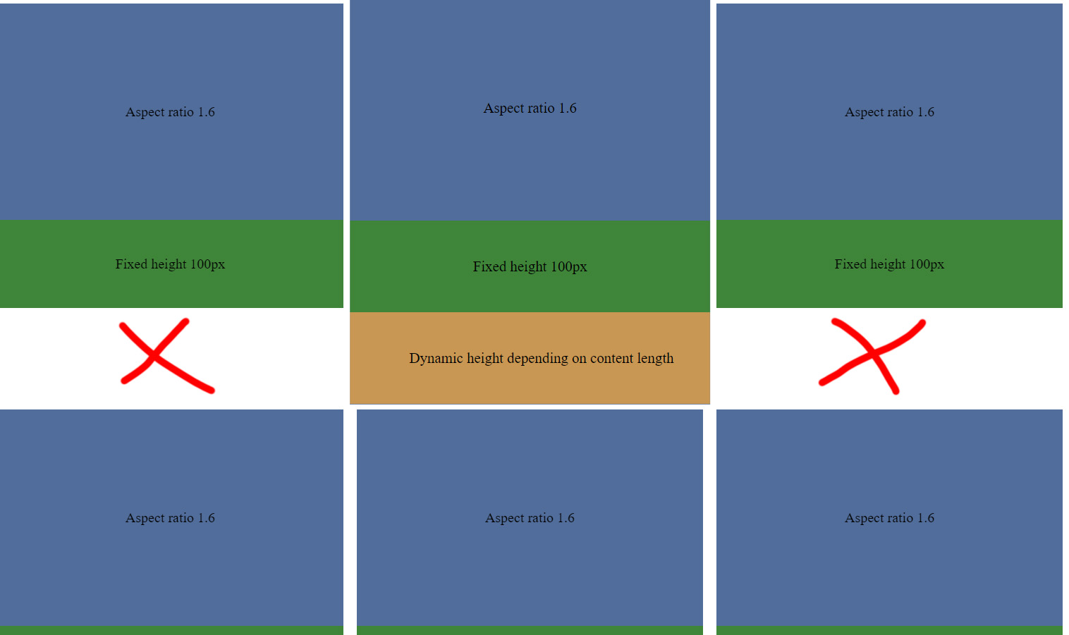
The problem is that when it expands it pushes all other cards down. Instead, I would like it to layer itself on top of the card that is situated underneath. Here are some images to visualize what I’m talking about.

CodePen Example: https://codepen.io/adrenaline681/pen/qBMqrEy

As you can see here there is empty white space underneath:

Wrong

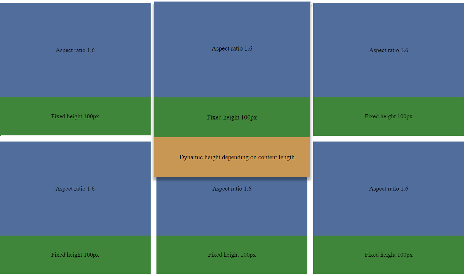
And here is an example of how I would like it to be. As you can see, the middle card has just expanded on top of the bottom card without pushing it down:

Expected

Here is how the CSS looks like:

.grid {
  display: grid;
  width: 60%;
  margin: 0 auto;
  grid-template-columns: 1fr 1fr 1fr;
  gap: 15px;
}

.card {
   transition: all 0.3s linear;
}

.card:hover {
  transform: scale(1.04)
}

.card:hover .description {
  max-height: 100px;
}
  
.image {
  aspect-ratio: 1.6;
  background-color: #516d9b;
  display: flex; 
  justify-content: center; 
  align-items: center;
}

.title {
  display: flex; 
  justify-content: center; 
  align-items: center;
  height: 100px;
  background-color: #3f8539;
}

.description {
  transition: all 0.3s linear;
  display: flex; 
  justify-content: center; 
  align-items: center;
  max-height: 0;
  overflow: hidden;
  height: 100px;
  background-color: #c99753;
  padding-left: 25px;
}

2

Answers


  1. No need for Codepens here on Stack Overflow. We have snippets!

    In this snippet I have made the adjustments to your code to implement the behaviour you are looking for.

    .grid {
      display: grid;
      width: 60%;
      margin: 0 auto;
      grid-template-columns: 1fr 1fr 1fr;
      gap: 15px;
    }
    
    .card {
      position: relative;
    }
    
    .card:hover .description {
      display: block;
      position: absolute;
      top: 100%;
    }
      
    .image {
      aspect-ratio: 1.6;
      background-color: #516d9b;
      display: flex; 
      justify-content: center; 
      align-items: center;
    }
    
    .title {
      display: flex; 
      justify-content: center; 
      align-items: center;
      height: 100px;
      background-color: #3f8539;
    }
    
    .description {
      display: none;
      overflow: hidden;
      background-color: #c99753;
      padding-left: 25px;
      z-index: 5;
    }
    <div class="grid">
      <div class="card">
        <div class="image">Aspect ratio 1.6</div>
        <div class="title">Fixed height 100px</div>
        <div class="description">Dynamic height depending on content length. Dynamic height depending on content length.</div>
      </div>
      <div class="card">
        <div class="image">Aspect ratio 1.6</div>
        <div class="title">Fixed height 100px</div>
        <div class="description">Dynamic height depending on content length</div>
      </div> 
      <div class="card">
        <div class="image">Aspect ratio 1.6</div>
        <div class="title">Fixed height 100px</div>
        <div class="description">Dynamic height depending on content length</div>
      </div>  
      <div class="card">
        <div class="image">Aspect ratio 1.6</div>
        <div class="title">Fixed height 100px</div>
        <div class="description">Dynamic height depending on content length</div>
      </div>  
      <div class="card">
        <div class="image">Aspect ratio 1.6</div>
        <div class="title">Fixed height 100px</div>
        <div class="description">Dynamic height depending on content length</div>
      </div>  
      <div class="card">
        <div class="image">Aspect ratio 1.6</div>
        <div class="title">Fixed height 100px</div>
        <div class="description">Dynamic height depending on content length</div>
      </div>  
      <div class="card">
        <div class="image">Aspect ratio 1.6</div>
        <div class="title">Fixed height 100px</div>
        <div class="description">Dynamic height depending on content length</div>
      </div>  
      <div class="card">
        <div class="image">Aspect ratio 1.6</div>
        <div class="title">Fixed height 100px</div>
        <div class="description">Dynamic height depending on content length. Dynamic height depending on content length</div>
      </div>  
      <div class="card">
        <div class="image">Aspect ratio 1.6</div>
        <div class="title">Fixed height 100px</div>
        <div class="description">Dynamic height depending on content length</div>
      </div>  
      <div class="card">
        <div class="image">Aspect ratio 1.6</div>
        <div class="title">Fixed height 100px</div>
        <div class="description">Dynamic height depending on content length</div>
      </div>  
      <div class="card">
        <div class="image">Aspect ratio 1.6</div>
        <div class="title">Fixed height 100px</div>
        <div class="description">Dynamic height depending on content length</div>
      </div>  
      <div class="card">
        <div class="image">Aspect ratio 1.6</div>
        <div class="title">Fixed height 100px</div>
        <div class="description">Dynamic height depending on content length</div>
      </div> 
        
    </div>
    Login or Signup to reply.
  2. If you don’t care about keeping the transitions, the solution by Brett is simple and works. If you do want the transitions, then you’ll need a way to force the description panel to slide above its subsequent siblings. To do that you can add z-index to the card that is hovered instead of the description.

    .grid {
      display: grid;
      grid-template-columns: repeat(3, 1fr);
      gap: 1rem;
    }
    
    .card {
      position: relative;
      transition: transform 0.3s ease-in-out;
    }
    
    .card:hover {
      transform: scale(1.04);
      /* push this card above siblings */
      z-index: 100;
    }
    
    .card:hover .description {
      max-height: 100%; /* set max-height to 100% */
      padding: 1rem; /* add the padding to top and bottom */
    }
      
    .image {
      aspect-ratio: 1.6;
      background-color: #516d9b;
    }
    
    .title {
      height: 100px;
      background-color: #3f8539;
      padding: 1rem;
    }
    
    .description {
      transition: all 0.3s ease-in-out;
      overflow: hidden;
      max-height: 0;
      height: max-content; /* dynamic height */
      background-color: #c99753;
      position: absolute;
      top: 100%;
      padding: 0 1rem; /* add padding left and right */
    }
    
    
    /* not important */
    
    * {
      box-sizing: border-box;
    }
    
    body {
      width: 60%;
      min-width: 30rem;
      max-width: 60rem;
      margin: 0 auto;
      font-family: sans-serif;
    }
    
    .card > * {
      display: flex; 
      justify-content: center; 
      align-items: center;
      text-align: center;
      user-select: none;
    }
    <div class="grid">
      <div class="card">
        <div class="image">Aspect ratio 1.6</div>
        <div class="title">Fixed height 100px</div>
        <div class="description">Dynamic height depending on content length. Dynamic height depending on content length.</div>
      </div>
      <div class="card">
        <div class="image">Aspect ratio 1.6</div>
        <div class="title">Fixed height 100px</div>
        <div class="description">Dynamic height depending on content length</div>
      </div> 
      <div class="card">
        <div class="image">Aspect ratio 1.6</div>
        <div class="title">Fixed height 100px</div>
        <div class="description">Dynamic height depending on content length</div>
      </div>  
      <div class="card">
        <div class="image">Aspect ratio 1.6</div>
        <div class="title">Fixed height 100px</div>
        <div class="description">Dynamic height depending on content length</div>
      </div>  
      <div class="card">
        <div class="image">Aspect ratio 1.6</div>
        <div class="title">Fixed height 100px</div>
        <div class="description">Dynamic height depending on content length</div>
      </div>  
      <div class="card">
        <div class="image">Aspect ratio 1.6</div>
        <div class="title">Fixed height 100px</div>
        <div class="description">Dynamic height depending on content length</div>
      </div>  
      <div class="card">
        <div class="image">Aspect ratio 1.6</div>
        <div class="title">Fixed height 100px</div>
        <div class="description">Dynamic height depending on content length</div>
      </div>  
      <div class="card">
        <div class="image">Aspect ratio 1.6</div>
        <div class="title">Fixed height 100px</div>
        <div class="description">Dynamic height depending on content length. Dynamic height depending on content length</div>
      </div>  
      <div class="card">
        <div class="image">Aspect ratio 1.6</div>
        <div class="title">Fixed height 100px</div>
        <div class="description">Dynamic height depending on content length</div>
      </div>  
      <div class="card">
        <div class="image">Aspect ratio 1.6</div>
        <div class="title">Fixed height 100px</div>
        <div class="description">Dynamic height depending on content length</div>
      </div>  
      <div class="card">
        <div class="image">Aspect ratio 1.6</div>
        <div class="title">Fixed height 100px</div>
        <div class="description">Dynamic height depending on content length</div>
      </div>  
      <div class="card">
        <div class="image">Aspect ratio 1.6</div>
        <div class="title">Fixed height 100px</div>
        <div class="description">Dynamic height depending on content length</div>
      </div> 
    </div>
    <p>Lorem ipsum dolor sit amet consectetur, adipisicing elit. Aperiam, excepturi, aut, corporis sapiente molestias magnam nisi rem quo quos exercitationem temporibus repudiandae eveniet neque quidem veniam ipsum beatae? Consequatur, ex.</p>
    Login or Signup to reply.
Please signup or login to give your own answer.
Back To Top
Search