skip to Main Content

I wanted to show the parent gradient just from child shape.

I tried adding ::after to parent with white background to hide parent background color, but then child’s background also becomes white.

Currently:

#parent {
  background: linear-gradient(#e66465, #9198e5);
  width: 100px;
  height: 300px;
}

.child {
  position: relative;
  width: 50px;
  height: 50px;
  border: 1px solid blue;
  border-radius: 50%;
  color: white;
}

.top-10 {
  top: 10px;
}

.top-20 {
  top: 20px;
}

.top-40 {
  top: 40px;
}

.top-60 {
  top: 60px;
}
<div id="parent">
  <div class="child top-10"></div>
  <div class="child top-20"></div>
  <div class="child top-40"></div>
  <div class="child top-60"></div>
</div>

current

Expected:

expected

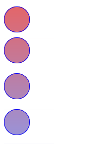
Also the child positions are changeable.

2

Answers


  1. The parent element does not set other styles. The child element adds two important style attributes: background: linear gradient (# e66465, # 9198e5);background-attachment: fixed;. the gradient is used for four circles respectively.

    all style codes:

    .child {
      position: relative;
      width: 50px;
      height: 50px;
      border: 1px solid blue;
      border-radius: 50%;
      background: linear-gradient(#e66465, #9198e5);
      background-attachment: fixed;
      color: white;
    }
    .top-10 {
      top: 10px;
    }
    .top-20 {
      top: 20px;
    }
    .top-40 {
      top: 40px;
    }
    .top-60 {
      top: 60px;
    }
    

    be careful:
    background-attachment:fixed

    https://developer.mozilla.org/en-US/docs/web/css/background-attachment

    Login or Signup to reply.
  2. This is my solution:

    .child {
      position: relative;
      width: 50px;
      height: 50px;
      border: 1px solid blue;
      border-radius: 50%;
      color: white;
      background: linear-gradient(#e66465, #9198e5);
      background-attachment: fixed;
    }
    
    .top-10 {
      top: 10px;
    }
    
    .top-20 {
      top: 20px;
    }
    
    .top-40 {
      top: 40px;
    }
    
    .top-60 {
      top: 60px;
    }
    <div id="parent">
      <div class="child top-10"></div>
      <div class="child top-20"></div>
      <div class="child top-40"></div>
      <div class="child top-60"></div>
    </div>

    Another solution with background that is not changing on scroll:

    .child {
      position: relative;
      width: 50px;
      height: 50px;
      border: 1px solid blue;
      border-radius: 50%;
      color: white;
      outline: 10px solid white;
    }
    
    #parent {
      background: linear-gradient(#e66465, #9198e5);
      width: fit-content;
      height: 267px;
    }
    
    .child:before {
      content: 'fe3b';
      color: white;
      display: block;
      top: -60px;
      position: absolute;
      left: -20px;
      font-size: 90px;
    }
    
    .child:after {
      content: 'fe3c';
      width: 60px;
      height: 10px;
      color: white;
      display: block;
      top: 10px;
      position: absolute;
      left: -20px;
      font-size: 90px;
    }
    
    .top-10 {
      top: 10px;
    }
    
    .top-20 {
      top: 25px;
      /* correction here*/
    }
    
    .top-40 {
      top: 40px;
    }
    
    .top-60 {
      top: 60px;
    }
    <div id="parent">
      <div class="child top-10"></div>
      <div class="child top-20"></div>
      <div class="child top-40"></div>
      <div class="child top-60"></div>
    </div>
    Login or Signup to reply.
Please signup or login to give your own answer.
Back To Top
Search