skip to Main Content

I have two divs:

  • back has a background image
  • front has a background image with transparency placed on the top.

I want to use cover and have the position in the middle so the images cut/grow on both sides equally. The html and css look like this:

.back{
  background-image: url('https://i.ibb.co/W5rb9Mp/358-1676542377653745.png'); 
  background-position: 50% 50%;
  background-size: cover;
  width: 100%;
  height: 100%;
  position: absolute;
  z-index: 1;
}

.front{
  background-image: url('https://i.ibb.co/NtXq0Sv/297-1676449694919336.png'); 
  background-position: 50% 50%;
  background-size: cover;
  width: 100%;
  height: 100%;
  position: absolute;
  z-index: 2;
}
<div class="back">
  <div class="front">
  </div>
</div>

Please note that this is a simplified version. In the app this layered images will be inside a container.

This works correctly, and it’s totally what I want.
However as you can see, the tap does not fit the position of the sink, so I wanted to add an offset to the top image to make match it.
enter image description here

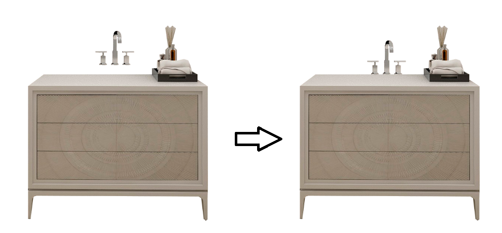
I have tried lots of different approaches, like adding background-position: 50% calc(50% + 40px); or padding and margins. But the problem is that I can’t get the front image to be kept in the correct position when the size of the window changes..

enter image description here

It would be great to see if there is a solution for this problem that only relies on CSS, but other options using JS would also work. I wouldn’t want to use a canvas if possible, as that would make things quite complicated.

Note: I know that the simplest solution would be to edit the front image and re-upload, but the problem is that the app I’m developing has sinks at different height so it will need to be corrected dynamically.

2

Answers


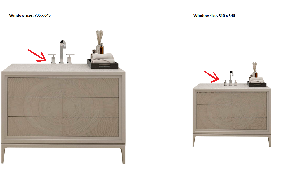
  1. According to what have understood is you need to set that Tap to the table just as shown is second image (right side)

    for that here is Css solution and a only a slight change in your code :

    .back {
      background-image: url('https://i.ibb.co/W5rb9Mp/358-1676542377653745.png');
      background-position: 50% 50%;
      background-size: cover;
      width: 100%;
      /*reduce hight by 5 px i donnt think so it will affect image quality but it will achieve your goal*/
      height: 95%;
      position: absolute;
      z-index: 1;
    }
    
    .front {
      background-image: url('https://i.ibb.co/NtXq0Sv/297-1676449694919336.png');
      background-position: 50% 50%;
      background-size: cover;
      width: 100%;
      height: 100%;
      position: absolute;
      z-index: 2;
    }
    <!-- take your front out of back div (anyhow you are taking care in z-index) -->
    <div class="front">
    </div>
    <div class="back">
    </div>

    It works in full screen really well. you can check if height 95/94 works for you.
    let me know if I have understood your issue correctly or not
    Thanks.

    Login or Signup to reply.
  2. Few Quick Fixes and also suggestion to use Bootstrap Framework :

    <!DOCTYPE html>
    <html>
    <head>
        <meta charset="utf-8">
        <meta name="viewport" content="width=device-width, initial-scale=1">
        <link rel="stylesheet" href="https://cdnjs.cloudflare.com/ajax/libs/font-awesome/4.7.0/css/font-awesome.min.css">
          <link rel="stylesheet" href="https://maxcdn.bootstrapcdn.com/bootstrap/3.4.1/css/bootstrap.min.css">
      <script src="https://ajax.googleapis.com/ajax/libs/jquery/3.6.4/jquery.min.js"></script>
      <script src="https://maxcdn.bootstrapcdn.com/bootstrap/3.4.1/js/bootstrap.min.js"></script>
        <title></title>
        <style type="text/css">
            .back{
      background-image: url('https://i.ibb.co/W5rb9Mp/358-1676542377653745.png'); 
      background-position: 50% 50%;
      background-size: cover;
      width: 60%;
      /*reduce hight by 5 px i donnt think so it will affect image quality but it will achieve your goal*/
      height: 60%;
      top: 20%;
      left: 20%;
      position: absolute;
      z-index: 1;
    }
    
    .front{
      background-image: url('https://i.ibb.co/NtXq0Sv/297-1676449694919336.png'); 
      background-position: 50% 50%;
      background-size: cover;
      width: 100%;
      height: 100%;
      bottom: 02%;
      position: absolute;
      z-index: 2;
      transform: scale(01) translate(0, 5%);
    }
        </style>
    </head>
    <body>
        <!-- take your front out of back div (anyhow you are taking care in z-index) -->
     <div class="container ">
        <div class="row">
    
    
    <div class="back col-md-3 col-xs-12 col-sm-6" >
      <div class="front col-md-3 col-xs-12 col-sm-6" >
      </div>
    </div>
        </div>
     </div>
    </body>
    </html>

    Please copy and run this code on your system i tested the responsive ness as well
    using Dev Tools in my Edge browser

    Just if you zoom in zoom out then it will make a bit difference

    try it in your system not in this code snippet

    Login or Signup to reply.
Please signup or login to give your own answer.
Back To Top
Search