skip to Main Content

I’m trying to set up a card for any kind of product for my website and I’d like to use grids since it seems to be quite effective, however I have a hard time understanding how to use these properties such as

grid-template-columns, grid-template-rows, grid-gap and others concerning the same subject.

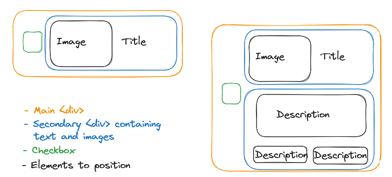
I have made an example of how I’d like my cards to look like, how I want it to look:

On the left is the simple version, and on the right a version that is more complex for me with a toggle-able description, hopefully it is clear enough.

Here is also the code sample of the HTML structure of my <div>:

    <div class="grid-item accommodation">
        <input type="checkbox" id="${id}" class="accommodation-checkbox">
        <div class="content">
            <div style="background-image: url(${image})" alt="" class="accommodation-image"></div>
            <h3 class="title">${title}</h3>
            <div class="accom-desc">
                <p class="description">${description}</p>
                <p class="price">Price: ${price} €</p>
                <p class="seats">Seats: ${seats}</p>
            </div>
        </div>
    </div>

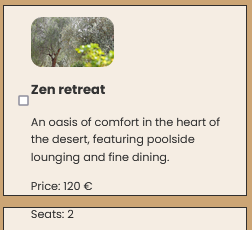
How it looks, as it is now:

As you can see I’ve tried to organize them, but I couldn’t really make it appear the way I wanted, whether it was with display: grid or other related grid elements. I don’t know what to expect from these as I’m still quite new to html. I’m not asking specifically for an answer to how to organize my html elements the way I want but more about how I should use grids.

Thank you very much in advance for your answers.

2

Answers


  1. To create the layout you’ve attached, you only need to work with grid columns, which determine the number of columns within the grid. The essential properties for achieving this layout are:

    1. grid-template-columns: This property defines the number and size of columns in the grid.

    2. grid-column: It specifies the location of an element within the grid, effectively placing it in a specific column.

    3. grid-column-start: This property tells the element where to begin within the grid’s columns.

    These properties will help you create the desired grid layout.

    Here is How I have done it

    .container {
      display: grid;
      grid-template-columns: repeat(2, 1fr);
    }
    
    .child {
      height: 200px;
      border: 0.1em solid;
    }
    
    .one {
      grid-column: span 1;
      grid-row: span 2;
      background-color: aqua;
    }
    
    .sub-container {
      display: grid;
      grid-template-columns: repeat(2, 1fr);
    }
    
    .two {
      background-color: red;
    }
    
    .three {
      background-color: blue;
    }
    
    .details {
      grid-column-start: 2;
      display: grid;
      grid-template-columns: repeat(2, 1fr);
    }
    
    .four {
      grid-column: span 2;
      background-color: yellow;
    }
    
    .five {
      background-color: green;
    }
    
    .six {
      background-color: brown;
    }
    <div class="container">
      <div class="one">1</div>
      <div class="sub-container">
        <div class="child two">2</div>
        <div class="child three">3</div>
      </div>
      <div class="details">
        <div class="child four">4</div>
        <div class="child five">5</div>
        <div class="child six">6</div>
      </div>
    </div>

    Screenshot:

    https://phpout.com/wp-content/uploads/2023/09/G3Ors.png

    Login or Signup to reply.
  2. You could do it with flexbox like this

    .card-main-container {
      display: flex;
      flex-direction: row;
      align-items: center;
      justify-content: center;
      border: 2px solid orange;
      border-radius: 25px;
      width: 300px;
    }
    
    .card-main-container-left {
      display: flex;
      align-items: center;
      justify-content: center;
      width: 25%;
      padding: 20px;
      border-radius: 25px;
    }
    
    .card-main-container-right {
      display: flex;
      flex-direction: column;
      align-items: center;
      justify-content: center;
      width: 75%;
      padding: 20px;
      border-radius: 25px;
    }
    
    .card-subcontainer-1 {
      display: flex;
      flex-direction: row;
      align-items: center;
      justify-content: space-evenly;
      border: 2px solid blue;
      padding: 20px;
      width: 75%;
      border-radius: 10px;
    }
    
    .card-subcontainer-2 {
      display: flex;
      flex-direction: column;
      align-items: center;
      justify-content: center;
      border: 2px solid blue;
      padding: 20px;
      width: 75%;
      border-radius: 10px;
    }
    
    .mini-container {
      border: 2px solid black;
      border-radius: 5px;
    }
    <div class="card-main-container">
      <div class="card-main-container-left">
        <p> checkbox </p>
      </div>
      <div class="card-main-container-right">
        <div class="card-subcontainer-1">
          <div class="mini-container">
            <p> image </p>
          </div>
          <p> title </p>
        </div>
        <div class="card-subcontainer-2">
          <p> desc </p>
          <div class="card-subcontainer-1">
            <div class="mini-container">
              <p> desc1 </p>
            </div>
            <div class="mini-container">
              <p> desc2 </p>
            </div>
          </div>
        </div>
      </div>
    </div>

    If I can explain it really simply, when you add flexbox on a "container" it tells this container how to behave with his childs. Here is some more docs on flexbox

    You will need to change things to be exactly how you want, but the structure is there 😀 !

    Login or Signup to reply.
Please signup or login to give your own answer.
Back To Top
Search