I’m building a two-column "report" in HTML and CSS (I’m new to both) and printing it to a PDF via Weasyprint in Python. My problem is that content in the first column is wrapping into the second column prematurely, ultimately resulting in a broken table that should remain in one column:
The HTML file calls the CSS file:
<html>
    <head>
        <meta charset="UTF-8">
        <link href="report.css" rel="stylesheet">
        <title>Report</title>
        <meta name="description" content="Report example">
    </head>
    ...
at some point, I create a page style in CSS called "satgeom":
@page {
  @top-left {
    background: #FF874A;
    content: counter(page);
    height: 1cm;
    text-align: center;
    width: 1cm;
  }
  @top-center {
    background: #FF874A;
    content: '';
    display: block;
    height: .05cm;
    opacity: .5;
    width: 100%;
  }
  @top-right {
    content: string(heading);
    font-size: 9pt;
    height: 1cm;
    vertical-align: middle;
    width: 100%;
  }
}
@page :blank {
  @top-left { background: none; content: '' }
  @top-center { content: none }
  @top-right { content: none }
}
@page no-chapter {
  @top-left { background: none; content: none }
  @top-center { content: none }
  @top-right { content: none }
}
@page :first {
  background: url(report_cover.png) no-repeat center;
  background-size: cover;
  margin: 0;
}
@page chapter {
  background: #FF874A;
  margin: 0;
  @top-left { content: none }
  @top-center { content: none }
  @top-right { content: none }
}

html {
  color: #393939;
  font-family: Montserrat;
  font-size: 11pt;
  font-weight: 300;
  line-height: 1.5;
}

h1 {
  color: #FF874A;
  font-size: 38pt;
  margin: 5cm 2cm 0 2cm;
  page: no-chapter;
  width: 100%;
}
h2, h3, h4 {
  color: black;
  font-weight: 400;
}
h2 {
  break-before: always;
  font-size: 28pt;
  string-set: heading content();
}
h3 {
  font-weight: 300;
  font-size: 15pt;
}
h4 {
  font-size: 13pt;
}

.column {
  display: flex;
  flex-direction: column;
  flex-basis: 100%;
  flex: 1;
}

#satgeom section {
  columns: 2;
  column-gap: 1cm;
}
#satgeom section p {
  text-align: justify;
}

/* Table */
.tg {border-collapse:collapse;border-spacing:0;}
.tg td{border-color:black;border-style:solid;border-width:1px;word-break:normal;}
.tg th{border-color:black;border-style:solid;border-width:1px;word-break:normal;}
.tg .tg-zv4m{border-color:#fcbb9a;text-align:left;vertical-align:top}
.tg .tg-ofj5{border-color:#fcbb9a;text-align:right;vertical-align:top}
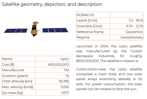
and call this style in the HTML. The contents of this page contain a lengthy table and text. My problem is that the table is wrapping prematurely, and I cannot figure out why. Ideally, I would like to wrap the text into the second column after the first column fills up. A snippet of my HTML for the "satgeom" page is as follows:
<article id="satgeom">
  <h2 id="satgeom-title">Satellite geometry</h2>

  <h3>Satellite geometry, depiction, and description</h3>

  <section>
    <img src="./satellite.png" alt="">
    <p>
      <table class="tg" style="table-layout: fixed; width: 300px">
        <colgroup>
          <col style="width: 150px">
          <col style="width: 150px">
        </colgroup>
        <tr>
          <td class="tg-zv4m">Name</th>
          <td class="tg-ofj5">Uydu</th>
        </tr>
        <tr>
          <td class="tg-zv4m">Cost [$]</th>
          <td class="tg-ofj5">600,000,000</th>
        </tr>
        <tr>
          <td class="tg-zv4m">Manufacturer</td>
          <td class="tg-ofj5">TAI</td>
        </tr>
        <tr>
          <td class="tg-zv4m">Duration [years]</td>
          <td class="tg-ofj5">15</td>
        </tr>
        <tr>
          <td class="tg-zv4m">Orbit altitude [km]</td>
          <td class="tg-ofj5">35,785</td>
        </tr>
        <tr>
          <td class="tg-zv4m">Max. velocity [km/s]</td>
          <td class="tg-ofj5">11,051</td>
        </tr>
        <tr>
          <td class="tg-zv4m">Dy mass [kg]</td>
          <td class="tg-ofj5">1,577</td>
        </tr>
        <tr>
          <td class="tg-zv4m">NORAD ID</td>
          <td class="tg-ofj5"> - </td>
        </tr>
        <tr>
          <td class="tg-zv4m">Uplink [GHz]</td>
          <td class="tg-ofj5">7.3 - 18.10</td>
        </tr>
        <tr>
          <td class="tg-zv4m">Downlink [GHz]</td>
          <td class="tg-ofj5">11.70 - 12.75</td>
        </tr>
        <tr>
          <td class="tg-zv4m">Reference frame</td>
          <td class="tg-ofj5">Geocentric</td>
        </tr>
        <tr>
          <td class="tg-zv4m">Regime</td>
          <td class="tg-ofj5">Geostationary</td>
        </tr>
      </table>
    </p>
    <p>
      Launched in 2024, the Uydu satellite was manufactured by the Turkish
      Aerospace Industries for roughly $600,000,000. The satellite's mission
      is
    </p>
    <p>
      Construction-wise, the Uydu satellite comprises a main body and two
      solar panel arrays extending laterally to its side. For power consumption,
      the solar panels can be rotated to face the sun.
    </p>
  </section>
</article>
I’ve tried adding a div{} to my CSS file and messed with the nowrap property, modifying the CSS file, and have also done a number of Google / SO searches, but haven’t found a solution. Honestly, I’m not sure I’m looking for the right phrases.


2
Answers
There is 2 problem in your code, first you have declared your columns for the section within the
#satgeom sectionselector, that will make the<section>element distributed across two columns, including the table, lets make the table stays in one column.Also the table is wrapped table with a
<p>tag, lets replace this:with
Why not use a div with two divs inside it for each column.
Something like this: