skip to Main Content

As a beginner in CSS and HTML, I’m working on building a website using Flexbox. Specifically, I’m trying to create a Flexbox navbar that is responsive to various screen sizes, including mobile devices.

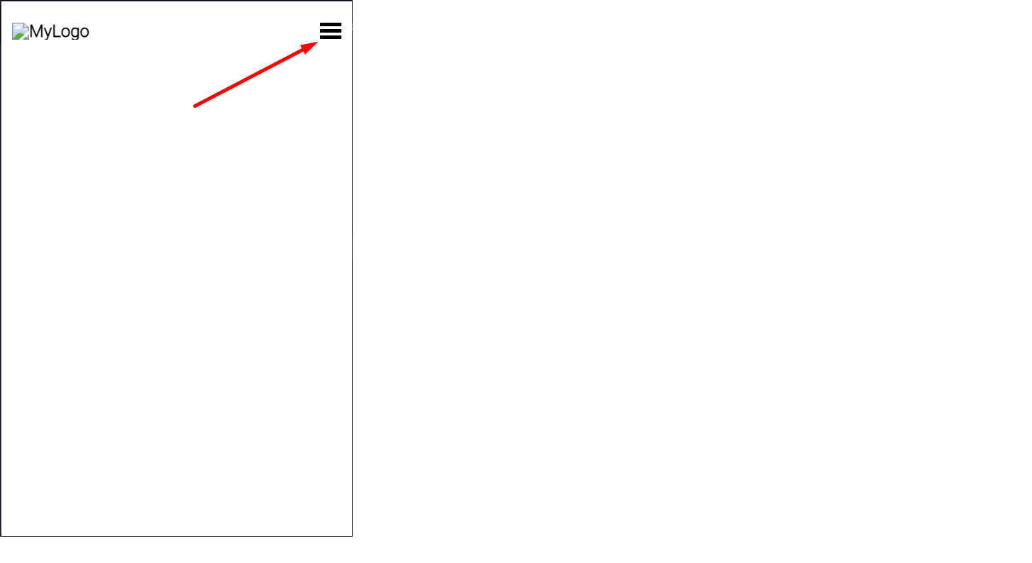
Unfortunately, I’m encountering issues with my JavaScript code as the menu doesn’t seem to work properly on mobile devices when I try to click it. See the image below:

enter image description here

I just need assistance in identifying the deficiencies present in my code and would greatly appreciate an explanation accompanying the feedback. You can also check it on CODEPEN

    const toggleButton = document.getElementById('toggle-menu');
    const naviList = document.getElementById('navlist');

    toggleButton.addEventListener('click', () => {
        naviList.classList.toggle('active');

    })
/* http://meyerweb.com/eric/tools/css/reset/ 
   v2.0 | 20110126
   License: none (public domain)
*/

html,
body,
div,
span,
applet,
object,
iframe,
h1,
h2,
h3,
h4,
h5,
h6,
p,
blockquote,
pre,
a,
abbr,
acronym,
address,
big,
cite,
code,
del,
dfn,
em,
img,
ins,
kbd,
q,
s,
samp,
small,
strike,
strong,
sub,
sup,
tt,
var,
b,
u,
i,
center,
dl,
dt,
dd,
ol,
ul,
li,
fieldset,
form,
label,
legend,
table,
caption,
tbody,
tfoot,
thead,
tr,
th,
td,
article,
aside,
canvas,
details,
embed,
figure,
figcaption,
footer,
header,
hgroup,
menu,
nav,
output,
ruby,
section,
summary,
time,
mark,
audio,
video {
    margin: 0;
    padding: 0;
    border: 0;
    font-size: 100%;
    font: inherit;
    vertical-align: baseline;
}

/* HTML5 display-role reset for older browsers */
article,
aside,
details,
figcaption,
figure,
footer,
header,
hgroup,
menu,
nav,
section {
    display: block;
}

body {
    line-height: 1;

}

ol,
ul {
    list-style: none;
}

blockquote,
q {
    quotes: none;
}

blockquote:before,
blockquote:after,
q:before,
q:after {
    content: '';
    content: none;
}

table {
    border-collapse: collapse;
    border-spacing: 0;
}

html {
    -webkit-box-sizing: border-box;
    /* Safari/Chrome, other WebKit */
    -moz-box-sizing: border-box;
    /* Firefox, other Gecko */
    box-sizing: border-box;
    /* Opera/IE 8+ */
    font-family: 'Roboto', sans-serif;
    font-weight: bold;
}

.logo {
    width: 110px;
    cursor: pointer;
}

body {
    background-image: url(images/backgroundimg.jpg);
    background-size: cover;
    background-repeat: no-repeat;
    height: 100vh;  
}


a {
    color: black;
    text-decoration: none;
}

header{
    display: flex;
    justify-content: space-between;
    align-items: center;
    padding: 30px 10%;
}

.nav_links li{
    display: inline;
    padding: 0 15px;

}

.nav_links li a {
        transition: all 0.3s ease 0s;
}

.nav_links li a:hover {
    color: #F0F0F0;
}

button {
    padding: 9px 25px;
    background-color:rgba(241,246,249,1);
    border: none;
    cursor: pointer;
    transition: all 0.3s ease 0s;
}

button:hover {
    background-color:rgba(241,246,249,0.8);

}

.menu {
    display: none;
}

.menu-line {
    width: 20px;
    height: 3px;
    background-color: black;
    margin-bottom: 3px;
}

@media (max-width: 760px) {

    .menu {
        display: block;
        position: absolute;
        top: 20px;
        right: 10px;
    }

    .nav_links li {
        display: block;
    }

    header {
        flex-direction: column;
        padding: 30px 0;
    }

    .logo {
        position: absolute;
        top: 20px;
        left: 10px;
    }

    nav {
        padding-top: 15px;
        width: 100%;
    }

    .nav_links li {
        padding: 15px 0;
        border-top: 2px solid white;
        text-align: center;
        display: none;
    }

    button {
        width: 100vh;
        padding: 15px 0;
        transition: none;
        display: none;
    }

    .active {
        display: block;
    }

}
<head>
    <meta charset="UTF-8">
    <meta name="viewport" content="width=device-width, initial-scale=1.0">
    <title>Flexbox Navbar</title>
    <link rel="preconnect" href="https://fonts.googleapis.com">
    <link rel="preconnect" href="https://fonts.gstatic.com" crossorigin>
    <link href="https://fonts.googleapis.com/css2?family=Roboto:wght@300&display=swap" rel="stylesheet">
    <link rel="stylesheet" href="style.css">
</head>
<body>

    <header>
     <img class="logo" src="#" alt="MyLogo" >
        <nav>
            <ul class="nav_links" id="navlist">
                <li><a href="#">Services</a></li>
                <li><a href="#">Projects</a></li>
                <li><a href="#">About</a></li>
            </ul>
        </nav>
        <a class="cta" href="#"><button>Contact Us</button></a>
        <div class="menu" id="toggle-menu">
            <div class="menu-line"></div>
            <div class="menu-line"></div>
            <div class="menu-line"></div>
        </div>
    </header>

</body>
2

Answers


  1. You are toggling the active class on the ul with the navlist class, and yet you added the diplay:none on the li. This is your problem. I added comments in the code for what I changed:

    const toggleButton = document.getElementById("toggle-menu");
    const naviList = document.getElementById("navlist");
    
    toggleButton.addEventListener("click", () => {
      naviList.classList.toggle("active");
    });
    /* http://meyerweb.com/eric/tools/css/reset/ 
       v2.0 | 20110126
       License: none (public domain)
    */
    
    html,
    body,
    div,
    span,
    applet,
    object,
    iframe,
    h1,
    h2,
    h3,
    h4,
    h5,
    h6,
    p,
    blockquote,
    pre,
    a,
    abbr,
    acronym,
    address,
    big,
    cite,
    code,
    del,
    dfn,
    em,
    img,
    ins,
    kbd,
    q,
    s,
    samp,
    small,
    strike,
    strong,
    sub,
    sup,
    tt,
    var,
    b,
    u,
    i,
    center,
    dl,
    dt,
    dd,
    ol,
    ul,
    li,
    fieldset,
    form,
    label,
    legend,
    table,
    caption,
    tbody,
    tfoot,
    thead,
    tr,
    th,
    td,
    article,
    aside,
    canvas,
    details,
    embed,
    figure,
    figcaption,
    footer,
    header,
    hgroup,
    menu,
    nav,
    output,
    ruby,
    section,
    summary,
    time,
    mark,
    audio,
    video {
      margin: 0;
      padding: 0;
      border: 0;
      font-size: 100%;
      font: inherit;
      vertical-align: baseline;
    }
    
    /* HTML5 display-role reset for older browsers */
    article,
    aside,
    details,
    figcaption,
    figure,
    footer,
    header,
    hgroup,
    menu,
    nav,
    section {
      display: block;
    }
    
    body {
      line-height: 1;
    }
    
    ol,
    ul {
      list-style: none;
    }
    
    blockquote,
    q {
      quotes: none;
    }
    
    blockquote:before,
    blockquote:after,
    q:before,
    q:after {
      content: "";
      content: none;
    }
    
    table {
      border-collapse: collapse;
      border-spacing: 0;
    }
    
    html {
      -webkit-box-sizing: border-box;
      /* Safari/Chrome, other WebKit */
      -moz-box-sizing: border-box;
      /* Firefox, other Gecko */
      box-sizing: border-box;
      /* Opera/IE 8+ */
      font-family: "Roboto", sans-serif;
      font-weight: bold;
    }
    
    .logo {
      width: 110px;
      cursor: pointer;
    }
    
    body {
      background-image: url(images/backgroundimg.jpg);
      background-size: cover;
      background-repeat: no-repeat;
      height: 100vh;
    }
    
    a {
      color: black;
      text-decoration: none;
    }
    
    header {
      display: flex;
      justify-content: space-between;
      align-items: center;
      padding: 30px 10%;
    }
    
    .nav_links li {
      display: inline;
      padding: 0 15px;
    }
    
    .nav_links li a {
      transition: all 0.3s ease 0s;
    }
    
    .nav_links li a:hover {
      color: #f0f0f0;
    }
    
    button {
      padding: 9px 25px;
      background-color: rgba(241, 246, 249, 1);
      border: none;
      cursor: pointer;
      transition: all 0.3s ease 0s;
    }
    
    button:hover {
      background-color: rgba(241, 246, 249, 0.8);
    }
    
    .menu {
      display: none;
    }
    
    .menu-line {
      width: 20px;
      height: 3px;
      background-color: black;
      margin-bottom: 3px;
    }
    
    @media (max-width: 760px) {
      .menu {
        display: block;
        position: absolute;
        top: 20px;
        right: 10px;
      }
    
      .nav_links li {
        display: block;
      }
    
      header {
        flex-direction: column;
        padding: 30px 0;
      }
    
      .logo {
        position: absolute;
        top: 20px;
        left: 10px;
      }
    
      nav {
        padding-top: 15px;
        width: 100%;
      }
    
      .nav_links li {
        padding: 15px 0;
        border-top: 2px solid white;
        text-align: center;
        /*  Line Commented */
        /*  display: none;*/ 
      }
    
      button {
        width: 100vh;
        padding: 15px 0;
        transition: none;
        display: none;
      }
    
      /* New Line Added */
      .nav_links {
        display: none;
      }
      /* Selector updated */
      .nav_links.active {
        display: block;
      }
    }
    <head>
      <meta charset="UTF-8">
      <meta name="viewport" content="width=device-width, initial-scale=1.0">
      <title>Flexbox Navbar</title>
      <link rel="preconnect" href="https://fonts.googleapis.com">
      <link rel="preconnect" href="https://fonts.gstatic.com" crossorigin>
      <link href="https://fonts.googleapis.com/css2?family=Roboto:wght@300&display=swap" rel="stylesheet">
      <link rel="stylesheet" href="style.css">
    </head>
    
    <body>
    
      <header>
        <img class="logo" src="#" alt="MyLogo">
        <nav>
          <ul class="nav_links" id="navlist">
            <li><a href="#">Services</a></li>
            <li><a href="#">Projects</a></li>
            <li><a href="#">About</a></li>
          </ul>
        </nav>
        <a class="cta" href="#"><button>Contact Us</button></a>
        <div class="menu" id="toggle-menu">
          <div class="menu-line"></div>
          <div class="menu-line"></div>
          <div class="menu-line"></div>
        </div>
      </header>
    
    </body>
    Login or Signup to reply.
  2. Your code is doing what is expected, however, these are the 2 problems I’ve found from your code:

    Html Closure: You’re missing a closure on your img, causing problems with your DOM structure

    <img class="logo" src="#" alt="MyLogo" />
    

    Style within Media query:
    You have CSS rules that apply for Mobile. And there’s one rule that is causing the links to not appear

    @media (max-width: 760px) {
    ...
    .nav_links li {
            padding: 15px 0;
            border-top: 2px solid white;
            text-align: center;
            /*display: none;*/ /*this is the culprit*/
        }
    ...
    

    Also just FYI it seems that a line before is adding display:block to exactly this same selector, so my recommendation is that you take a look at your css structure. A way to prevent this would be to use a css compiler like SASS or SCSS that would help to prevent this kind of double classing the same selectors.

    Regards

    Login or Signup to reply.
Please signup or login to give your own answer.
Back To Top
Search