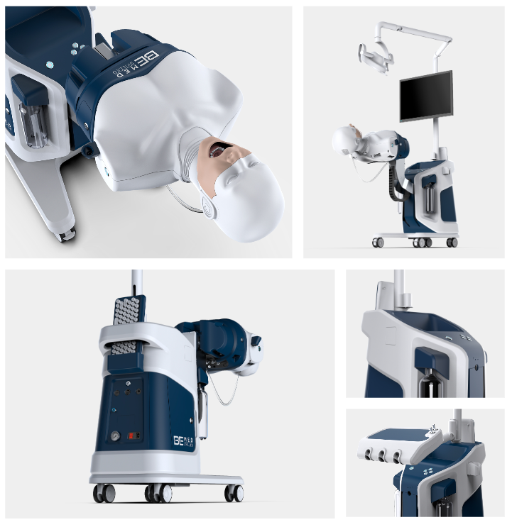
I’m codding such grid with pictures in Bootstrap 5 framework.
My code for this grid:
#project_images img {
  height: 100%;
  width: 100%;
  object-fit: cover;
}
<section>
<div class="container" id="project_images">
<div class="row gy-3 gy-lg-4">
<div class="col-12">
<div class="row gx-3 gy-3 gx-lg-4 gy-lg-4">
<div class="col-12 col-md-7"><img class="img-fluid" src="assets/img/Geotar_1.jpg"></div>
<div class="col-12 col-md-5"><img class="img-fluid" src="assets/img/Geotar_2.jpg"></div>
</div>
</div>
<div class="col-12">
<div class="row gx-3 gy-3 gx-lg-4">
<div class="col"><img class="img-fluid" src="assets/img/Geotar_3.jpg"></div>
<div class="col-md-4">
<div class="row gx-0 gy-3 gy-lg-4">
<div class="col-12"><img class="img-fluid" src="assets/img/Geotar_4.jpg"></div>
<div class="col-12"><img class="img-fluid" src="assets/img/Geotar_5.jpg"></div>
</div>
</div>
</div>
</div>
</div>
</div>
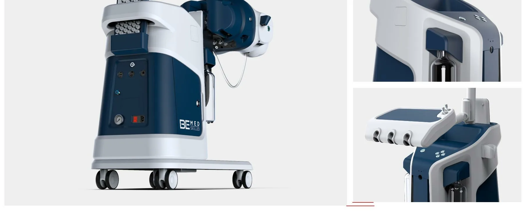
</section>All pictures have different sizes. And with CSS rules above they all fit in "div" perfectly, except for bottom right image (name "Geotar_5.jpg"). At the screenshot you can see a little step, because this image haven’t 100% height of the "div". And I don’t know how to fix it.


2
Answers
I’m pretty sure you’re problem is more easily fixed in the editing the images and not the css. You could use most photo editors to combine the images into a collage and get more precise measurements than trying to make it with css.
Creating a new image that is a collage of the others also means only one element has to be made responsive to mobile instead of 5.
However, I understand that’s not always an option.
At first glance you may be able to use this
clip-path
or potentially hide overflow at the bottom of the other image.
alternatively, adjust the gaps to allow the
Without the files or at minimum the dimensions of each photo, it’s difficult to try replicating this to help you troubleshoot.
Add
d-flex align-items-stretchBootstrap classes to thecol-md-4.See the snippet below.