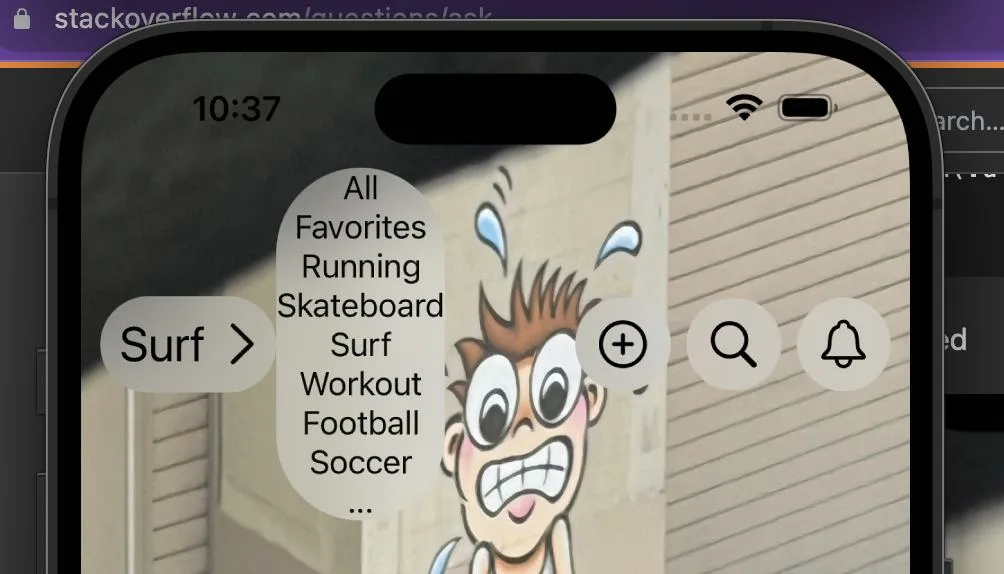
I have tried to create a drop-down list, but the list doesn’t look good and when opening, it keeps changing the size of the HStack
ZStack {
                VStack() {
                    HStack(spacing: 0) {
                        HStack {
                            Text(filters[selectedFilter].name)
                                .foregroundColor(Color.black)
                                .font(.system(size: 25))
                            Image(systemName: "chevron.right")
                                .aspectRatio(contentMode: .fit)
                                .font(.system(size: 25, weight: .none))
                        }
                        .padding(10)
                        .background(.ultraThinMaterial, in : RoundedRectangle(cornerRadius: 45.0))
                        .onTapGesture {
                            withAnimation(Animation.spring().speed(2)) {
                                showOptions.toggle()
                            }
                        }

                        if showOptions {
                            VStack() {
                                ForEach(filters.indices, id: .self) { i in
                                    Text(filters[i].name)
                                        .onTapGesture {
                                            showOptions.toggle()
                                            selectedFilter = i
                                        }
                                }
                            }
                            .background(.ultraThinMaterial, in : RoundedRectangle(cornerRadius: 45.0))
                        }
I posted some pics of the result when collapsed
below when expanded
I do not want the dropdown on the right side but below. Also as you can see, the entire icons are moving down. I need the icons to stay on top and just have a simple dropdown when clicking on the text on the left
Any idea?
Thanks


2
Answers
The other buttons move downwards because the
HStack‘s alignment is.center.If you set the alignment to
.top, the other buttons will not move downwards:If you want the dropdown to appear directly below "Surf >", wrap them both in a
VStack(alignment: .leading). Again, the alignment matters here.That said, the easier way to make a dropdown is with a
Menu:Since this looks like a picker, also consider using a
Pickerwith a style of.menu:First create a custom preference key.
Then add anchor preference key to the view you want. In current case the
Surf Buttonand finally add an overlayPreferenceValue to your VStack