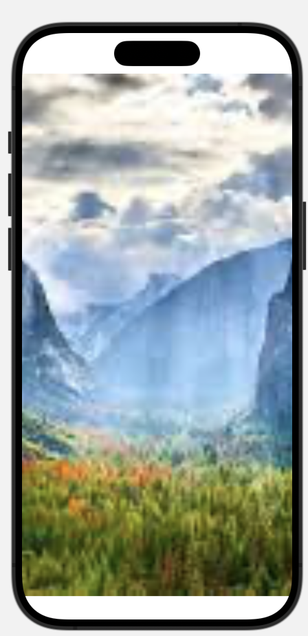
I’m trying to create a view that presents a full screen Image and a NavigationLink in the top right corner overlayed on top of the image. However, I’m running into an issue such that the full screen Image somehow pushes the NavigationLink outside of the viewable part of the screen when I align the NavigationLink to the .topTrailing position. Here is the buggy code and the corresponding preview:
ZStack {
   Image("yose").resizable()
        .aspectRatio(contentMode: .fill)
    NavigationLink(destination: OverviewView()) {
        OverviewButton()
    }.frame(maxWidth: .infinity, maxHeight: .infinity, alignment: .topTrailing).padding()
}
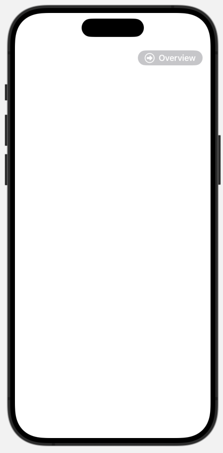
When I comment out the full screen Image, the NavigationLink can be seen where I would like it to be. Also, if I align the NavigationLink to be .bottom or .top, it is within the viewable part of the screen as well. Code:
ZStack {
//   Image("yose").resizable()
//        .aspectRatio(contentMode: .fill)
    NavigationLink(destination: OverviewView()) {
        OverviewButton()
    }.frame(maxWidth: .infinity, maxHeight: .infinity, alignment: .topTrailing).padding()
}
Preview:
How can I overlay the NavigationLink in the top right corner on top of the full screen image?


2
Answers
I’m not sure what’s causing this, but using a
GeometryReaderinstead of.infinityseems to fix the problem.The size of a
ZStackis determined by the size of its contents.Since you are scaling the image to fill, the full image is (probably) going to be larger than the screen (unless the aspect ratio of the image exactly matches the aspect ratio of the screen). This is the size being adopted by the
ZStack.The
.framemodifier being applied to the button is then making it occupy the same size as the image. So this is why it is going off-screen.I would suggest applying the
Imageas background to theZStackinstead:You could also consider applying the button as an overlay to the parent container. This would be another way of positioning it in the top-right corner and might mean that a
ZStackwould not be needed any more: