From the apple document , I learned that the layoutPriority modifier changes the priority of views while laying them out. This means that the parent view’s proposed size is given to subviews with higher priority. After that, each subview takes the space it requires, and the remaining space is divided among other subviews with lower priority.
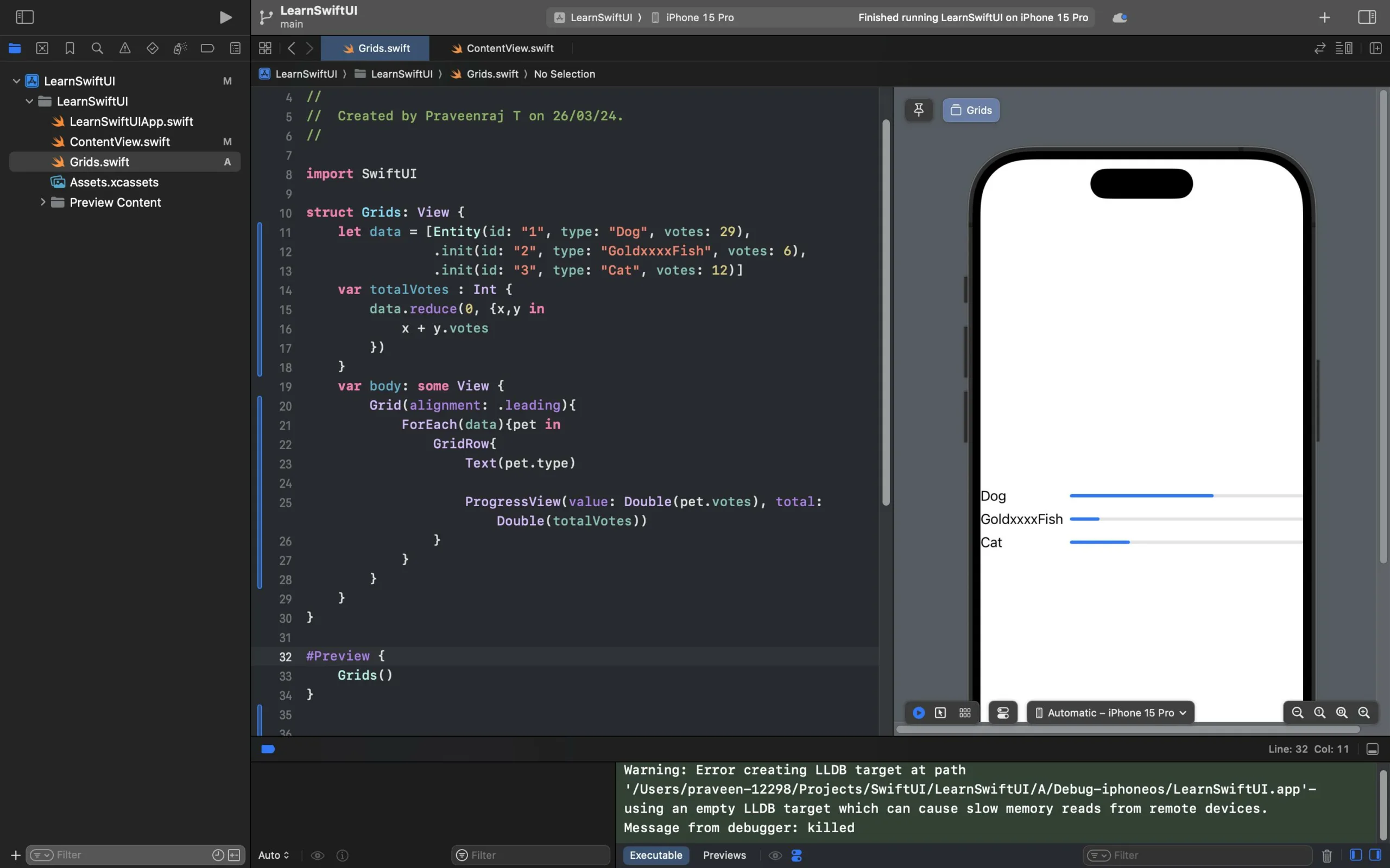
In grid view, i have text and progressview (kind of flexible view). By default,the text view occupies the proposed size it needs, as shown in the image.
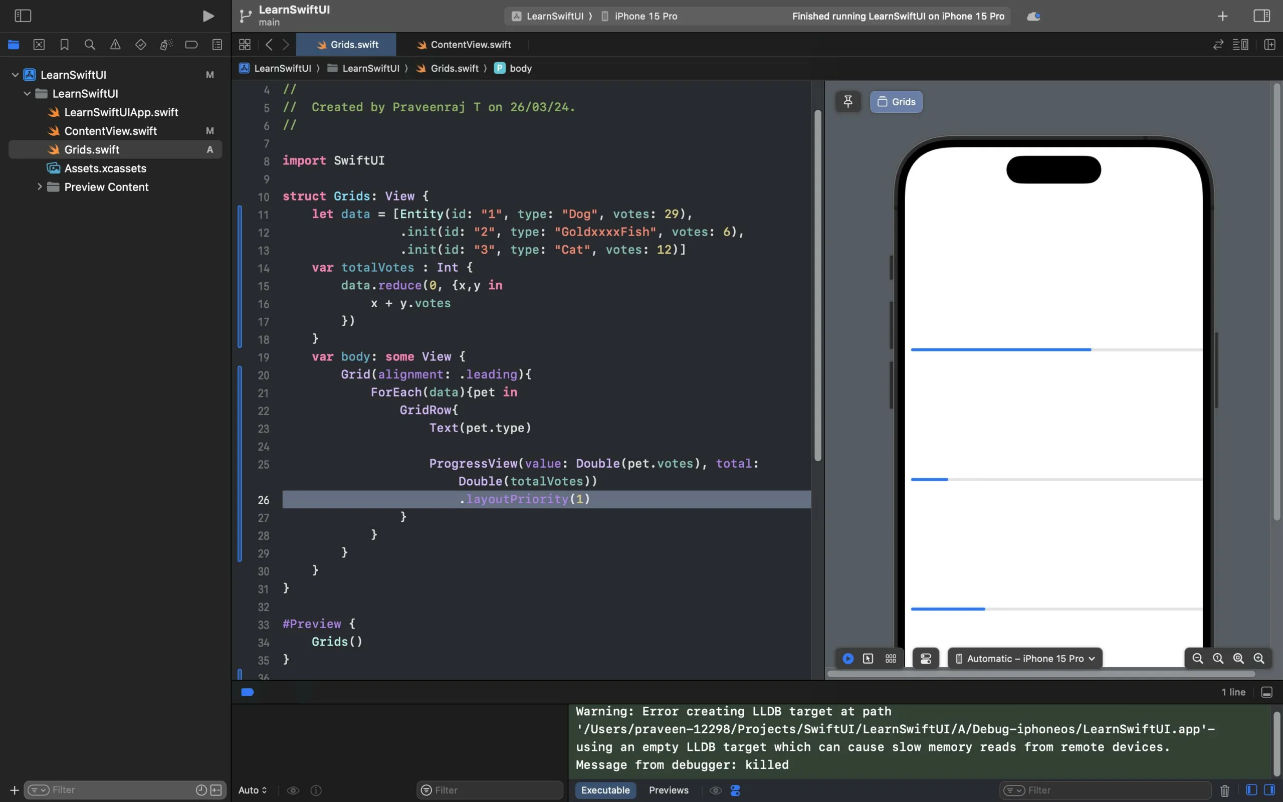
However, when I increase the layoutPriority of the ProgressView, the entire view expands to occupy more space. What is the reason for this increase in size?
struct Grids: View {
    let data = [Entity(id: "1", type: "Dog", votes: 29),
                .init(id: "2", type: "GoldxxxxFish", votes: 6),
                .init(id: "3", type: "Cat", votes: 12)]
    var totalVotes : Int {
        data.reduce(0, {x,y in
            x + y.votes
        })
    }
    var body: some View {
        Grid(alignment: .leading){
            ForEach(data){pet in
                GridRow{
                    Text(pet.type)

                    ProgressView(value: Double(pet.votes), total: Double(totalVotes))
                        .layoutPriority(1)
                }
            }
        }
    }
}

#Preview {
    Grids()
}


struct Entity:Identifiable{
    let id: String
    let type: String
    let votes : Int
}

 Question posted in


2
Answers
Obviously, this is expected behavior.
Let’s make an example, set
ProgressViewheight to 30 and leave theTextas it’s:Since
Gridwill provide its size based onRows. Each row’s width is Text + ProgressView, and each row’s height is whatever the larger height these content views were. In this scenario, withoutlayoutPriority(1), theRowwill take width as screen width (because theGridwas nested nowhere), and height asProgressView, because it’s larger thanText. You can put a border for each view to see the frames.According to documentation about
layoutPriority(_:)So, when you set up
ProgressViewwith.layoutPriority(1), you’re saying that: let’s make progressView overwhelming and take all the width space. The row only had two views, and theTexthad0priority by default, therefore the Text will be shrunk as much as possible until it reaches minimum space required for all its lower-priority children. On the other hand, Text has multiple lines, if the width shrinks, the height will expand, to fit the content inside.That’s why you saw the entire
Gridheight expand, because now this Grid taking the larger height, it’s theText, whether you see it or not, the Text is still there. Try to set a minimum width and make multiple lines of content to test it out.You might use
.padding()as well to accommodate with proper distance between each ProgressView.—Or—
However the Spacer() will equally distribute abed on available size