skip to Main Content

I am trying to align my elements automatically in SwiftUI. The text is slightly off from the vertical side of the circle image. And the whole element seems to be too shrank towards middle, I would like to stretch it little further across the horizon. I know only how to do it manually by adjusting the values, but it doesn’t seem to be reliable as I will have more data later.
enter image description here

struct ContentView: View {
    @StateObject private var viewModel = WebViewModel()
    @State private var urlString = ""

    var body: some View {
        VStack {
            ScrollView {
                ForEach(viewModel.contents) { content in
                    HStack(alignment: .top) {
                        if let urlString = content.imageThumbnail {
                            ImageView(urlString: urlString)
                                .aspectRatio(contentMode: .fit)
                                .frame(width: 100, height: 100)
                                .clipShape(RoundedRectangle(cornerRadius: 5))
                        }

                        VStack(alignment: .leading) {
                            HStack(alignment: .top) {
                                if let profilePicURLString = content.userProfilePic {
                                    ImageView(urlString: profilePicURLString)
                                        .frame(width: 20, height: 20)
                                        .clipShape(Circle())
                                }
                            }
                            .frame(height: 20)

                            if let title = content.title {
                                Text(title)
                                    .font(.system(size: 12))
                                    .foregroundColor(.black)
                                    .lineLimit(4)
                                    .padding(.leading, 5)  // Adjust padding as needed
                            }
                        }

                        Spacer()
                    }
                    .padding(.horizontal)
                }
            }

            Spacer()

            HStack {
                TextField("Enter URL", text: $urlString)
                    .textFieldStyle(RoundedBorderTextFieldStyle())
                    .padding()

                Button("Load") {
                    viewModel.loadPage(urlString: urlString)
                }
                .padding()
            }
            .background(Color.white)
            .cornerRadius(10)
            .shadow(radius: 1)
            .padding(.bottom, 20)
            .frame(height: 36)
        }
        .padding()
    }
}

2

Answers


  1. I have reduced your example to something a bit more simple to show the layout and what impacts what. Check this style of layout and try to apply it to your case:

    struct DataModel {
        let topText: String
        let bottomText: String
    }
    
    struct ScrollViewCellLayout: View {
        
        let models: [DataModel]
        
        var body: some View {
            VStack {
                ScrollView {
                    ForEach(models.indices, id: .self) { index in
                        cell(forModel: models[index])
                            .aspectRatio(4/1, contentMode: .fit)
                    }
                }
            }
        }
        
        private func cell(forModel model: DataModel) -> some View {
            HStack(alignment: .top) {
                Color.blue
                    .aspectRatio(1.0, contentMode: .fit)
                VStack(alignment: .leading) {
                    Color.green
                        .frame(width: 20, height: 20)
                    Text(model.topText)
                    Text(model.bottomText)
                }
                Spacer()
            }
            .frame(maxWidth: .infinity, maxHeight: .infinity)
            .padding(.horizontal, 10)
        }
    }
    

    Using as preview:

    #Preview {
        ScrollViewCellLayout(models: DataModel.mocked)
    }
    
    private extension DataModel {
        
        static let mocked: [DataModel] = [
            DataModel(topText: "Top text",
                      bottomText: "Bottom text"),
            DataModel(topText: "This is a very long text used to show the top text being long and not fitting in a single line",
                      bottomText: "Bottom text"),
            DataModel(topText: "Top text",
                      bottomText: "This is a very long text used to show the top text being long and not fitting in a single line"),
            DataModel(topText: "This is a very long text used to show the top text being long and not fitting in a single line",
                      bottomText: "This is a very long text used to show the top text being long and not fitting in a single line")
        ]
        
    }
    

    The first thing I did is I control the height of a cell. I do that with aspect ratio because I think it might look better when height increases with larger size of a screen. You can change that to using a fixed height by simply replacing .aspectRatio(4/1, contentMode: .fit) with .frame(height: 100). Whatever fits your design.

    After that the whole design is moved into the cell which is neatly packed into a method and can easily be extracted into its own view if you ever need to reuse it.

    In the cell on top level I use the two lines .frame(maxWidth: .infinity, maxHeight: .infinity) .padding(.horizontal, 10). The first one says to stretch as far as possible in both directions (constrained by the previous point and width of the parent view). The second one controls your padding from left and right which you mentioned you wish to decrease.

    Now going deeper I use a blue color to mock your big image. Again I do not care about a frame but I rather tell it to have an aspect ratio of 1, being a square. It will automatically use a perfect size.

    The Spacer on the right ensures your content is pushed to the left if text is too short to fill the content.

    And the inner VStack should be pretty straight forward. Using leading alignment will ensure that all are aligned left which was one of problems you pointed out. And the top alignment on the HStack ensures that this content is pushed to top. You could use another Spacer for that if you wish. But it is hard to say what your design requirements are for this part anyway:

        HStack {
            Color.blue
                .aspectRatio(1.0, contentMode: .fit)
            VStack(alignment: .leading) {
                Color.green
                    .frame(width: 20, height: 20)
                Text(model.topText)
                Text(model.bottomText)
                Spacer()
            }
    

    You can for instance remove the last Spacer() here and you will have a center alignment.

    I hope this puts you on the right path. Let us know if you have more specific difficulties.

    Login or Signup to reply.
  2. I tried your example code and found that it just needs two small changes.

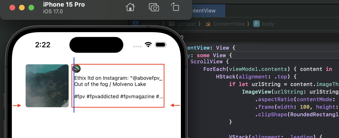
    1. Remove the horizontal padding from the HStack inside the ForEach

    ScrollView {
        ForEach(viewModel.contents) { content in
            HStack(alignment: .top) {
                // content as before
            }
            // .padding(.horizontal)
        }
    }
    

    This padding was the cause of the insets that you showed in your screenshot with the arrows at the side.

    This still leaves some padding on all sides. This is being added by the very last line of the code (before the closing parentheses).

    2. Remove the leading padding from the title

    if let title = content.title {
        Text(title)
            .font(.system(size: 12))
            .foregroundColor(.black)
            .lineLimit(4)
            // .padding(.leading, 5)  // Adjust padding as needed
    }
    

    This padding was the cause of the offset that you have shown with the blue line in your screenshot.

    Login or Signup to reply.
Please signup or login to give your own answer.
Back To Top
Search