skip to Main Content

I’ve got a SwiftUI Button, and it’s label changes when it’s clicked.
The code looks like this:

struct MyButton: View {
    var label: String
    @State var loading = false
    
    var body: some View {
        Button(action: { loading.toggle() }) {
            if (loading) {
                Text("...")
            } else {
                Text(label)
            }
        }
        .buttonStyle(.borderedProminent)
    }
}


struct MyButton_Previews: PreviewProvider {
    static var previews: some View {
        MyButton(label: "This is a button")
    }
}

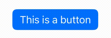
When it’s rendered, the button changes size when it’s clicked and it’s label content changes, as you can see here:

button

How can I get the button to remain the same size no matter what it’s label content is?
I’m hoping to find a solution that doesn’t require hard coding a frame size or something like that, because I’m trying to create a generic, reusable button that can have any label.

By way of example of what I’m looking for, in Compose, I can use a custom layout for this. I can measure both the Text view for the "loading" state and the Text view for the "non-loading" state, and then set the parent/button size to the larger of the two, and then only place the Text that should be visible, resulting in a button that’s big enough to show either label, and can switch between the two. Is there anything like that in SwiftUI?

3

Answers


  1. To create a fixed-size SwiftUI Button with a changing label, use a VStack with conditional Text views and set a fixed size with the frame modifier. Adjust opacity based on the loading state.

    struct MyButton: View {
        var label: String
        @State var loading = false
        
        var body: some View {
            Button(action: { loading.toggle() }) {
                VStack {
                    Text(label)
                        .frame(maxWidth: .infinity)
                        .opacity(loading ? 0 : 1) 
                    Text("...")
                        .frame(maxWidth: .infinity)
                        .opacity(loading ? 1 : 0) 
                }
                .frame(maxWidth: .infinity, maxHeight: 50) // Set your desired fixed size
            }
            .buttonStyle(.borderedProminent)
        }
    }
    
    Login or Signup to reply.
  2. You can use overlay

    struct AnimatedButton: View {
        var label: String
        @State var loading = false
        
        var body: some View {
            Button(action: { loading.toggle() }) {
                Text(label)
                    .overlay {
                        if loading {                        
                            ZStack {
                                Color.accentColor // accent color is the background color for `.borderedProminent`
                                Text("...")
                            }
                        }
                    }
            }.buttonStyle(.borderedProminent)
        }
    }
    

    And if you want to add a little animation you can use TimelineView.

    struct AnimatedButton: View {
        var label: String
        @State var loading = false
        
        var body: some View {
            Button(action: { loading.toggle() }) {
                Text(label)
                    .overlay {
                        if loading {
                            ZStack {
                                Color.accentColor //Cover the label
                                TimelineView(.periodic(from: .now, by: 1)) { context in //Use context for animation
                                    let curr = Int(context.date.timeIntervalSince1970) % 3
                                    let str = (0...curr).map { _ in
                                        "."
                                    }.joined()
                                    Text(str)
                                }
                            }
                        }
                    }
            }.buttonStyle(.borderedProminent)
        }
    }
    

    If you don’t want to hardcode the color and you can always "hide" the label with opacity.

    struct AnimatedButton: View {
        var label: String
        @State var loading = false
        
        var body: some View {
            Button(action: { loading.toggle() }) {
                Text(label)
                    .opacity(loading ? 0 : 1) //Hide the label
                    .overlay {
                        if loading {
                            TimelineView(.periodic(from: .now, by: 1)) { context in
                                let curr = Int(context.date.timeIntervalSince1970) % 3
                                let str = (0...curr).map { _ in
                                    "."
                                }.joined()
                                Text(str)
                            }
                        }
                    }
            }.buttonStyle(.borderedProminent)
        }
    }
    
    Login or Signup to reply.
  3. If you want the button to adopt its natural size for the full label then you can use a hidden version of the label to establish the footprint and then show the relevant label as an overlay. This avoids the need to set a frame with any kind of minimum or fixed width.

    Button(action: { loading.toggle() }) {
        Text(label)
            .hidden()
            .overlay(Text(loading ? "..." : label))
    }
    .buttonStyle(.borderedProminent)
    

    Loading

    If you don’t know which of the two labels is the longest then you can use a ZStack to establish the footprint instead:

    ZStack {
        Text(label)
        Text("...")
    }
    .hidden()
    .overlay( /* as before */ )
    
    Login or Signup to reply.
Please signup or login to give your own answer.
Back To Top
Search