skip to Main Content

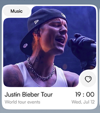
I am just wondering what are a component to make a Ui design card.cause I saw a lot of these cool card design on pinterest and I was wondering how to make it. Like what are the component to make such a design with SwiftUI

card UI

i have tried it ! the further i have extended the image is this

my image


import SwiftUI
struct RoundedCorners: Shape {
    var radius: CGFloat = 25.0
    var corners: UIRectCorner = .allCorners
    func path(in rect: CGRect) -> Path {
        let path = UIBezierPath(
            roundedRect: rect,
            byRoundingCorners: corners,
            cornerRadii: CGSize(width: radius, height: radius)
        )
        return Path(path.cgPath)
    }
}
struct ContentView: View {
    var body: some View {
        Image("images")
            .resizable()
            .aspectRatio(contentMode: .fill)
            .frame(width: 200, height: 200) // Set your desired image size
            .clipShape(RoundedCorners(radius: 50, corners: [.topLeft, .bottomRight]))
            .shadow(radius: 5)
            .padding()
    }
}
struct ContentView_Previews: PreviewProvider {
    static var previews: some View {
        ContentView()
    }
}

i have tried this but can’t .If anyone knows how to make this with a standard.

2

Answers


  1. The basic shape can be built by creating a path and adding arcs to it.

    • One approach is to create a custom Shape, as you were doing originally. However, doing it this way, it will be difficult to reserve the correct amount of space for showing the label in the top-left corner, unless the size of the label is fixed of course.

    • If you want to show a label that can contain text of varying size and also adapt to dynamic font sizes, then an alternative approach is to use a Canvas. You can then pass in the label as a "symbol" for the canvas to use.

    • A Canvas receives a GraphicsContext as parameter and this lets you measure the size of images and other symbols. So this makes it possible to build a path that fits exactly to the size of the label.

    • An easy way to draw the curves is to use addArc(tangent1End:tangent2End:radius:transform:). Here you just pass in the points that you would use if you were drawing the shape with square corners, instead of rounded corners.

    For the round button bottom-right, it is not possible to attach a tap gesture to a symbol that is passed to the Canvas. Here is what the documentation says on this point:

    The symbol inputs, like all other elements that you draw to the canvas, lack individual accessibility and interactivity, even if the original SwiftUI view has these attributes.

    However, the size of this button is probably fixed, so the path can just be built using this fixed size (instead of passing the button as a symbol). Then the button itself can be shown as an overlay over the canvas, using alignment .bottomTrailing.

    Here is an example to show it working this way:

    struct CardWithInsetCorners: View {
        let label: String
        let image: Image
        let roundButtonDiameter: CGFloat = 44
        let roundedCornerRadius: CGFloat = 10
        let gapToCornerItems: CGFloat = 4
    
        var body: some View {
            Canvas { ctx, size in
                if let label = ctx.resolveSymbol(id: "label") {
    
                    // Draw the label in the top-left corner
                    ctx.draw(label, in: CGRect(origin: .zero, size: label.size))
    
                    // Build a path with rounded corners
                    let path = pathWithRoundedCorners(canvasSize: size, labelSize: label.size)
    
                    // Use the path as clip shape for subsequent drawing operations
                    ctx.clip(to: path)
                }
                // Determine the rectangle for the image when scaled to fill
                let resolvedImage = ctx.resolve(image)
                let rect = rectForImage(canvasSize: size, imageSize: resolvedImage.size)
    
                // Show the image
                ctx.draw(resolvedImage, in: rect)
    
            } symbols: {
                labelInCorner.tag("label")
            }
            .overlay(alignment: .bottomTrailing) {
                roundButton
            }
        }
    
        private func pathWithRoundedCorners(canvasSize: CGSize, labelSize: CGSize) -> Path {
            let wLabel = labelSize.width + gapToCornerItems
            let hLabel = labelSize.height + gapToCornerItems
            let wButton = roundButtonDiameter + gapToCornerItems
            let hButton = roundButtonDiameter + gapToCornerItems
            return Path { path in
    
                // Begin half-way down the left side
                path.move(to: CGPoint(x: 0, y: canvasSize.height / 2))
    
                // Rounded-corner bottom-left of label
                path.addArc(
                    tangent1End: CGPoint(x: 0, y: hLabel),
                    tangent2End: CGPoint(x: wLabel, y: hLabel),
                    radius: roundedCornerRadius
                )
                // Rounded-corner bottom-right of label
                path.addArc(
                    tangent1End: CGPoint(x: wLabel, y: hLabel),
                    tangent2End: CGPoint(x: wLabel, y: 0),
                    radius: (hLabel + gapToCornerItems) / 2
                )
                // Rounded-corner top-right of label
                path.addArc(
                    tangent1End: CGPoint(x: wLabel, y: 0),
                    tangent2End: CGPoint(x: canvasSize.width, y: 0),
                    radius: roundedCornerRadius
                )
                // Rounded-corner top-right
                path.addArc(
                    tangent1End: CGPoint(x: canvasSize.width, y: 0),
                    tangent2End: CGPoint(x: canvasSize.width, y: canvasSize.height - hButton),
                    radius: roundedCornerRadius
                )
                // Rounded-corner top-right of round button
                path.addArc(
                    tangent1End: CGPoint(x: canvasSize.width, y: canvasSize.height - hButton),
                    tangent2End: CGPoint(x: canvasSize.width - wButton, y: canvasSize.height - hButton),
                    radius: roundedCornerRadius
                )
                // Rounded-corner top-left of round button
                path.addArc(
                    tangent1End: CGPoint(x: canvasSize.width - wButton, y: canvasSize.height - hButton),
                    tangent2End: CGPoint(x: canvasSize.width - wButton, y: canvasSize.height),
                    radius: (wButton + gapToCornerItems) / 2
                )
                // Rounded-corner bottom-left of round button
                path.addArc(
                    tangent1End: CGPoint(x: canvasSize.width - wButton, y: canvasSize.height),
                    tangent2End: CGPoint(x: 0, y: canvasSize.height),
                    radius: roundedCornerRadius
                )
                // Rounded-corner bottom-left
                path.addArc(
                    tangent1End: CGPoint(x: 0, y: canvasSize.height),
                    tangent2End: CGPoint(x: 0, y: canvasSize.height / 2),
                    radius: roundedCornerRadius
                )
                path.closeSubpath()
            }
        }
    
        private func rectForImage(canvasSize: CGSize, imageSize: CGSize) -> CGRect {
            let wImage = imageSize.width
            let hImage = imageSize.height
            let scalingFactor = max(canvasSize.width / wImage, canvasSize.height / hImage)
            let w = wImage * scalingFactor
            let h = hImage * scalingFactor
            let xImage = (canvasSize.width - w) / 2
            let yImage = (canvasSize.height - h) / 2
            return CGRect(
                origin: CGPoint(x: xImage, y: yImage),
                size: CGSize(width: w, height: h)
            )
        }
    
        private var labelInCorner: some View {
            Text(label)
                .font(.subheadline)
                .padding(.horizontal, 20)
                .padding(.vertical, 6)
                .background {
                    Capsule()
                        .fill(Color(.systemGray5))
                }
        }
    
        private var roundButton: some View {
            Image(systemName: "heart")
                .resizable()
                .scaledToFit()
                .padding(12)
                .frame(width: roundButtonDiameter, height: roundButtonDiameter)
                .background {
                    Circle()
                        .fill(Color(.systemGray5))
                }
                .onTapGesture {
                    print("+like")
                }
        }
    }
    
    struct ContentView: View {
        var body: some View {
            CardWithInsetCorners(
                label: "Music",
                image: Image(.image3)
            )
            .frame(height: 350)
            .frame(maxHeight: .infinity, alignment: .top)
        }
    }
    

    Screenshot

    Login or Signup to reply.
  2. As an alternative to the accepted answer, here’s another way to go about it.

    Possibly because of my creative background, I thought this could be achieved using a shape to basically mask/stamp out the corners where needed. I got a little carried away in the process, but I think I ended up with something very flexible.

    The key to this method is a simple round corner shape – basically an arc with a custom radius:

    enter image description here

    Using various blend modes, this shape can be used to either mask out a corner or fill a corner:

    enter image description here

    This is done through an .overlay modifier that:

    • Aligns one corner shape to the top left
    • Aligns another corner shape with a larger radius to the top right, rotates it 180 degrees, and flips it vertically.

    enter image description here

    Using this method, we can apply it to an overlay text in a capsule aligned to the top left, to add and mask out corners as needed.

    ArtistCard(image: "halsey")
        .overlay(alignment: .topLeading) {
            Text("Music")
                .padding(.horizontal, 10)
                .padding(.vertical, 5)
                .background(.white.opacity(0.9), in: Capsule())
                .padding(10)
            }
    

    enter image description here

    Then mask out the background behind the text capsule:

    ArtistCard(image: "halsey")
        .overlay(alignment: .topLeading) {
            Text("Music")
                .padding(.horizontal, 10)
                .padding(.vertical, 5)
                .background(.gray.opacity(0.2), in: Capsule())
                .background(.white.opacity(0.9), in: Capsule())
                .padding(10)
                
                // Mask out background
                .background {
                    Rectangle()
                        .blendMode(.destinationOut) // <- Add blend mode
                }
        }
        .compositingGroup() // <- Apply the mask
    

    enter image description here

    Fill in the bottom right corner:

    .roundCorners(.fill) { 
        RoundCorner(radius: 20, alignment: .bottomTrailing, orientation: .bottomTrailing, position: .inside, flip: .trailing)
    }
    

    enter image description here

    Add two more corners, to the bottom left and the top right, on the outside:

    .roundCorners { // (.mask) is implied as parameter - to mask out parts of the card
        RoundCorner(radius: 20, alignment: .bottomLeading, orientation: .topLeading, position: .outside, flip: .bottom)
        RoundCorner(radius: 20, alignment: .topTrailing, orientation: .topLeading, position: .outside, flip: .trailing)
                            }
    

    enter image description here

    Similarly, another label with the artist name can be added to the bottom right of the card, for the final result:

    enter image description here

    Because it is just overlaying views, the content can be anything, including a button:

    enter image description here

    Note that this method also allows for transparency, so that you don’t have to joggle the overlay colors to match the background color.

    To recap:

    • Automatically adapts to content shape and size
    • Easily animatable (see demo)
    • Each corner can have its own radius value
    • Allows for use of buttons or any view really
    • Allows for background colors to come through

    The working code below includes some controls to play around with:

    enter image description here

    import SwiftUI
    
    
    //MARK: - Main view
    
    struct CustomArtistCard: View {
        
        //State values
        @State private var artistName: String = "Artist"
        @State private var isLiked: Bool = false
    
        //Form states
        @State private var selectedElement: ElementType = .rect
        @State private var backgroundHue: Double = 0.5
        @State private var elementSize: Double = 1.0
        
        //Computed properties
        private var currentColor: Color {
            Color(hue: backgroundHue, saturation: 0.5, brightness: 0.9)
        }
        
        //Body
        var body: some View {
            
            
            VStack(spacing: 40) {
                
                Spacer()
                
                ArtistCard(image: "") // <- Specify your named image from Assets here
                
                    //MARK: - Top left
                
                    .overlay(alignment: .topLeading) {
                        Text("Music")
                            .padding(.horizontal, 10)
                            .padding(.vertical, 5)
                            .background(.white, in: Capsule())
                            .padding(10)
                            .roundCorners(.fill) {
                                RoundCorner(radius: 20, alignment: .bottomTrailing, orientation: .bottomTrailing, position: .inside, flip: .trailing)
                            }
                            .roundCorners {
                                RoundCorner(radius: 20, alignment: .bottomLeading, orientation: .topLeading, position: .outside, flip: .bottom)
                                RoundCorner(radius: 20, alignment: .topTrailing, orientation: .topLeading, position: .outside, flip: .trailing)
                            }
                    }
                
                    //MARK: - Bottom right
                    
                    .overlay(alignment: .bottomTrailing) {
                        
                        Group {
                            
                            //MARK: - Singer name
                            
                            if selectedElement == .rect {
                                
                                if artistName != "" {
                                    Text(artistName)
                                        .padding(.horizontal, 10)
                                        .padding(.vertical, 5)
                                        .background(.gray.opacity(0.2), in: Capsule())
                                        .padding(.horizontal, 5)
                                        .padding(.vertical, 5)
                                        .background(.white, in: RoundedRectangle(cornerRadius: 16))
                                        .padding(10)
                                }
                                else {
                                    EmptyView()
                                }
                            }
                            
                            //MARK: - Like button
                            
                            else {
                                
                                //Like button
                                Button {
                                    isLiked.toggle()
                                } label: {
                                    withAnimation(.interactiveSpring) {
                                        Image(systemName: isLiked ? "heart.fill" : "heart")
                                    }
                                }
                                .tint(isLiked ? .red : .gray)
                                .padding(10)
                                .background(.white.opacity(0.7), in: Circle())
                                .padding(5)
                            }
                        }
                        .roundCorners(.fill) {
                            RoundCorner(radius: 20, alignment: .topLeading, orientation: .topLeading, position: .inside, flip: .leading)
    
                        }
                        .roundCorners {
                            RoundCorner(radius: 20, alignment: .bottomLeading, orientation: .bottomTrailing, position: .outside, flip: .leading)
                            RoundCorner(radius: 20, alignment: .topTrailing, orientation: .bottomTrailing, position: .outside, flip: .top)
                        }
                        .scaleEffect(elementSize, anchor: .bottomTrailing)
                        
                    }
                    .compositingGroup()
                    .animation(.easeInOut, value: selectedElement)
                    .animation(.default, value: artistName)
                
                
                //MARK: - Demo Controls
                
                Form {
                    
                    Section("Element type") {
                        Picker("Element", selection: $selectedElement) {
                            Text("Rectangle").tag(.rect as ElementType)
                            Text("Circle").tag(.circle as ElementType)
                        }
                        .pickerStyle(.segmented)
                    }
                    
                    if selectedElement == .rect {
                        Section {
                            TextField("Change text...", text: $artistName)
                        } header: {
                            HStack {
                                Text("Change name")
                                Spacer()
                                Button {
                                    withAnimation {
                                        artistName = ""
                                    }
                                } label: {
                                    Text("Clear")
                                        .font(.caption2)
                                        .fontWeight(.bold)
                                }
                                .buttonStyle(.plain)
                            }
                        }
                        .transition(.blurReplace)
                    }
                    
                    //MARK: - Slider - Background color
                    
                    Section {
                        HStack {
                            Slider(value: $backgroundHue, in: 0...1) {
                                Text("Background color")
                            }
                        }
                    } header: {
                        HStack(alignment: .center) {
                            Text("Background color")
                            Spacer()
                            
                            //Reset button
                            if backgroundHue != 0.5 {
                                Button {
                                    withAnimation {
                                        backgroundHue = 0.5
                                    }
                                } label: {
                                    Image(systemName: "gobackward")
                                        .imageScale(.small)
                                }
                                .buttonStyle(.plain)
                            }
                        }
                    }
                    
                    //MARK: - Slider - Element size
                    
                    Section {
                        Slider(value: $elementSize, in: 0.5...2) {
                            Text("Background color")
                        }
                    } header: {
                        HStack(alignment: .center) {
                            Text("Element size")
                            Spacer()
                            
                            //Reset button
                            if elementSize != 1.0 {
                                Button {
                                    withAnimation(.easeInOut(duration: 0.5)) {
                                        elementSize = 1.0
                                    }
                                } label: {
                                    Image(systemName: "gobackward")
                                        .imageScale(.small)
                                }
                                .buttonStyle(.plain)
                            }
                        }
                    }
                }
                .padding(.horizontal)
                .scrollContentBackground(.hidden)
                .animation(.easeInOut, value: selectedElement)
                .tint(currentColor)
            }
            .frame(maxWidth: .infinity, maxHeight: .infinity, alignment: .center)
            .background {
                currentColor
                    .ignoresSafeArea()
            }
            .animation(.smooth(duration: 2.0), value: backgroundHue)
        }
        
    }
    
    //MARK: - Artist card view
    
    struct ArtistCard: View {
        
        var image: String = ""
        
        var body: some View {
            
            Group {
                if image != "" {
                    Image(image)
                        .resizable()
                        .scaledToFill()
                }
                else {
                    Color.yellow
                }
            }
            .frame(width: 300, height: 300)
            .clipShape(RoundedRectangle(cornerRadius: 16))
        }
    }
    
    //MARK: - Arc Shape
    
    struct RoundCornerArc: Shape {
        
        //Parameters
        var radius: CGFloat = 120
        
        //Path
        func path(in rect: CGRect) -> Path {
            
            return Path { path in
                
                // Define points
                let start = CGPoint(x: rect.minX, y: rect.maxY) // Bottom-left corner
                let end = CGPoint(x: rect.maxX, y: rect.minY)    // Top-right corner
                
                // Start drawing
                path.move(to: start) // Start at bottom-left
                path.addArc(tangent1End: .zero, tangent2End: end, radius: radius) //Add arc to top-right
                path.addLine(to: .zero) // Draw vertical line to top-left
                path.closeSubpath() //Close the path to bottom-left point
            }
        }
    }
    
    //MARK: - View extension
    
    extension View {
        
        func roundCorners<Corners: View>(_ mode: RoundCorner.MaskMode = .mask,
            @ViewBuilder corners: () -> Corners
        ) -> some View {
            self.modifier(RoundCornersViewModifier(mode: mode, corners: corners))
        }
    }
    
    //MARK: - View modifier
    
    struct RoundCornersViewModifier<Corners: View>: ViewModifier {
        
        //Parameters
        var mode: RoundCorner.MaskMode = .mask
        @ViewBuilder let corners: Corners
        
        //ViewModifier body
        func body(content: Content) -> some View {
            content
                .background {
                    if mode == .fill {
                        Rectangle()
                            .overlay {
                                corners
                                // RoundCorner(radius: 20, alignment: .bottomTrailing, orientation: .bottomTrailing, position: .inside, flip: .trailing, preview: false, previewColor: .green)
                            }
                            .compositingGroup()
                            .blendMode(.destinationOut)
                    }
                }
                .overlay {
                    if mode == .mask {
                        corners
                    }
                }
        }
        
        
    }
    
    //MARK: - RoundCorner view
    
    struct RoundCorner: View {
        
        public enum MaskMode {
            case mask, fill
        }
        
        //Parameters
        var radius: CGFloat = 20
        var alignment: Alignment = .topLeading
        var orientation: Alignment = .topLeading
        var position: MaskPosition = .inside
        var flip: Edge = .leading
        var blend: Bool = true
        var fill: Color?
        var preview: Bool = false
        var previewColor: Color = .black
        var mode: String = ""
        
        //Computed properties
        private var rotation: Angle {
            switch orientation {
                case .topLeading: return .degrees(0)
                case .bottomTrailing: return .degrees(-180)
                case .topTrailing: return .degrees(90)
                case .bottomLeading: return .degrees(-90)
                default: return .degrees(0)
            }
        }
        
        private var offsetX: CGFloat {
            switch position {
                case .inside:
                    switch flip {
                        case .top:
                            return 0
                        case .bottom:
                            return 0
                        case .trailing:
                            return 0
                        case .leading:
                            return 0
                    }
                case .outside:
                    switch flip {
                        case .top:
                            return 0
                        case .bottom:
                            return 0
                        case .trailing:
                            return radius
                        case .leading:
                            return -radius
                    }
            }
        }
        
        private var offsetY: CGFloat {
            switch position {
                case .inside:
                    switch flip {
                        case .top:
                            return 0
                        case .bottom:
                            return 0
                        case .trailing:
                            return 0
                        case .leading:
                            return 0
                    }
                case .outside:
                    switch flip {
                        case .top:
                            return -radius
                        case .bottom:
                            return radius
                        case .trailing:
                            return 0
                        case .leading:
                            return 0
                    }
            }
        }
        
        //View body
        var body: some View {
            Color.clear
                .overlay(alignment: alignment) {
                    RoundCornerArc(radius: radius)
                        .fill(preview ? previewColor : fill ?? .black)
                        .frame(width: radius, height: radius)
                        .rotationEffect(rotation)
                        .blendMode(preview ? .normal : blend ? .destinationOut : .normal)
                        .border(preview ? previewColor : .clear)
                        .offset(x: offsetX, y: offsetY)
                }
        }
    }
    
    
    //MARK: - MaskPosition enum for view modifier
    
    enum MaskPosition {
        case inside, outside
    }
    
    //MARK: - Helper enum for form controls
    
    enum ElementType {
        case rect, circle
    }
    
    //Test view for alternate preview
    struct RoundCornerTest: View {
        
        //State values
        @State private var debug: Bool = false
        
        //Computed properties
        private var preview: Bool {
            !debug
        }
        
        //Body
        var body: some View {
            
            VStack {
                
                //Example 1 - Simple
                Rectangle()
                    .fill(.yellow)
                    .frame(width: 200, height: 200)
                    .roundCorners {
                        
                        //Round corner - Inside - Top left
                        RoundCorner(radius: 40, alignment: .topLeading, orientation: .topLeading, position: .inside, flip: .top, blend: true, preview: preview, previewColor: .black)
                            
                        //Round corner - Outside - Top right
                        RoundCorner(radius: 80, alignment: .topTrailing, orientation: .bottomTrailing, position: .outside, flip: .top, blend: false, fill:  .yellow,  preview: preview, previewColor: .pink)
                    }
                    .compositingGroup()
                    .padding(.bottom, 50)
    
                
                //Example 2 - Advanced
                RoundedRectangle(cornerRadius: 10)
                    .fill(.black)
                    .frame(width: 200, height: 200)
                    .overlay(alignment: .bottom) {
                        
                        //Place rectangle at the bottom
                        Rectangle()
                            .fill(.white)
                            .frame(width: 75, height: 75)
                            .roundCorners {
                                
                                //Round corners - Top left
                                RoundCorner(radius: 40, alignment: .topLeading, orientation: .bottomLeading, position: .outside, flip: .top, preview: preview, previewColor: .yellow)
                                RoundCorner(radius: 30, alignment: .topLeading, orientation: .topTrailing, position: .outside, flip: .leading, preview: preview, previewColor: .red)
                                RoundCorner(radius: 20, alignment: .topLeading, orientation: .topLeading, position: .inside, preview: preview, previewColor: .orange)
                                
                                // Round corners - Top right
                                RoundCorner(radius: 40, alignment: .topTrailing, orientation: .bottomTrailing, position: .outside, flip: .top, preview: preview, previewColor: .pink)
                                RoundCorner(radius: 30, alignment: .topTrailing, orientation: .topLeading, position: .outside, flip: .trailing, preview: preview, previewColor: .indigo)
                                RoundCorner(radius: 20, alignment: .topTrailing, orientation: .topTrailing, position: .inside, preview: preview, previewColor: .orange)
                                
                                //Round corners - Bottom left
                                RoundCorner(radius: 40, alignment: .bottomLeading, orientation: .bottomTrailing, position: .outside, flip: .leading, preview: preview, previewColor: .green)
                                
                                //Round corners - Bottom right
                                RoundCorner(radius: 40, alignment: .bottomTrailing, orientation: .bottomLeading, position: .outside, flip: .trailing, preview: preview, previewColor: .teal)
                            }
                            .animation(.default, value: preview)
                    }
                    .compositingGroup()
                    .padding(.bottom, 20)
                
                
                //Preview toggle
                Toggle("Preview", isOn: $debug)
                    .fixedSize()
                    .padding()
                    .foregroundStyle(.secondary)
            }
        }
    }
    
    #Preview("CustomArtistCard Demo") {
        CustomArtistCard()
    }
    
    #Preview("RoundCorner Test") {
        RoundCornerTest()
    }
    
    #Preview("Arc Shape") {
        RoundCornerArc()
            .frame(width: 100, height: 100, alignment: .center)
            .foregroundStyle(.yellow)
    }
    
    #Preview("Artist Card") {
        ArtistCard() // or ArtistCard(image: "") <- Specify your named image from Assets here
    }
    
    
    Login or Signup to reply.
Please signup or login to give your own answer.
Back To Top
Search