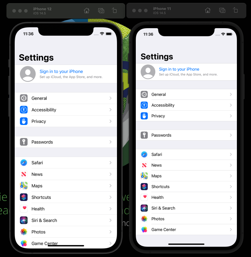
iPhone 11 and iPhone 12 have same screen size of 6.1 inch. But the layout appears different on both of these phone. iPhone 12 seems to be expanding everything.
The application I am working on has some CTAs at the bottom. And because of this issue, iPhone 12(its same for 12 pro, 13 and 14) is pushing those CTA out of the screen. The screen is scrollable, but it is possible user will not scroll and miss the CTA.
Reaching out the community if anyone has face a similar issue and if you could share your thoughts.
Attaching a screenshot showing the settings application on the simulator. We can see for iPhone 12 the list is upto the bottom of the screen, but iPhone 11 still has some space. This can be seen everywhere throughout the phone.


2
Answers
Do you try reading this question?
I think it might help or you could share more information about what you are using and the code.
How much "space" there are to display things, doesn’t really depend on the physical size of the phone. Devices can have different numbers of pixels in one inch, and they can have different display scales factors.
iPhone 11 is 828 x 1792 pixels with a scale factor of 2, and iPhone 12 is 1170 x 2532 with a scale factor of 3.
Most UI APIs operate in points. the numbers in
CGPoints andCGSizes etc are all measured in points. Points is what you get when you divide the pixels by the scale factor. So iPhone 11 is 414 x 896 points, and iPhone 12 is 390 x 844 points. This is how much "logical space" there are to display things.As you can see, iPhone 12 is clearly smaller in this sense, than iPhone 11.
See also this useful site that tells you the logical sizes and scale factors of iOS devices.
You should design the UI of your app to adapt to different screen sizes. You should avoid relying on the exact size of the screen to lay out your views. It sounds like you have a scroll view and would like some buttons to always be visible. You can see this (for SwiftUI) or this (for UIKit) for some ideas.