I’m facing some challenges to layout this prototype in SwiftUI.
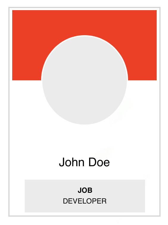
I used ZStack to layout the views. But my main problem is to position the profile image view’s first half on the top the red background and the other half below to it. I used .offset() with some static value to layout as described. Here is what I tried so for
struct ProfileView: View {
    var body: some View {
        ZStack(alignment: .top) {
            Rectangle()
                .foregroundColor(.clear)
                .frame(width: 249, height: 291)
                .overlay(RoundedRectangle(cornerRadius: 0).stroke(.gray, lineWidth: 1))
            Rectangle()
                .frame(width: 243, height: 85)
                .foregroundColor(.red)
                .padding([.leading, .trailing, .top], 3)
            VStack(alignment: .center, spacing: 12) {
                VStack(alignment: .center, spacing: 12) {
                    Image(systemName: "person.crop.circle.fill")
                        .resizable()
                        .aspectRatio(contentMode: .fill)
                        .frame(width: 89, height: 89)
                        .background(Color.white)
                        .foregroundColor(.gray.opacity(0.2))
                        .clipShape(Circle())
                        .overlay(Circle().stroke(Color.white, lineWidth: 4))
                    Text("John Doe")
                        .font(.system(size: 16))
                        .foregroundColor(.black)
                }
                .padding(.bottom, 24)
                VStack(spacing: 0) {
                    Text("JOB")
                        .font(.system(size: 12).bold())
                    Text("Developer")
                        .font(.system(size: 12))
                }
                .frame(width: 200, height: 59)
                .background(Color.gray.opacity(0.2))
            }
            .offset(y: 42.5)
        }
    }
}
I don’t want to use this static offset instead I want to use something like GeometryReader along with position as dynamic solution. I tried GeometryReader inside ZStack but it scatters the layout.
Can someone help me to fix this? Thanks in advance.


2
Answers
The content in this view is essentially arranged vertically, so I would suggest, an easier way to achieve the layout is to use a
VStackinstead of aZStack. Spacing can be achieved with padding, instead of offsets. For sections containing text, I would also use padding instead of fixed vertical height (if the overall height can be flexible), because this will adapt automatically to a larger text size if the user has chosen to use this on their device.The picture in the circle can be positioned quite easily by adding padding below the red rectangle and then using an overlay with
alignment: .bottom.Like this:
You can get any child size in 3 simple steps:
No you can use the size where you need:
Done! 🎉