skip to Main Content

Problem:

I want to replicate the settings app left cell.UIImage with sfSymbols to a T
programmatically not using a nib or custom cell.

I am trying to replicate the settings app sfSymbol images on the left of the cell (as seen in the image).

Is it possible to do this without creating a custom cell and only using TableViewCell?

The issue I am having is the imageView background color border while sizing a sfSymbol inside of it. The problem is creating the the sfSymbol to fit in the background just as settings app does.

func tableView(_ tableView: UITableView, cellForRowAt indexPath: IndexPath) -> UITableViewCell {
        var cell = tableView.dequeueReusableCell(withIdentifier: "cell")
        
        if cell == nil {
            cell = UITableViewCell(style: .default, reuseIdentifier: "cell")
        }
        
        
        cell?.textLabel?.font = .systemFont(ofSize: 17, weight: .regular)
        cell?.accessoryType = .disclosureIndicator
        cell?.selectionStyle = .none
        
        let item = tableItems[indexPath.row]
        cell?.textLabel?.text = item.title

         //let config = UIImage.SymbolConfiguration(pointSize: 25, weight: .regular, scale: .small)
         //cell?.imageView?.image = UIImage(systemName: item.systemImageName, withConfiguration: config)?.withTintColor(.white, renderingMode: .alwaysOriginal)
        
        
        cell?.imageView?.image = UIImage(systemName: item.systemImageName)?.withTintColor(.white, renderingMode: .alwaysOriginal)

        cell?.imageView?.backgroundColor = tableItems[indexPath.row].backgroundColor
       
        if let imageView = cell?.imageView, imageView.transform == .identity {
           imageView.transform = imageView.transform.scaledBy(x: 0.50, y: 0.50)
           imageView.contentMode = .center
           imageView.layer.cornerRadius = 5
        }

        
        return cell!
    }

My goal is to replicate this without creating a custom cell or nib.Perhaps a custom container view programmatically.
enter image description here

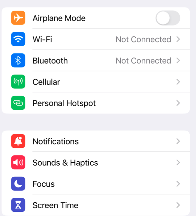
Output (What my code lookes like): I need it to replicate the settings app images in the image above.
enter image description here

2

Answers


  1. Chosen as BEST ANSWER

    To Replicate settings app Icons (sfSymbols) with without a nib or custom cell.

    You need to:

    • Create a custom UIImageView for the SF Symbol
    • Set the background color and corner radius
    • Convert the custom UIImageView to UIImage
    • Convert the visual content of a UIView, including its subviews, into an image (UIImage).
    • Set the custom image as the cell's imageView image

    This will allow you to replicate the settings app left side icons of the tableView cell with sfSymbols, corner radius, and background colors.

       func tableView(_ tableView: UITableView, cellForRowAt indexPath: IndexPath) -> UITableViewCell {
            var cell = tableView.dequeueReusableCell(withIdentifier: "cell")
            
            if cell == nil {
                cell = UITableViewCell(style: .default, reuseIdentifier: "cell")
            }
            
            
            cell?.textLabel?.font = .systemFont(ofSize: 17, weight: .regular)
            cell?.accessoryType = .disclosureIndicator
            cell?.selectionStyle = .none
            
            let item = tableItems[indexPath.row]
            cell?.textLabel?.text = item.title
            
            
            // Create a custom UIImageView for the SF Symbol
            let config = UIImage.SymbolConfiguration(pointSize: 15, weight: .regular, scale: .small)
            let imageView = UIImageView(image: UIImage(systemName: item.systemImageName,withConfiguration: config)?.withTintColor(.white, renderingMode: .alwaysOriginal))
            imageView.frame = CGRect(x: 0, y: 0, width: 25, height: 25)
            imageView.contentMode = .center
            
            // Set the background color and corner radius
            imageView.backgroundColor = tableItems[indexPath.row].backgroundColor
            imageView.layer.cornerRadius = 5
            
            // Convert the custom UIImageView to UIImage
            if let compositeImage = image(from: imageView) {
                // Set the custom image as the cell's imageView image
                cell?.imageView?.image = compositeImage
            }
            
            return cell!
        }
    
    
        func image(from view: UIView) -> UIImage? {
            
         UIGraphicsBeginImageContextWithOptions(view.bounds.size, false, 0.0)
            if let context = UIGraphicsGetCurrentContext() {
                view.layer.render(in: context)
                let image = UIGraphicsGetImageFromCurrentImageContext()
                UIGraphicsEndImageContext()
                return image
            }
            return nil
        }


  2. iOS 14.0

    You should take advantage of UIListContentConfiguration introduced in iOS 14 and also the style property of your UITableView with the initialiser init(frame: CGRect, style: UITableView.Style).

    You could create your UITableView like this below:

    private func configure() {
        title = "Settings"
        navigationItem.largeTitleDisplayMode = .always
        tableView = UITableView(frame: view.bounds, style: .insetGrouped)
        tableView.delegate = self
        tableView.dataSource = self
        tableView.register(UITableViewCell.self, forCellReuseIdentifier: settingsCellReuseIdentifier)
        view.addSubview(tableView)
    }
    

    And your UITableViewDelegate and UITableViewDataSource like:

    func tableView(_ tableView: UITableView, numberOfRowsInSection section: Int) -> Int {
        Settings.allCases.count
    }
    
    func numberOfSections(in tableView: UITableView) -> Int {
        return 2
    }
    
    func tableView(_ tableView: UITableView, cellForRowAt indexPath: IndexPath) -> UITableViewCell {
        let cell = tableView.dequeueReusableCell(withIdentifier: settingsCellReuseIdentifier, for: indexPath)
    
        var content = cell.defaultContentConfiguration()
    
        // Configure content.
        content.image = Settings.allCases[indexPath.row].image
        content.text = Settings.allCases[indexPath.row].name
        content.secondaryText = Settings.allCases[indexPath.row].content
        cell.accessoryType = Settings.allCases[indexPath.row].accessory
    
        // Customize appearance.
        content.imageProperties.tintColor = Settings.allCases[indexPath.row].color
        
        cell.contentConfiguration = content
    
        return cell
    }
    

    Just as a helper, the enum below:

    enum Settings: CaseIterable {
    
     case wifi, icloud
    
     var name: String {
         switch self {
         case .wifi: return "Wi-Fi"
         case .icloud: return "iCloud"
         }
     }
    
     var content: String? {
         switch self {
         case .wifi: return nil
         case .icloud: return "Apple ID"
         }
     }
    
     var image: UIImage {
         switch self {
         case .wifi: return UIImage(systemName: "wifi.square.fill")!
         case .icloud: return UIImage(systemName: "icloud.square.fill")!
         }
     }
    
     var color: UIColor {
         switch self {
         case .wifi, .icloud: return .link
         }
     }
    
     var accessory: UITableViewCell.AccessoryType {
         switch self {
         case .wifi, .icloud: return .disclosureIndicator
         }
     }
    }
    

    This way you avoid creating any kind of custom cells and without a custom container view.

    Screenshot

    Login or Signup to reply.
Please signup or login to give your own answer.
Back To Top
Search