skip to Main Content

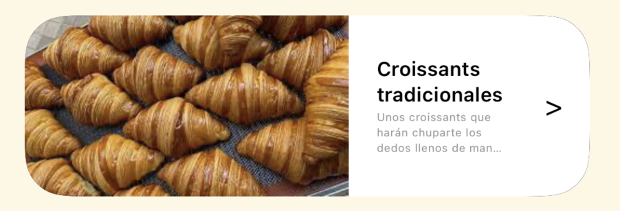
I want to have a view that shows two elements created with a customShape (it is basically the same Shape as RoundedRectangle(cornerRadius:25.0) but combined with a normal rectangle to make 2 corners sharped). The problem is that when I try to combine these two views (miking it a Capsule() I am not able to modify its proportion. I’d like the image to occupy only the 25% of the pill and the text the 75% lasting. But I am not able to accomplish this. This is a photo of what i have : View shown

And what I want to have: View expected

I tried using GeometryReader but I don’t know if it is a good solution or if I don’t know how to use it but I get this: View using GeometryReader

The code of the main view is:

struct CardHomeContent: View {
    var body: some View {
        ZStack {
            RoundedRectangle(cornerRadius: /*@START_MENU_TOKEN@*/25.0/*@END_MENU_TOKEN@*/)
            HStack(spacing:0) { //Contenido
                ImageContent(image:"Croissant")
                TextCardContent()
            }
        }
        .clipShape(RoundedRectangle(cornerRadius: 25))
        .padding(.horizontal)
    }
}

ImageView is:

struct ImageContent: View {
    let image : String
    
    var body: some View {
        ZStack {
            Image(image)
                .resizable()
                .scaledToFill()
        }
    }
}

And the TextView:

struct TextCardContent: View {
    let uiFont: UIFont = .systemFont(ofSize: 13)
    let description = "Unos croissants que harán chuparte los dedos llenos de mantequilla"
    var justifiedTest: String {
        description.justified(font: uiFont, maxWidth: 165)
    }
    var body: some View {
        ZStack {
            RoundedRectangleCustomShapeRight().foregroundStyle(Color.white)
            HStack {
                VStack {
                    Text("Croissants tradicionales").bold().lineLimit(2).minimumScaleFactor(0.4)
                    Text(description).font(.footnote).foregroundStyle(Color.gray).lineLimit(3).minimumScaleFactor(0.5)
                        .multilineTextAlignment(.leading)
                }
                .padding(.all)
                Text(">")
                    .padding(.trailing)
            }

        }
    }
}

So I would appreciate if someone could come up with any idea.

2

Answers


  1. From my perspective, the simplest way to accomplish this is to wrap CardHomeContent into a GeometryReader, and then calculate the width of each card view part. i.e, ImageContent has 0.25 and TextCardContent will take 0.75, of the total width.

    var body: some View {
       ZStack {
            RoundedRectangle(cornerRadius: 25)
            GeometryReader { geo in //<- Here
                HStack(spacing: 0) {
                    ImageContent(image: "Croissant")
                        .frame(width: geo.size.width * 0.25) //<- Here
    
                    TextCardContent()
                        .frame(width: geo.size.width * 0.75) //<- Here
                }
            }
        }
        .clipShape(RoundedRectangle(cornerRadius: 25))
        .padding(.horizontal)
    }
    

    You also can remove ZStack in ImageContent, since it was an Image only and its parent is a ZStack already. However, ImageContent need to change to scaledToFit or you can keep scaledToFill with clipped(), to avoid overwhelming.

    Login or Signup to reply.
  2. If you are fixing the height and the width of the card views then there is an easy solution: you just need to wrap the shape with a GeometryReader, as explained in another answer.

    However, if you want the cards to adopt a natural height, it’s a bit more tricky. Here are two techniques:

    1. Use a hidden footprint with an overlay

    • The footprint (in particular, the height) is established using hidden content. The text part can probably be used for this purpose.
    • Ideally, dummy text (perhaps containing newlines) should be used for finding the footprint, so that the height of the footprint is always the same for all instances.
    • The overlay contains a GeometryReader, which measures the size of the footprint.
    • A clip shape with rounded corners can be applied to the overall composition. This way, it is not necessary to apply a half-rounded rectangle to the text part.
    struct CardHomeContent: View {
        var body: some View {
            TextCardContent()
                .frame(maxWidth: .infinity)
                .hidden()
                .overlay {
                    GeometryReader { proxy in
                        HStack(spacing:0) { //Contenido
                            ImageContent(image: "Croissant")
                                .frame(width: proxy.size.width / 4)
                                .frame(maxHeight: .infinity)
                                .clipped()
                            TextCardContent()
                                .frame(maxWidth: .infinity, maxHeight: .infinity)
                                .background(.white)
                        }
                    }
                }
                .clipShape(RoundedRectangle(cornerRadius: 25))
        }
    }
    
    struct ImageContent: View {
        // as betore
    }
    
    struct TextCardContent: View {
        let description = "Unos croissants que harán chuparte los dedos llenos de mantequilla"
    
        var body: some View {
            HStack {
                VStack(alignment: .leading) {
                    Text("Croissants tradicionales")
                        .bold()
                        .lineLimit(2)
                        .minimumScaleFactor(0.4)
                    Text(description)
                        .font(.footnote)
                        .foregroundStyle(Color.gray)
                        .lineLimit(3)
                        .minimumScaleFactor(0.5)
                        .multilineTextAlignment(.leading)
                }
                .padding()
                Text(">")
                    .padding(.trailing)
            }
        }
    }
    

    By default, CardHomeContent will grab as much width as possible, because the footprint uses maxWidth: .infinity. The width can be constrained by applying a frame to CardHomeContent:

    struct ContentView: View {
        var body: some View {
            ZStack {
                Color.gray
                CardHomeContent()
                    .frame(width: 350)
            }
        }
    }
    

    2. Use a custom layout

    Another way to solve the problem is using a custom Layout. In the following example implementation, the layout is only expecting to have two subviews and the height of the overall card is determined by the second of the subviews:

    struct CardLayout: Layout {
        func sizeThatFits(proposal: ProposedViewSize, subviews: Subviews, cache: inout ()) -> CGSize {
            let w = proposal.width ?? 100
            var h = CGFloat.zero
            if subviews.count == 2, let lastSubview = subviews.last {
                let subviewSize = lastSubview.sizeThatFits(.init(width: w * 3 / 4, height: proposal.height))
                h = subviewSize.height
            }
            return CGSize(width: w, height: h)
        }
        
        func placeSubviews(in bounds: CGRect, proposal: ProposedViewSize, subviews: Subviews, cache: inout ()) {
            if let w = proposal.width, subviews.count == 2,
               let firstSubview = subviews.first, let lastSubview = subviews.last {
                let subviewSize = lastSubview.sizeThatFits(.init(width: w * 3 / 4, height: proposal.height))
                let h = subviewSize.height
                firstSubview.place(
                    at: bounds.origin,
                    proposal: .init(width: w / 4, height: h)
                )
                lastSubview.place(
                    at: CGPoint(x: bounds.minX + bounds.width / 4, y: bounds.minY),
                    proposal: .init(width: w * 3 / 4, height: h)
                )
            }
        }
    }
    
    struct CardHomeContent: View {
        var body: some View {
            CardLayout { //Contenido
                ImageContent(image: "Croissant")
                    .clipped()
                TextCardContent()
                    .background(.white)
            }
            .clipShape(RoundedRectangle(cornerRadius: 25))
        }
    }
    
    // ImageContent, TextCardContent and ContentView as before
    

    Screenshot

    Login or Signup to reply.
Please signup or login to give your own answer.
Back To Top
Search