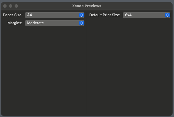
I have a fairly basic SwiftUI view heirarcy that I’m attempting to insert a divider into, however the divider is sizing itself to some obscure value and pushing the parent view out to meet it. Every other view in the heirarchy is behaving correctly and the parent view is wrapping the largest child, as expected.
I’ve searched and searched and just can’t find any insight into this behaviour – so I’m asking you good folks for some thoughs.
View code:
Form {
    HStack(alignment: .top) {
        VStack(alignment: .trailing) {
            Picker("Paper Size:", selection: $viewModel.layoutParameters.paperSize) {
                ForEach(PrintSize.allCases, id: .self) {
                    Text($0.description)
                }
            }
            .pickerStyle(.menu)

            Picker(selection: $viewModel.layoutParameters.margin) {
                ForEach(Margin.allCases, id: .self) {
                    Text($0.description)
                }
            } label: {
                Text("Margins:")
                    .padding(.leading, 15) // This is janky, find a better way to do it.
            }
            .pickerStyle(.menu)
        }

        Divider()

        Picker("Default Print Size:", selection: $viewModel.layoutParameters.printSize) {
            ForEach(PrintSize.allCases, id: .self) {
                Text($0.description)
            }
        }
        .pickerStyle(.menu)
    }
}
.padding(8)
Exhibited behaviour with divider:
Bonus points if you can give me a way to nudge the Margins label over without explicitly applying padding.


2
Answers
Both the issues that you describe can be solved by using overlays.
Divideris greedy and expands to use all the space available, just like aSpacer. To constrain it to the height of theHStack, just put it in an overlay over theHStack. By default, the overlay will be aligned to the center of theHStack. This is perfect, because the twoPickerwill have equal widths, so theDividerwill automatically be positioned in the middle between them. However, two extra steps are needed to get it looking right:Divideris normally determined by the stack that contains it, or horizontal by detault. Since you want it to be vertical, it needs to be nested inside a dummyHStack.spacingthat is used by theHStack, since there is now only one space between the twoPicker.Here is an updated version of your example with the two changes applied:
Note that you are using Xcode Previews. Previews behave a little differently from running the app normally.
If you run the app normally, the window sizes will be the same for both cases (whatever the macOS default window size is, or whatever is stored in your preferences), and you can resize both to the smallest size possible. The sizes you see is just a Xcode Preview quirk.
Notice that without a
Divider, you can still resize the window to as big as you want, and theHStacksits in the middle, without changing its height, and there are lots of blank space below and above. On the other hand, thePickers will expand horizontally, theHStack‘s width can change.Preview tries to display your view without any of those surrounding blank space. This is why you get a window that nicely fits the
HStackwhen there is noDivider. Notice that the preview window’s width is the default macOS window width. This is because the pickers are greedy and tries to take up as much horizontal space as possible – the preview has to stop it somewhere.Dividers are also greedy, and tries to expand vertically as much as possible. When there is aDivider, theTextall gets aligned at the top (becauseHStack(alignment: .top)) when the height of theHStackis greater than the height of the pickers combined. Also, there is none of the "surrounding blank space" above and below anymore, because there is always theDividerto fill that space. The preview chooses the macOS default height for windows (again, it has to stop the expansion somewhere), which is a larger number than the height of the pickers combined.Previews could have been designed to resize the window to its minimum size, but it wasn’t designed like that. I’d imagine lots of views would look rather cramped this way.
I’m not sure there is a way for previews to show the minimum sized-window. You can force the preview to use a particular sized window though:
You can also try putting
.fixedSizeon theHStack, but this resizes to its "ideal size", not its minimum size. The "ideal size" is still quite a lot larger than the minimum size.As for aligning the labels, I would use a
Grid:Side note: you can put
.pickerStyle(.menu)on theHStack, instead of each picker. It applies that style to all the children.