skip to Main Content

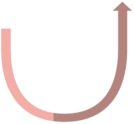
I have this svg icon that I want to fill with color according to the percentage value, it’s a chart, so it should start from the top left and fill all the way to the right following the line..

Demo

function setProgress(amt)
{
  amt = (amt < 0) ? 0 : (amt > 1) ? 1 : amt;
  document.getElementById("stop1").setAttribute("offset", amt);
  document.getElementById("stop2").setAttribute("offset", amt);
}


setProgress(0.60);
<svg xmlns="http://www.w3.org/2000/svg" viewBox="0 0 254.25 233.26">
<defs>
 <linearGradient id="progress" x1="1" y1="0" x2="0" y2="0">
      <stop id="stop1" offset="0" stop-color="#bb8e89"/>
      <stop id="stop2" offset="0" stop-color="#f4b6b0"/>
    </linearGradient>
</defs>
<g id="Capa_2" data-name="Capa 2">
<g id="Capa_1-2" data-name="Capa 1">
<path class="cls-1" fill="url(#progress)" d="M254.25,17.72,235.32,0,216.38,17.72H227V92.93c0,66.6-25.41,124.48-104.17,124.48S18.63,159.53,18.63,92.93V52.35H0V92.14c0,76.11,32.18,141.12,122.79,141.12,89.77,0,122-65,122-141.12V17.72Z"/>
</g>
</g>
</svg>

2

Answers


  1. First you need to draw a path that is following your shape. Mine is not perfect but still works.

    svg{width:90vh; border:solid;}
    <svg xmlns="http://www.w3.org/2000/svg" viewBox="0 0 254.25 233.26">
    <defs>
     <linearGradient id="progress" x1="-1" >
          <stop id="stop1" offset="0" stop-color="#bb8e89"/>
          <stop id="stop2" offset="0" stop-color="#f4b6b0"/>
        </linearGradient>
    </defs>
    <g id="Capa_2" data-name="Capa 2">
    <g id="Capa_1-2" data-name="Capa 1">
    
    <path fill="url(#progress)" class="cls-1" d="M254.25,17.72 L235.32,0,216.38,17.72H227V92.93c0,66.6-25.41,124.48-104.17,124.48S18.63,159.53,18.63,92.93V52.35H0V92.14c0,76.11,32.18,141.12,122.79,141.12,89.77,0,122-65,122-141.12V17.72Z"/>
    
      <path stroke="black"  fill="none" id="pth" d="M10,52L10,92.14C10,273 240,273 235.32,92.14L235.32,0" />
    </g>
    </g>
    </svg>

    Next you set the width of the stroke to something big like 40 and you make the stroke="url(#progress)"

    svg{border:solid; width:90vh}
    <svg xmlns="http://www.w3.org/2000/svg" viewBox="0 0 254.25 233.26">
    <defs>
     <linearGradient id="progress" x1="-1" >
          <stop id="stop1" offset="0" stop-color="#bb8e89"/>
          <stop id="stop2" offset="0" stop-color="#f4b6b0"/>
        </linearGradient>
    </defs>
    <g id="Capa_2" data-name="Capa 2">
    <g id="Capa_1-2" data-name="Capa 1">
    
    <path class="cls-1" d="M254.25,17.72 L235.32,0,216.38,17.72H227V92.93c0,66.6-25.41,124.48-104.17,124.48S18.63,159.53,18.63,92.93V52.35H0V92.14c0,76.11,32.18,141.12,122.79,141.12,89.77,0,122-65,122-141.12V17.72Z"/>
    
      <path stroke="url(#progress)"  fill="none" stroke-width="40" clip-path="url(#cp)" id="pth" d="M10,52L10,92.14C10,273 240,273 235.32,92.14L235.32,0"/>
    </g>
    </g>
    </svg>

    Now you can use clipPath to clip the wide stroke with your shape:

    svg{border:solid; width:90vh}
    <svg xmlns="http://www.w3.org/2000/svg" viewBox="0 0 254.25 233.26">
    <defs>
     <linearGradient id="progress" x1="-1" >
          <stop id="stop1" offset="0" stop-color="#bb8e89"/>
          <stop id="stop2" offset="0" stop-color="#f4b6b0"/>
        </linearGradient>
    </defs>
    <g id="Capa_2" data-name="Capa 2">
    <g id="Capa_1-2" data-name="Capa 1">
      <clipPath id="cp">
    <path class="cls-1" d="M254.25,17.72 L235.32,0,216.38,17.72H227V92.93c0,66.6-25.41,124.48-104.17,124.48S18.63,159.53,18.63,92.93V52.35H0V92.14c0,76.11,32.18,141.12,122.79,141.12,89.77,0,122-65,122-141.12V17.72Z"/>
      </clipPath> 
      <path stroke="url(#progress)"  fill="none" stroke-width="40" clip-path="url(#cp)" id="pth" d="M10,52L10,92.14C10,273 240,273 235.32,92.14L235.32,0" />
    </g>
    </g>
    </svg>

    Finaly you can set the stroke-dasharray of the path to whatever you need. Please observe that pathLength="100"

    function setProgress(amt)
    {
      amt = (amt < 0) ? 0 : (amt > 1) ? 1 : amt;
     let s= 100*amt;
      document.getElementById("pth").setAttribute("stroke-dasharray", `${s},${100 - s}`);
    }
    
    
    setProgress(0.60);
    svg{width:90vh;border:solid}
    <svg xmlns="http://www.w3.org/2000/svg" viewBox="0 0 254.25 233.26">
    <defs>
     <linearGradient id="progress" x1="-1" >
          <stop id="stop1" offset="0" stop-color="#bb8e89"/>
          <stop id="stop2" offset="0" stop-color="#f4b6b0"/>
        </linearGradient>
    </defs>
    <g id="Capa_2" data-name="Capa 2">
    <g id="Capa_1-2" data-name="Capa 1">
      <clipPath id="cp">
    <path class="cls-1" d="M254.25,17.72 L235.32,0,216.38,17.72H227V92.93c0,66.6-25.41,124.48-104.17,124.48S18.63,159.53,18.63,92.93V52.35H0V92.14c0,76.11,32.18,141.12,122.79,141.12,89.77,0,122-65,122-141.12V17.72Z"/>
      </clipPath> 
      <path stroke="url(#progress)"  fill="none" stroke-width="40" clip-path="url(#cp)" id="pth" d="M10,52L10,92.14C10,273 240,273 235.32,92.14L235.32,0" pathLength="100" />
    </g>
    </g>
    </svg>
    Login or Signup to reply.
  2. I am not 100% sure what you are after.

    Exaneta is correct when he shows to use path stroke and not fill

    With stroke you can use stroke-dashArray="[percentage] 100"

    Only tricky part then is your arrow-head, to position it dynamically you need animateMotion

    Using a native Web Component because this is what they are meant to do

    Making it reactive with observed attribute percentage

    <svg-percentage percentage="10"></svg-percentage>
    <svg-percentage percentage="42"></svg-percentage>
    <svg-percentage percentage="77"></svg-percentage>
    

    creates:

    Added an onclick for Stack Overflow Snippet demo only

    customElements.define("svg-percentage", class extends HTMLElement {
      static get observedAttributes() {
        return ["percentage"];
      }
      connectedCallback() {
        this.attributeChangedCallback();
        this.onclick = () => this.setAttribute("percentage", ~~(Math.random() * 100));
      }
      attributeChangedCallback() {
        let p = ~~(this.getAttribute("percentage") || 42);
        this.innerHTML = `<svg viewBox="-10 -25 260 280" stroke-width="15">
       <path id="P" d="m10 52 0 40c0 181 230 181 225 0l0-92" fill="none" stroke="lightgrey"/>
       <path d="m10 52 0 40c0 181 230 181 225 0l0-92" fill="none" 
             stroke="lightgreen" pathLength="100" stroke-dasharray="${p} 100"/>
       <path d="m0 -15 30 15-30 15z" fill="green">         
       <animateMotion dur="0.001s" rotate="auto" fill="freeze" keyPoints="0;${p/100}" keyTimes="0;1" calcMode="linear">
          <mpath href="#P"></mpath>
        </animateMotion>
        </path>
        <text x="125" y="125" font-size="3em" text-anchor="middle">${p}%</text>
    </svg>`;
      }
    })
    <style>
      svg {
        max-height: 180px
      }
    </style>
    
    <svg-percentage percentage="10"></svg-percentage>
    <svg-percentage percentage="42"></svg-percentage>
    <svg-percentage percentage="77"></svg-percentage>
    Login or Signup to reply.
Please signup or login to give your own answer.
Back To Top
Search