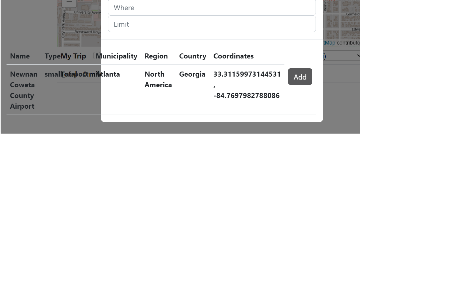
I have a table in React that works well in a defaulted desktop view; however, when down scaled to a phone, this table significantly overflows with text.
All of my efforts to fix this thus far have been changing the table’s style component, changing the max-width, whiteSpace, and overflow properties for example. These have not worked however, and I am searching for someone who might have any ideas of what I could pursue to fix this.


2
Answers
If your table is simple (no ordering, grouping, searching, etc) as an alternative solution instead of table you may reach same display by using divs positioned flex. In mobile view then u may use power of responsivity
if you still wanna do that ellipse thing, here is the solution.
Given a fixed width for table (i.e; width 100% for table and table-layout as fixed)