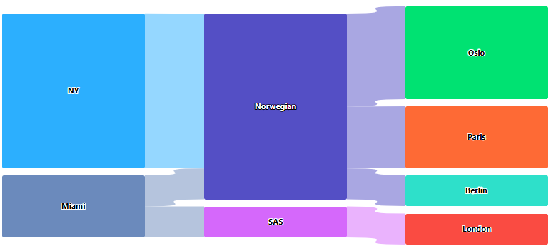
I have some flights data which looks like this:
[{"from":"NY", "to":"Oslo", "company": "Norwegian", "flights":3},
{"from":"NY", "to":"Paris", "company": "Norwegian", "flights":2},
{"from":"Miami", "to":"Berlin", "company": "Norwegian", "flights":1},
{"from":"Miami", "to":"London", "company": "SAS", "flights":1}]
I’m looking for a way to implement a highcharts sankey/alluvial or similar graph where "from" will be on the left side, the company involved will be in the middle and the destination will be on the right.
The problem is that there doesn’t seem to be a way of actually doing it.
I can sort of get the look of it by faking data and doing a: {From => company}, {company => to}-mapping, according to this fiddle: https://jsfiddle.net/1a9h8kz0/1/
But it doesn’t really work properly, for example, when hovering on NY, i want it to display all the targets of NY (Oslo and Paris) but it only goes to the "Norwegian".
This is not really strange, because there’s no connection between the source and target destinations, only through the "middle".
So, is there a way of making it recognize the flow of data between from => company => to and properly display the lines when doing tooltips etc?

 Question posted in


2
Answers
I think you were very close to the solution!
After checking the library I tried to edit your configuration file with that values:
With
pointFormatwe can custom the tooltip value to render bothfromandtostrings. I usedkeyswithdataas a matrix as documented in the highchart docs.Let me know if that is what you expected as result!
All right, I know what the problem is. The suggested solution would be to create a linksHover function to highlight connected nodes and links dynamically. Here’s the code:
And in your chart config:
Demo: https://jsfiddle.net/BlackLabel/qo38yxkm/1/