I am using the Ant Design (v5) Table component in my React project. Inside the Table component, I am using the pagination prop to show page details. However, the page numbers are displayed along with the currently selected page, like below –
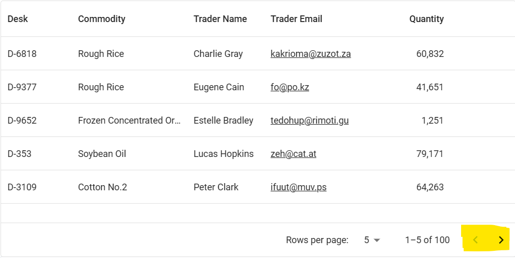
I want to display only the previous and next icon buttons, like in MUI Datagrid (screenshot below). How can I achieve this?
While we are on the topic, I also want to shift the position of the 10/page selection box to the left of the 1-10 of 46 text, just like MUI Datagrid. How do I do that?
Please find my React code below –
import React, { useState } from 'react';
import { Table } from 'antd';
import type { ColumnsType } from 'antd/es/table';

interface DataType {
  key: React.Key;
  name: string;
  age: number;
  address: string;
}

const columns: ColumnsType<DataType> = [
  {title: 'Name', dataIndex: 'name'},
  {title: 'Age', dataIndex: 'age'},
  {title: 'Address', dataIndex: 'address'},
];

const data: DataType[] = [];
for (let i = 0; i < 46; i++) {
  data.push({ key: i, name: `Edward King ${i}`, age: 32, address: `London, Park Lane no. ${i}`});
}

const App: React.FC = () => {
  const [selectedRowKeys, setSelectedRowKeys] = useState<React.Key[]>([]);
  const [current, setCurrent] = useState(1);

  const onSelectChange = (newSelectedRowKeys: React.Key[]) => {
    console.log('selectedRowKeys changed: ', newSelectedRowKeys);
    setSelectedRowKeys(newSelectedRowKeys);
  };

  const rowSelection = { selectedRowKeys, onChange: onSelectChange};

  return (
    <div>
      <Table
      rowSelection={rowSelection}
      columns={columns}
      dataSource={data}
      pagination={{
        current,
        hideOnSinglePage: true,
        defaultPageSize: 10,
        showSizeChanger: true,
        pageSizeOptions: [5, 10, 20],
        showTotal: (total, range) => `${range[0]}-${range[1]} of ${total}`,
      }}
      />
    </div>
  );
};

export default App;


2
Answers
You can use css for it.
Apply the following property.
If this style solves your problem,
just set "simple" property of pagination to true as follows for your table component.