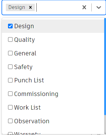
I have a Select from react-select that’s multi option, I want an option placed on top op the others that invert selected options to unselected and vice versa.
And when this ‘Invert selection’ option is selected don’t show in grey into selected options preview.
I know that there’s a second parameter to onChange prop that means the action, where I can see which option were selected or unelected, but I don’t know how to properly manage the options.
How my Select component looks like:
Code:
<Select
    placeholder="Selecionar..."
    defaultValue={issuesTypes.results.map(
        (iT) =>
            selectedCategoryOptions.includes(iT.id) && {
                value: iT.id,
                label: iT.title,
            }
    )}
    isMulti
    closeMenuOnSelect={false}
    hideSelectedOptions={false}
    onChange={(options, a) => {
        if (Array.isArray(options)) {
            setSelectedCategoryOptions(options.map((opt) => opt.value));
        }
    }}
    options={(() => {
        let aux = [];
        issuesTypes.results.map((iT) => {
            if (iT.isActive) {
                aux.push({
                    value: iT.id,
                    label: iT.title,
                });
            }
        });
        return aux;
    })()}
    components={{
        Option: DefaultInputOption,
    }}
/>;

const DefaultInputOption = ({
    getStyles,
    Icon,
    isDisabled,
    isFocused,
    isSelected,
    children,
    innerProps,
    ...rest
}) => {
    const [isActive, setIsActive] = useState(false);
    const onMouseDown = () => setIsActive(true);
    const onMouseUp = () => setIsActive(false);
    const onMouseLeave = () => setIsActive(false);

    // styles
    let bg = "transparent";
    if (isFocused) bg = "#eee";
    if (isActive) bg = "#B2D4FF";

    const style = {
        alignItems: "center",
        backgroundColor: bg,
        color: "inherit",
        display: "flex ",
    };

    // prop assignment
    const props = {
        ...innerProps,
        onMouseDown,
        onMouseUp,
        onMouseLeave,
        style,
    };

    return (
        <components.Option
            {...rest}
            isDisabled={isDisabled}
            isFocused={isFocused}
            isSelected={isSelected}
            getStyles={getStyles}
            innerProps={props}
        >
            <input type="checkbox" checked={isSelected} onChange={() => {}} />
            {children}
        </components.Option>
    );
};


2
Answers
Found the solution. Inside components prop you can overwrite some components, just like I did with Option in the above question, so I created a MenuList wich is the dropdown menu and passed to components:
MenuList:
As you can see it has a div with inner text "Invert Selection" and the magic is in the
onClickfunction, callingselectOptionwill trigger the UI selection on inputs insideDefaultInputOptionand theonChangeinside<Select />.Not sure why do you want to do that.
But you could add a new function and validate if the "invert selection" option is selected
and use that function for the default values. If it is selected, then you can change the validation there: