 Question posted in


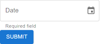
I am experiencing an issue in my web application. When I press the "Submit" button without selecting a date, the error message displays correctly. However, I have noticed that the text does not highlight in red as it should. Additionally, I intend for the borders to also appear in red. Although I have tried various approaches, I have been unable to achieve this effect without resorting to external CSS styles. Is there any suggestion or solution to achieve this effect without the need for additional CSS? I appreciate any guidance you can provide on this matter.
This is how my component appeared:
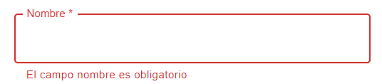
I wish it that way
import React from "react";
import { useForm, Controller } from "react-hook-form";
import { LocalizationProvider, DatePicker } from "@mui/x-date-pickers";
import { AdapterDayjs } from "@mui/x-date-pickers/AdapterDayjs";
import Box from "@mui/material/Box";
import Button from "@mui/material/Button";

const DateComponent = () => {
  const {
    control,
    handleSubmit,
    formState: { errors },
  } = useForm();

  const onSubmit = (data) => {
    console.log("Formulario enviado:", data);
  };

  return (
    <form
      onSubmit={handleSubmit(onSubmit)}
      style={{ backgroundColor: "#fff", marginTop: "25px" }}
    >
      <Box width={300}>
        <Controller
          control={control}
          name="selectedDate"
          defaultValue={null}
          rules={{ required: true }} // Add the required property here
          render={({ field }) => (
            <LocalizationProvider dateAdapter={AdapterDayjs}>
              <DatePicker
                label="Date"
                {...field}
                slotProps={{
                  textField: {
                    helperText: errors.selectedDate ? "Campo requerido" : "",
                  },
                }}
              />
            </LocalizationProvider>
          )}
        />

        <Button type="submit" variant="contained" color="primary">
         Submit
        </Button>
      </Box>
    </form>
  );
};

export default DateComponent;
2
Answers
You can use the
errorprop fortextFieldinsideslotProps.inside the TextField
textField is an object that contains two properties: helperText and error. These properties are used to customize the appearance and behavior of the text field associated with the DatePicker. Let’s look at each property:
error:
This property is typically used to indicate whether there is an error in the input field.
This helps to visually highlight the input field when there is an error.
helperText
This property is likely used to display a helper or error message beneath the text field.
and also This helps provide feedback to the user about the input requirements.