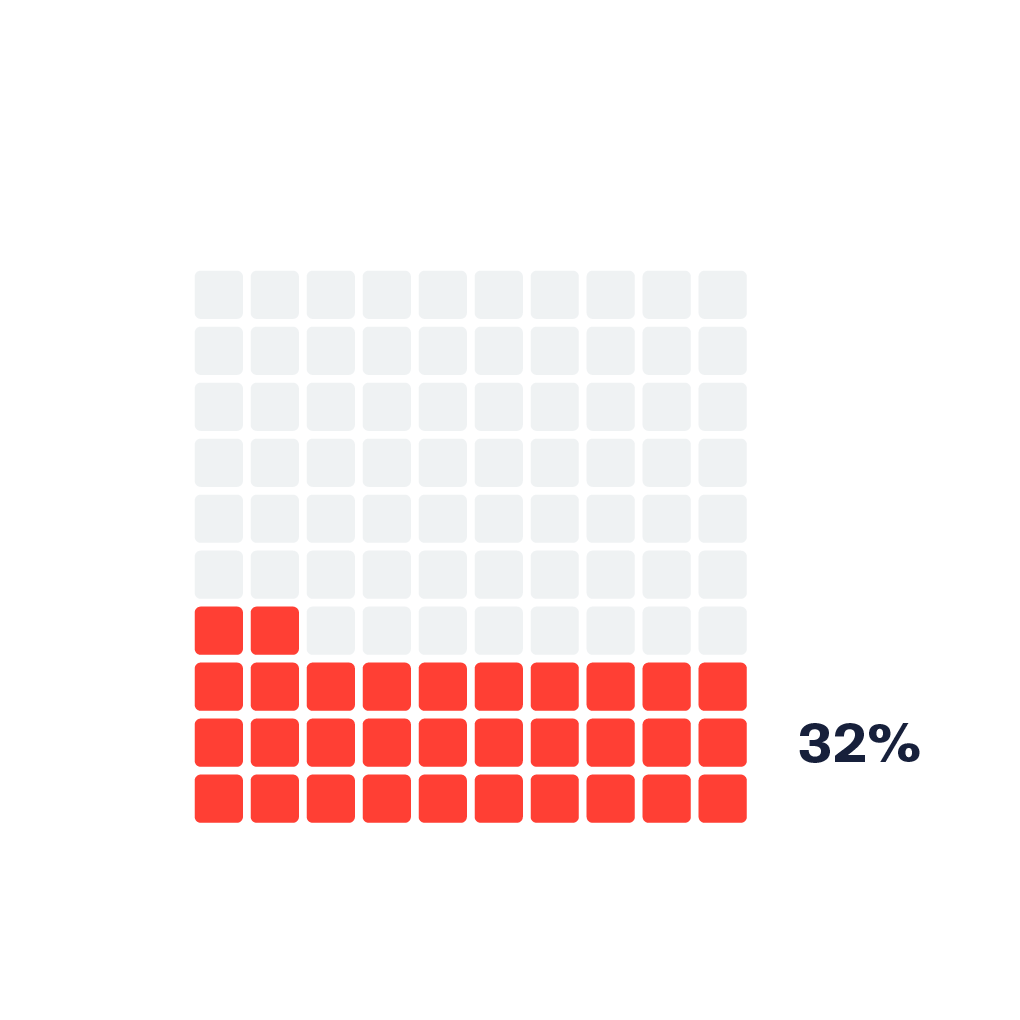
I am using Highcharts to create a waffle chart. Here’s a good example:
https://datavizproject.com/data-type/percentage-grid/
Highcharts calls them "item charts", and they work pretty well.
However, I can’t figure out how to control the spacing/padding between the items.
I’ve tried using the itemPadding property, but that only seems to set the padding between the rows, but not the columns.
Here’s a working fiddle:
https://jsfiddle.net/stuehler/frt80u2p/4/
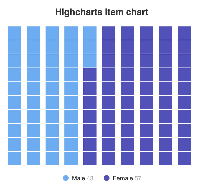
As you can see in this screenshot below, the row padding is 1px (itemPadding: 1 – that’s what I want), but the column padding is much larger:
Here is the code I’m using:
Highcharts.chart('container', {

  chart: {
    type: 'item'
  },

  series: [{
    marker: {
      symbol: 'square'
    },
    itemPadding: 1,
    rows: 10,
    data: [
      {
        name: 'Male',
        y: 43
      },
      {
        name: 'Female',
        y: 57
      }
    ]
  }]
});
Thanks in advance for your help!


2
Answers
From the docs it looks like you can set a width ONLY on image markers.
width: number
Image markers only. Set the image width explicitly. When using this option, a height must also be set.
https://api.highcharts.com/highcharts/plotOptions.series.marker.symbol
Might be only way to get what you want.
There appears to be a relationship between the plot width and the spacing that is used. I see from the code that e.g.:
So if the plot is very wide then it will utilize that space. Although not ideal, you could lock down either
chart.widthor#container { max-width: 320px; ... }to a size that gives you very little padding between columns.See e.g. how I’ve used
320pxfor this JSFiddle demonstration.