


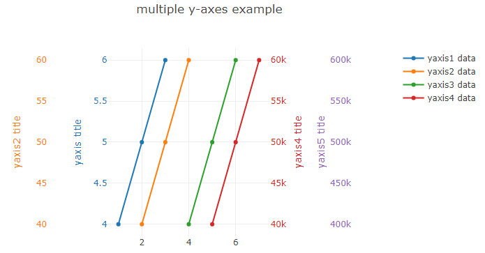
We are developing an AngularJS application with plotly.js charts. We have a scatter plot that can have multiple y axes. We would like to stack the y axes horizontally to the right of the chart (ideally) or every odd y axes on the left and every even y axes on the right. There is an example of how this can be done in the Plotly.js references docs here with a link to a code pen example. Notice how the chart has 2 y axes stacked on the left side and 2 y axes stacked on the right side:
But when I attempt to mimic this behavior, I get this:
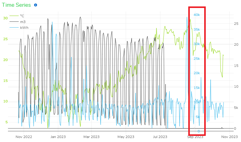
Note that the kWh axis (blue) is positioned within the chart (about 85% in from the left). Why does it do this whereas the code pen example does not?
Here is my trace data:
[
   {
      "type":"scatter",
      "x":[...],
      "y":[...],
      "hovertemplate":"%{x}<br>%{y:.2f} %{text}<extra></extra>",
      "text":[...],
      "name":"°C",
      "marker":{
         "color":"#89d300",
         "size":1,
         "opacity":1
      },
      "line":{
         "width":1
      },
      "yaxis":"y",
      "connectgaps":true,
      "measurementGroupId":18
   },
   {
      "type":"scatter",
      "x":[...],
      "y":[...],
      "hovertemplate":"%{x}<br>%{y:.2f} %{text}<extra></extra>",
      "text":[...],
      "name":"m3",
      "marker":{
         "color":"#3c3c3c",
         "size":1,
         "opacity":1
      },
      "line":{
         "width":1
      },
      "yaxis":"y2",
      "connectgaps":true,
      "measurementGroupId":8
   },
   {
      "type":"scatter",
      "x":[...],
      "y":[...],
      "hovertemplate":"%{x}<br>%{y:.2f} %{text}<extra></extra>",
      "text":[...],
      "name":"kWh",
      "marker":{
         "color":"#2fb5ea",
         "size":1,
         "opacity":1
      },
      "line":{
         "width":1
      },
      "yaxis":"y3",
      "connectgaps":true,
      "measurementGroupId":2
   }
]
And here is my layout:
{
   "title":{
      "text":"Time Series",
      "font":{
         "color":"#3dcd58",
         "family":"Nunito-Regular",
         "size":18
      },
      "xanchor":"left",
      "x":0
   },
   "font":{
      "color":"#333",
      "family":"Nunito-Regular"
   },
   "dragmode":"select",
   "autosize":true,
   "margin":{
      "l":20,
      "r":15,
      "b":30,
      "t":30
   },
   "plot_bgcolor":"#ffffff",
   "showlegend":true,
   "legend":{
      "x":0,
      "bgcolor":"rgba(255,255,255,0.3)"
   },
   "xaxis":{
      "range":[
         1664845980000,
         1699440540000
      ]
   },
   "hovermode":"closest",
   "yaxis":{
      "showticklabels":true,
      "side":"left",
      "tickfont":{
         "color":"#89d300"
      },
      "range":[
         2.133101851851852,
         31.59375
      ],
      "name":"°C"
   },
   "yaxis2":{
      "showticklabels":true,
      "side":"right",
      "overlaying":"y",
      "tickfont":{
         "color":"#3c3c3c"
      },
      "range":[
         -1328.6000000000001,
         27900.6
      ],
      "name":"m3"
   },
   "yaxis3":{
      "showticklabels":true,
      "side":"left",
      "position":0.85,
      "overlaying":"y",
      "tickfont":{
         "color":"#2fb5ea"
      },
      "range":[
         -948.1500000000001,
         41163.15
      ],
      "name":"kWh"
   }
}
The code to build the layout looks like this:
var layout = {
    title: {
        text: 'Time Series',
        font: {
            color: "#3dcd58",
            family: "Nunito-Regular",
            size: 18
        },
        xanchor: "left",
        x: 0
    },
    font: {
        color: "#333",
        family: "Nunito-Regular"
    },
    dragmode: 'select',
    autosize: true,
    margin: {
        l: 20,
        r: 15,
        b: 30,
        t: 30
    },
    plot_bgcolor: '#ffffff',
    showlegend: true,
    legend: {
        x: 0,
        bgcolor: 'rgba(255,255,255,0.3)'
    },
    xaxis: {
        range: [minMaxDateValues[0], minMaxDateValues[1]]
    },
    hovermode: 'closest'
};

...

for (var i = 0; i < visibleDrivers.length; i++) {
    var driver = visibleDrivers[i];
    var yAxisName = 'yaxis' + (i > 0 ? (i + 1) : '');
    var minMax = _.find(minMaxDriverValues, function(values) {
        return values.id === driver.nodeId + '.' + driver.measurementGroupId;
    });
    if (!minMax) {
        minMaxDriverValues.push({
            id: driver.nodeId + '.' + driver.measurementGroupId,
            yAxis: yAxisName,
            minValue: driver.minValue,
            maxValue: driver.maxValue
        });
    }
    layout[yAxisName] = {
        showticklabels: true,
        side: i % 2 > 0 ? 'right' : 'left',
        position: i < 2 ? undefined : 0.85,
        overlaying: i > 0 ? 'y' : undefined,
        tickfont: { color: driver.color },
        range: driver.measurementGroupId === 2
            ? energyRange
            : [
                minMax ? minMax.minValue : driver.minValue,
                minMax ? minMax.maxValue : driver.maxValue
            ],
        name: driver.unit
    }
}
Note that I am toggling the side the y axis shows up on like this: side: i % 2 > 0 ? 'right' : 'left'. And I am setting the position of the y axis like this: position: i < 2 ? undefined : 0.85.
This works well for the first two y axes. The first gets placed on the left with no position, and the second gets placed on the right with no position. Then when it comes to the third y axis, it gets assigned to the right and gets a position of .85. This apparently (unlike the code pen example) positions it 85% into the chart from the left (even though it’s assigned to the right side).
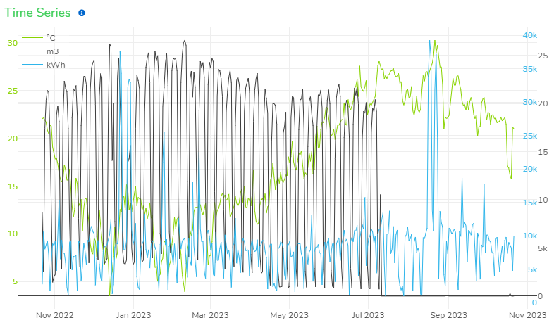
I can try a hack of setting it’s position to 1.0, which places it as far right on the chart as it can go (but still inside the chart):
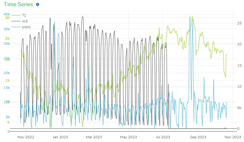
But this is not ideal because 1) we want the axes to sit outside the chart, and 2) what happens when we have a fourth or fifth or sixth y axis? Anything beyond a position of 1.0 seems to just be ignored and positions the axis back at the beginning (left side of the chart):
Looking at my code and the resultant layout, can anyone see what I’m doing wrong that the code pen example is doing right? Thanks!
2
Answers
What happens if you have an explicit width like this:
You need to constrain the xaxis
domainto make some room for the y axes, eg.This makes the portion of the plot
[0.9, 1.0]available, also now the y axes set withside: 'right'are positioned at0.9by default, so you would then adjust thepositionof the third y axis, eg.