skip to Main Content

I’m trying to mimic the an effect where cards unstack on scroll. For visuals, please click here to view a GIF of the effect.

The website the above GIF is from is this website.

Now, I’ve tried to mimic the above using GSAP / ScrollTrigger. However, my effect differs in the following aspects:

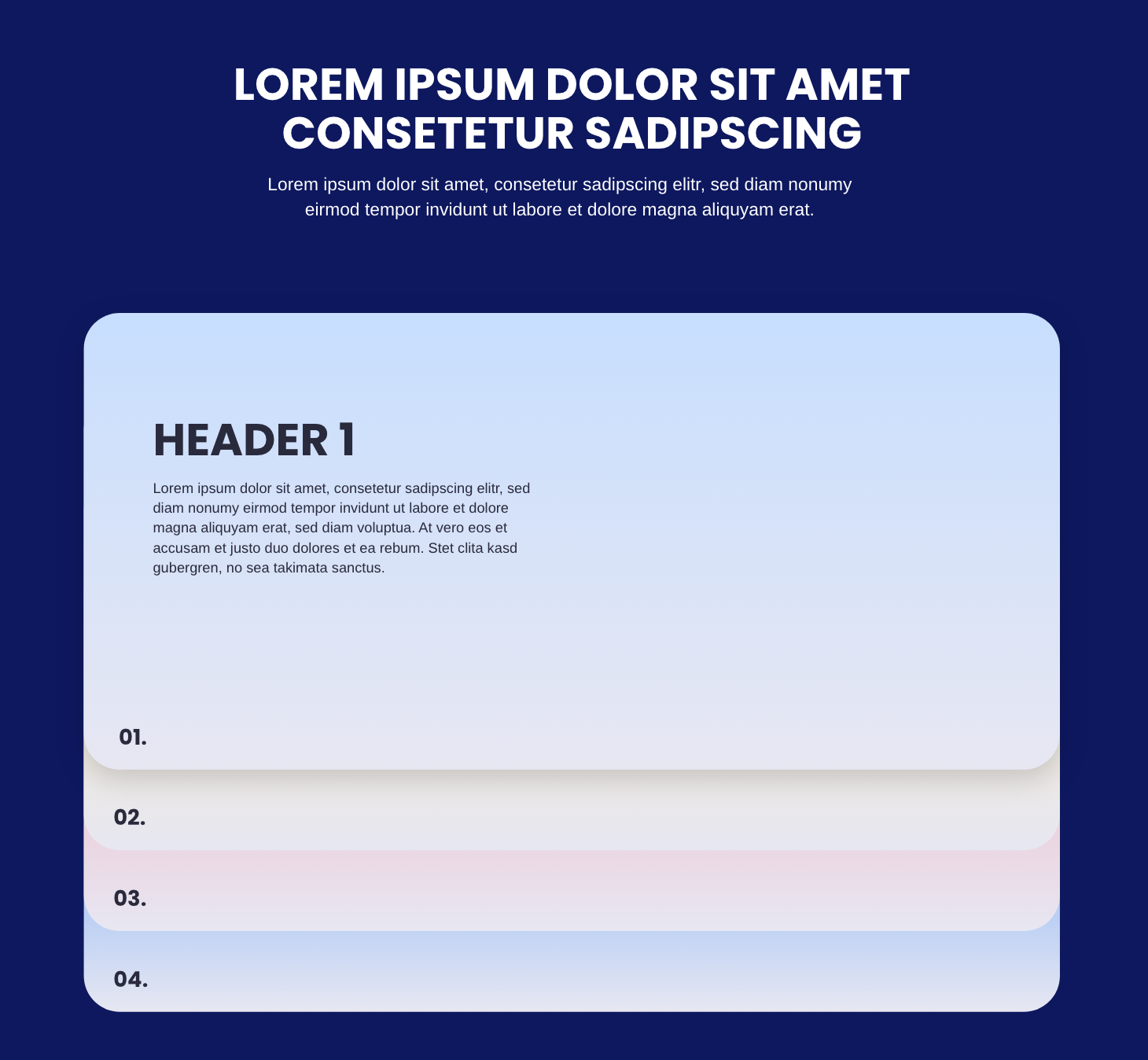
  1. The cards stack on top of each other in my demo, but reveal themselves in the demo I’m trying to mimic (see image of the design I’m trying to achieve below). I’ve tried z-indexing but this didn’t do the trick.
  2. The cards pin to the top of the page, whereas I’m looking for it to be centered.
  3. It doesn’t unpin when you’ve passed .cardStacking (carries on until the end of the page)

enter image description here

Demo (view on 1200px +)

$(function() {

  const cards = gsap.utils.toArray(".stackCard");

  cards.forEach((card, index) => {
    const tween = gsap.to(card, {
      scrollTrigger: {
        trigger: card,
        start: () => `top bottom-=100`,
        end: () => `top top+=40`,
        scrub: true,
        markers: true,
        invalidateOnRefresh: true
      },
      ease: "none",
      scale: () => 1 - (cards.length - index) * 0.025
    });

    ScrollTrigger.create({
      trigger: card,
      start: "top top",
      pin: true,
      pinSpacing: false,
      markers: true,
      id: 'pin',
      end: 'max',
      //end: '.cardStacking',
      invalidateOnRefresh: true,
    });

  });

});
:root {
  --navy: #0E185F;
  --white: #FFFFFF;
}

.background--navy {
  background-color: var(--navy);
}

.color--white {
  color: var(--white);
}

.spacer {
  height: 2000px;
}

.cardStacking {
  padding: 120px 0 141px 0;
  /*********/
}
.cardStacking__intro {
  margin-bottom: 100px;
}
.cardStacking .stackCard {
  border-radius: 40px;
  background: linear-gradient(90deg, #c7defe 0%, #e7e7f2 100%);
  margin-bottom: 50px;
  padding: 106px 135px 126px 77px;
  /* CONTENT */
}
.cardStacking .stackCard:first-child {
  box-shadow: 0px 10px 30px 0px rgba(0, 0, 0, 0.16);
}
.cardStacking .stackCard__content-header {
  margin-bottom: 10px;
}
<link href="https://cdn.jsdelivr.net/npm/[email protected]/dist/css/bootstrap.min.css" rel="stylesheet" integrity="sha384-EVSTQN3/azprG1Anm3QDgpJLIm9Nao0Yz1ztcQTwFspd3yD65VohhpuuCOmLASjC" crossorigin="anonymous">
<script src="https://cdnjs.cloudflare.com/ajax/libs/jquery/3.6.0/jquery.min.js" integrity="sha512-894YE6QWD5I59HgZOGReFYm4dnWc1Qt5NtvYSaNcOP+u1T9qYdvdihz0PPSiiqn/+/3e7Jo4EaG7TubfWGUrMQ==" crossorigin="anonymous" referrerpolicy="no-referrer"></script>
<script src="https://cdnjs.cloudflare.com/ajax/libs/gsap/3.9.1/gsap.min.js"></script>
<script src="https://cdnjs.cloudflare.com/ajax/libs/gsap/3.9.1/ScrollTrigger.min.js"></script>

<div class="spacer"></div>

<section class="cardStacking background--navy">
  <div class="container">

    <div class="row justify-content-center">
      <div class="col-12 col-md-10 col-lg-7">
        <div class="cardStacking__intro text-center">
          <h2 class="cardStacking__intro-header color--white">LOREM IPSUM DOLOR SIT AMET CONSETETUR SADIPSCING</h2>
          <div class="cardStacking__intro-copy color--white">Lorem ipsum dolor sit amet, consetetur sadipscing elitr, sed diam nonumy eirmod tempor invidunt ut labore et dolore magna aliquyam erat.</div>
        </div>
      </div>
    </div>

    <div class="row justify-content-center">
      <div class="col-12 col-md-10">
        <div class="cardStacking__cards">
  
            <!------------>
            <!-- CARD 1 -->
            <!------------>
          
            <div class="stackCard">
              <div class="stackCard__content">
                <span class="stackCard__content-header d-block">Header</span>
                <div class="stackCard__content-copy">Lorem ipsum dolor sit amet, consetetur sadipscing elitr, sed diam nonumy eirmod tempor invidunt ut labore et dolore magna aliquyam erat, sed diam voluptua. At vero eos et accusam et justo duo dolores et ea rebum. Stet clita kasd gubergren, no sea takimata sanctus.</div>
              </div>
            </div>
          
            <!------------>
            <!-- CARD 2 -->
            <!------------>
            <div class="stackCard">
              <div class="stackCard__content">
                <span class="stackCard__content-header d-block">Header 2</span>
                <div class="stackCard__content-copy">Lorem ipsum dolor sit amet, consetetur sadipscing elitr, sed diam nonumy eirmod tempor invidunt ut labore et dolore magna aliquyam erat, sed diam voluptua. At vero eos et accusam et justo duo dolores et ea rebum. Stet clita kasd gubergren, no sea takimata sanctus.</div>
              </div>
            </div>
          
            <!------------>
            <!-- CARD 3 -->
            <!------------>
            <div class="stackCard">
              <div class="stackCard__content">
                <span class="stackCard__content-header d-block">Header 3</span>
                <div class="stackCard__content-copy">Lorem ipsum dolor sit amet, consetetur sadipscing elitr, sed diam nonumy eirmod tempor invidunt ut labore et dolore magna aliquyam erat, sed diam voluptua. At vero eos et accusam et justo duo dolores et ea rebum. Stet clita kasd gubergren, no sea takimata sanctus.</div>
              </div>
            </div>

        </div>
      </div>
    </div>

  </div>
</section>

<div class="spacer"></div>

Edit:

I have managed to somewhat resolve items 1 and 3 in my above list.

However, the functionality for item 1 isn’t quite there yet. I do not know why the cards are not stacked upon each other and are not centered.

See updated demo here:

$(function() {

   const container = document.querySelector(".cardStacking__cards");
  const card = document.querySelector(".stackCard");
  const cards = document.querySelectorAll(".stackCard");
  const height = 500;

  const timeline = gsap.timeline({
    scrollTrigger: {
      trigger: container,
      pin: true,
      markers: true,
      scrub: 1,
      start: "bottom-=10% center",
      end: "bottom top"
    }
  });

  timeline.from(card, {
    y: (index) => height * (cards.length - (index + 1)),
    duration: (index) => 0.6 / (index + 1),
    ease: "none",
    stagger: (index) => 0.3 * (index),
  });

});
:root {
  --navy: #0E185F;
  --white: #FFFFFF;
}

.background--navy {
  background-color: var(--navy);
}

.color--white {
  color: var(--white);
}

.spacer {
  height: 2000px;
}

.cardStacking {
  padding: 120px 0 141px 0;
  /*********/
}
.cardStacking__intro {
  margin-bottom: 100px;
}
.cardStacking .stackCard {
  border-radius: 40px;
  background: linear-gradient(90deg, #c7defe 0%, #e7e7f2 100%);
  margin-bottom: 50px;
  padding: 106px 135px 126px 77px;
  /* CONTENT */
}
.cardStacking .stackCard:first-child {
  box-shadow: 0px 10px 30px 0px rgba(0, 0, 0, 0.16);
}
.cardStacking .stackCard__content-header {
  margin-bottom: 10px;
}
<link href="https://cdn.jsdelivr.net/npm/[email protected]/dist/css/bootstrap.min.css" rel="stylesheet" integrity="sha384-EVSTQN3/azprG1Anm3QDgpJLIm9Nao0Yz1ztcQTwFspd3yD65VohhpuuCOmLASjC" crossorigin="anonymous">
<script src="https://cdnjs.cloudflare.com/ajax/libs/jquery/3.6.0/jquery.min.js" integrity="sha512-894YE6QWD5I59HgZOGReFYm4dnWc1Qt5NtvYSaNcOP+u1T9qYdvdihz0PPSiiqn/+/3e7Jo4EaG7TubfWGUrMQ==" crossorigin="anonymous" referrerpolicy="no-referrer"></script>
<script src="https://cdnjs.cloudflare.com/ajax/libs/gsap/3.9.1/gsap.min.js"></script>
<script src="https://cdnjs.cloudflare.com/ajax/libs/gsap/3.9.1/ScrollTrigger.min.js"></script>

<div class="spacer"></div>

<section class="cardStacking background--navy">
  <div class="container">

    <div class="row justify-content-center">
      <div class="col-12 col-md-10 col-lg-7">
        <div class="cardStacking__intro text-center">
          <h2 class="cardStacking__intro-header color--white">LOREM IPSUM DOLOR SIT AMET CONSETETUR SADIPSCING</h2>
          <div class="cardStacking__intro-copy color--white">Lorem ipsum dolor sit amet, consetetur sadipscing elitr, sed diam nonumy eirmod tempor invidunt ut labore et dolore magna aliquyam erat.</div>
        </div>
      </div>
    </div>

    <div class="row justify-content-center">
      <div class="col-12 col-md-10">
        <div class="cardStacking__cards">
  
            <!------------>
            <!-- CARD 1 -->
            <!------------>
          
            <div class="stackCard" style="z-index: 0;">
              <div class="stackCard__content">
                <span class="stackCard__content-header d-block">Header</span>
                <div class="stackCard__content-copy">Lorem ipsum dolor sit amet, consetetur sadipscing elitr, sed diam nonumy eirmod tempor invidunt ut labore et dolore magna aliquyam erat, sed diam voluptua. At vero eos et accusam et justo duo dolores et ea rebum. Stet clita kasd gubergren, no sea takimata sanctus.</div>
              </div>
            </div>
          
            <!------------>
            <!-- CARD 2 -->
            <!------------>
            <div class="stackCard" style="z-index: -1;">
              <div class="stackCard__content">
                <span class="stackCard__content-header d-block">Header 2</span>
                <div class="stackCard__content-copy">Lorem ipsum dolor sit amet, consetetur sadipscing elitr, sed diam nonumy eirmod tempor invidunt ut labore et dolore magna aliquyam erat, sed diam voluptua. At vero eos et accusam et justo duo dolores et ea rebum. Stet clita kasd gubergren, no sea takimata sanctus.</div>
              </div>
            </div>
          
            <!------------>
            <!-- CARD 3 -->
            <!------------>
            <div class="stackCard" style="z-index: -2;">
              <div class="stackCard__content">
                <span class="stackCard__content-header d-block">Header 3</span>
                <div class="stackCard__content-copy">Lorem ipsum dolor sit amet, consetetur sadipscing elitr, sed diam nonumy eirmod tempor invidunt ut labore et dolore magna aliquyam erat, sed diam voluptua. At vero eos et accusam et justo duo dolores et ea rebum. Stet clita kasd gubergren, no sea takimata sanctus.</div>
              </div>
            </div>

        </div>
      </div>
    </div>

  </div>
</section>

<div class="spacer"></div>

2

Answers


  1. In order to reproduce this effect you need to create 2 scroll effects.

    First the stage with the stacked cards is in reality as high as if the cards were not stacked. Then when scrolling over that stage, we pin the whole content of the stage to the top of the screen:

    const y = window.pageYOffset; // current scroll position
    const top = document.getElementById('stage').offsetTop; // offset of the stage from top
    const bottom = document.getElementById('stage').clientHeight + top - window.innerHeight; // the max position where to pin the content is not the bottom of the stage but the bottom - viewport height
    const onStage = y >= top && y <= bottom;
    const offset = y - top; // the new position of the content
    if( onStage ) { 
      document.getElementById("content").style.transform = `translateY(${offset}px)`;
    }
    

    In addition to that, we preserve the original position of each card when we initialize the stack. By doing so we can now calculate when we would reach each card and start repositioning the card when scrolling further down.

    for(let i = 0; i < cards.length; i ++) {
        let card = cards[i];
        const o = parseInt( card.getAttribute('data-offset') ); // the original position before stacking
        const h = card.clientHeight;
        if(y >= (o - 40) && i < cards.length - 1) {
          card.style.transform = `translateY(${-offset}px)`; // set new position to scroll this card off screen
        }else{
            card.style.transform = `translateY(-${i * h}px)` // reset to stacked position
        }
    }
    

    The animation does not work properly in this snippet. I am not 100 percent sure why. It works in this jsfiddle. And I tested it locally in every major browser.

    There is obviously room for improvement. The animation is a little bit abrupt in the beginning, and it is obviously not responsive due to missing media queries, but I think the concept is clear enough to work with it.

    function initCards() {
      let cards = document.getElementsByClassName('card');
      for(let i = 0; i < cards.length; i ++) {
        let card = cards[i];
        card.setAttribute('data-offset', card.offsetTop);
        const h = cards[i].clientHeight;
        card.style.transform = `translateY(-${i * h}px)`;
        card.style.zIndex = `${1000 - i}`;
      }
    }
    
    initCards();
    
    window.addEventListener('scroll', function() {
        const y = window.pageYOffset;
      const top = document.getElementById('stage').offsetTop;
      const bottom = document.getElementById('stage').clientHeight + top - window.innerHeight;
      const onStage = y >= top && y <= bottom;
      const offset = y - top;
      if( onStage ) {
        document.getElementById("content").style.transform = `translateY(${offset}px)`;
        let cards = document.getElementsByClassName('card');
        for(let i = 0; i < cards.length; i ++) {
            let card = cards[i];
          const o = parseInt( card.getAttribute('data-offset') );
          const h = card.clientHeight;
          if(y >= (o - 40) && i < cards.length - 1) {
            card.style.transform = `translateY(${-offset}px)`;
          }else{
            card.style.transform = `translateY(-${i * h}px)`
          }
        }
      }
    });
    html, body {
      margin: 0;
      padding: 0;
    }
    
    * {
      box-sizing: border-box;
    }
    
    img {
      max-width: 100%;
      max-height: 90%;
    }
    
    #stage {
      width: 100%;
      overflow: hidden;
      margin: 0;
      padding-top: 1em;
      padding-left: 15%;
      padding-right: 15%;
      padding-bottom: 60%;
      background-color: #333;  
    }
    
    #content .head {
      color: #F1F1F1;
      text-align: center;
    }
    
    .stack {
      padding: 4em;
    }
    
    .card {
      height: 60%;
      position: relative;
      background-color: #F1F1F1;
      padding: 2em 2em 0em 2em;
      color: #333;
      box-shadow: 0px 5px 15px rgba(0, 0, 0, 0.25);
      display: flex;
      border-radius: 1em;
      flex-direction: column;
      margin-bottom: 50px;
    }
    
    .card .head {
      padding-bottom: 1em;
      margin-bottom: 2em;
    }
    
    .card .body{
      display: flex;
      flex-direction: row;
      overflow: hidden;
    }
    
    .card .body .image span {
      color: #CECECE;
      font-size: 0.8em;
    }
    
    .card .body .content {
      margin-right: 2em;
      overflow-y: scroll;
    }
    
    .card .body .image, .card .body .content {
      width: 50%;
    }
    
    .card .footer span{
      color: #CECECE;
      position: absolute;
      bottom: 10px;
      font-size: 1.5em;
    }
    <br><br><br><br><br><br><br><br>
    <br><br><br><br><br><br><br><br>
    <br><br><br><br><br><br><br><br>
    <br><br><br><br><br><br><br><br>
    <div id="stage">
      <div id="content">
        <div class="head">
          <h1>
            Lorem ipsum dolor sit amet
          </h1>
          <p>
            Lorem ipsum dolor sit amet, consetetur sadipscing elitr, sed diam nonumy eirmod tempor invidunt ut labore et dolore magna aliquyam erat, sed diam voluptua. At vero eos et accusam et justo duo dolores et ea rebum.
          </p>
        </div>
        <div class="stack">
          <div class="card">
            <div class="body">
              <div class="content">
                <h2>
                  1 Lorem Ipsum dolor
                </h2>
                <p>
                  Stet clita kasd gubergren, no sea takimata sanctus est Lorem ipsum dolor sit amet. Lorem ipsum dolor sit amet, consetetur sadipscing elitr, sed diam nonumy eirmod tempor invidunt ut labore et dolore magna aliquyam erat, sed diam voluptua. At vero eos et accusam et justo duo dolores et ea rebum. Stet clita kasd gubergren, no sea takimata sanctus est Lorem ipsum dolor sit amet.
                </p>
              </div>
              <div class="image">
                <img src="https://via.placeholder.com/600" />
                <span>Lorem ipsum dolor sit amet</span>
              </div>
            </div>
            <div class="footer"></div>
          </div>
          <div class="card">
            <div class="body">
              <div class="content">
                <h2>
                  2 Lorem Ipsum dolor
                </h2>
                <p>
                  Stet clita kasd gubergren, no sea takimata sanctus est Lorem ipsum dolor sit amet. Lorem ipsum dolor sit amet, consetetur sadipscing elitr, sed diam nonumy eirmod tempor invidunt ut labore et dolore magna aliquyam erat, sed diam voluptua. At vero eos et accusam et justo duo dolores et ea rebum. Stet clita kasd gubergren, no sea takimata sanctus est Lorem ipsum dolor sit amet.
                </p>
                <p>
                  Stet clita kasd gubergren, no sea takimata sanctus est Lorem ipsum dolor sit amet. Lorem ipsum dolor sit amet, consetetur sadipscing elitr, sed diam nonumy eirmod tempor invidunt ut labore et dolore magna aliquyam erat, sed diam voluptua. At vero eos et accusam et justo duo dolores et ea rebum. Stet clita kasd gubergren, no sea takimata sanctus est Lorem ipsum dolor sit amet.
                </p>
              </div>
              <div class="image">
                <img src="https://via.placeholder.com/600" />
                <span>Lorem ipsum dolor sit amet</span>
              </div>
            </div>
            <div class="footer"></div>
          </div>
          <div class="card">
            <div class="body">
              <div class="content">
                <h2>
                  3 Lorem Ipsum dolor
                </h2>
                <p>
                  Stet clita kasd gubergren, no sea takimata sanctus est Lorem ipsum dolor sit amet. Lorem ipsum dolor sit amet, consetetur sadipscing elitr, sed diam nonumy eirmod tempor invidunt ut labore et dolore magna aliquyam erat, sed diam voluptua. At vero eos et accusam et justo duo dolores et ea rebum. Stet clita kasd gubergren, no sea takimata sanctus est Lorem ipsum dolor sit amet.
                </p>
                <p>
                  Stet clita kasd gubergren, no sea takimata sanctus est Lorem ipsum dolor sit amet. Lorem ipsum dolor sit amet, consetetur sadipscing elitr, sed diam nonumy eirmod tempor invidunt ut labore et dolore magna aliquyam erat, sed diam voluptua. At vero eos et accusam et justo duo dolores et ea rebum. Stet clita kasd gubergren, no sea takimata sanctus est Lorem ipsum dolor sit amet.
                </p>
              </div>
              <div class="image">
                <img src="https://via.placeholder.com/600" />
                <span>Lorem ipsum dolor sit amet</span>
              </div>
            </div>
            <div class="footer"></div>
          </div>
    
        </div>
      </div>
    </div>
    
    <br><br><br><br><br><br><br><br>
    <br><br><br><br><br><br><br><br>
    <br><br><br><br><br><br><br><br>
    <br><br><br><br><br><br><br><br>
    Login or Signup to reply.
  2. why use GASP when you can just use css

    /*QuickReset*/
    
    *,
    *::before,
    *::after {
      margin: 0;
      box-sizing: border-box;
    }
    
    html,
    body {
      scroll-behavior: smooth;
    }
    
    body {
      font: clamp(11px, 2.5vmin, 18px)/1.4 sans-serif;
      color: #252525;
    }
    
    article {
      display: flex;
      flex-direction: column;
      justify-content: center;
      align-items: center;
      min-height: 100vh;
      font-size: 1.2em;
    }
    
    .holder {}
    
    
    /* Whatever you like */
    
    .holder__head {
      padding: 0.4em 2em;
      position: sticky;
      z-index: 1;
      bottom: calc(var(--b) * 2em);
      top: calc(var(--t) * 2em);
    }
    
    .holder__item {
      padding: 2rem;
      position: sticky;
      height: 100vh;
      top: calc((var(--t) + 1) * 1.6em);
      padding-bottom: 8em;
    }
    
    
    /* Just some colors... */
    
    .bg-0 {
      background: #000000;
      color: #b3ab9d;
    }
    
    .bg-1 {
      background: #817466;
    }
    
    .bg-2 {
      background: #a2a093;
    }
    
    .bg-3 {
      background: #a5882a;
    }
    
    .bg-4 {
      background: #b29d73;
    }
    <article class="bg-0">
      <h1>How We Work</h1>
    </article>
    <article>
      <h2>Welcome</h2>
      <p>Scroll down to find out more</p>
    </article>
    
    <section class="holder">
    
      <header class="holder__head bg-3" style="--t:0; --b:3;">1 STEP &mdash; IDENTIFYING STRENGTHS AND WEAKNESSES</header>
      <article class="holder__item bg-3" style="--t:0;">
        <h2>IDENTIFYING STRENGTHS AND WEAKNESSES</h2>
        <p>OUR MULTIDISCIPLINARY TEAM IS HERE TO IDENTIFY BOTH YOUR STRENGTHS AND WEAKNESSES, WITH THE AMBITION TO UNDERSTAND HOW TO BEST ASSIST IN GROWING YOUR BRAND AND REACHING YOUR COMMUNITY.</p>
      </article>
    
      <header class="holder__head bg-0" style=" --t:1; --b:2;">2 STEP &mdash; PUTTING THE PIECESTOGETHER</header>
      <article class="holder__item bg-0" style="--t:1;">
        <h2>PUTTING THE PIECESTOGETHER</h2>
        <p>BASED ON RESEARCH AND DISCUSSIONS, WE WILL SINGLE OUT THE BEST MEDIUM OR MEDIUMS TO TRANSLATE YOUR BRAND.</p>
      </article>
    
      <header class="holder__head bg-2" style="--t:2; --b:1;">3 STEP &mdash; FINE-TUNING YOUR CONTENT</header>
      <article class="holder__item bg-2" style="--t:2;">
        <h2>FINE-TUNING YOUR CONTENT</h2>
        <p>BY PRESENTING OUR WORK TO YOU THROUGH OPEN DIALOGUE, WE WILL FINE-TUNE YOUR CONTENT BASED ON FEEDBACK AND OUR COLLECTIVE EXPERTISE.</p>
      </article>
    
      <header class="holder__head bg-1" style="--t:3; --b:0;">4 STEP &mdash; COMPLETING THE PICTURE</header>
      <article class="holder__item bg-1" style="--t:3;">
        <h2>COMPLETING THE PICTURE</h2>
        <p>WHETHER PRODUCING PHOTOGRAPHY, FILM, CURATING YOUR DIGITAL PLATFORMS OR CREATING A COHESIVE BRAND IDENTITY AND STRATEGY, WE WILL PACKAGE UP ALL OUR WORK AND ASSETS INTO AN ORGANISED LIBRARY A PACKAGE THAT IS SIMPLE FOR YOU TO ENGAGE WITH.</p>
      </article>
    
    </section>
    
    <article class="bg-4">
      <h2>First footer</h2>
    </article>
    <article class="bg-0">
      <h2>Second footer</h2>
    </article>

    credit to : Jquery translate elements based on scroll

    Login or Signup to reply.
Please signup or login to give your own answer.
Back To Top
Search