skip to Main Content

This is what I would like to achieve:

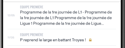
enter image description here

and it’s working for iOS but Android refuses to display the icon for truncated text:

enter image description here

Code:

 const Title = styled.Text`
  color: ${colorPalette.N80};
  font-size: 14px;
  line-height: 16.8px;
  text-transform: uppercase;
  ${() => ({ ...fontFamilyForStyledComponents(typeStyles.alternative.bold) })};
`;


const DescriptionWrapper = styled.View`
  width: 100%;
  flex-direction: row;
  align-items: center;
`;

const TextWrapper = styled.Text`
  flex-direction: row;
  flex-wrap: wrap;
`;

const Description = styled.Text`
  color: ${colorPalette.B1100};
  font-size: 14px;
  line-height: 19.6px;
  ${() => ({ ...fontFamilyForStyledComponents(typeStyles.regular.regular) })};
`;

const PremiumIcon = styled.View`
  width: 9px;
  height: 14px;
  justify-content: flex-end;
  padding-bottom: ${isAndroid ? 0 : 2}px;
`;


  // ....

  const [truncatedTitle, setTruncatedTitle] = useState('');

  const isTruncated = (lines) => {
    const numberOfLines = lines.length;
    if (lines.length < 3)
      return false;
    if (isAndroid && lines.length>3) { return true}
    // lines.length equals to numberOfLines on iOS if text is truncated or it
    // takes exactly numberOfLines
    // This is used to trim some chars from the last line chars to display the lock at the end of the 3 dots 
    return lines[numberOfLines-1].text.length > lines[0].text.length-5
  }

  const onTextLayout = (event: any) => {
    const { lines } = event.nativeEvent;

    // If the text is truncated we make sure there is space for the lock icon at the end of the 
    // string by removing about 10% of last row characters if last row is too big.
    if (!truncatedTitle && isTruncated(lines)) {
      let text = lines.slice(0, 3).map((line: any) => line.text).join('');
      const lineLength = Math.max(lines[0].text.length, lines[1].text.length)
      setTruncatedTitle(text.substr(0, Math.floor(2.8*lineLength)).concat('...'));
    }
  }

   
 // ...
 return (
  <TextWrapper hasIcon={hasIcon} numberOfLines={3} ellipsizeMode='tail' 
      onTextLayout={onTextLayout} >
            <Description>
              {truncatedTitle || title}
            </Description>
            <Text>
              <Spacer />
              {!item.props.isPremium && (
                <PremiumIcon>
                  <NewsFeedPremiumIcon /> // <-- this is a simple svg icon
                </PremiumIcon>
              )}
            </Text>
  </TextWrapper>
 )

Any workaround/solution including using a react native library to add the icon at the end of the last word of text will be tested and accepted if it works.


2

Answers


  1. Chosen as BEST ANSWER

    As workaround for this I had to add a View (with the icon aligned bottom) next to the text component for the case when text is truncated.

    Attention:

    1. below code handles only the case of maxNumberOfLines=3, to have the code work you will have to add an extra parameter to the below component.

    2. the returned tree might be simplified and remove some of the extra wrappers.

        const Spacer = styled.View`
          width: ${relativeSize('small')};
        `;
        
        const ContentWrapper = styled.View`
          width: 87%;
          padding-vertical: 10px;
        `;
        
        const Title = styled.Text`
          font-size: 14px;
          line-height: 17px;
          text-transform: uppercase;
        `;
        
           
        const DescriptionWrapper = styled.View`
          width: 98%;
          flex-direction: row;
          align-items: center;
        `;
        
        const TextWrapper = styled.Text<{isTruncated: boolean }>`
          flex-direction: row;
          flex-wrap: wrap;
          width: ${props =>
           props.isTruncated ? '96%' : '98%'};
        `;
        
        const Description = styled.Text`
          font-size: 14px;
          line-height: 19px;
        `;
        
        const PremiumIcon = styled.View`
          width: 16px;
          height: 14px;
          padding-right: 4px;
          padding-left: ${isAndroid ? 0 : 4}px;
          justify-content: flex-end;
          padding-bottom: ${isAndroid ? 0 : 2}px;
        `;
        
        // This is used as container only for the case of truncated text
        const PremiumIconWrapper = styled.View`
          height: 55px;
          width: 20px;
          padding-right: 4px;
          justify-content: flex-end;
          padding-bottom: 2px;
        `;
        
        export default (props) => {
          const { item } = props;
          const { title } = item.props;
        
          const [isTitleTruncated, setIsTitleTruncated] = useState(false);
        
          const computeIsTextTruncated = (lines: Array<{ text: string }>) => {
            const numberOfLines = lines.length;
            if (lines.length < 3) return false;
            if (isAndroid && lines.length > 3) {
              return true;
            }
            // in IOS lines.length is number of lines if text is truncated or it
            // takes exactly max number of allowed lines
            return (
              lines[numberOfLines - 1].text.length >
              Math.max(lines[0].text.length, lines[1].text.length)
            );
          };
        
          const onTextLayout = (event: any) => {
            const { lines } = event.nativeEvent;
        
            // If the text is truncated we position the icon after the 3 dots in a different way
            // This approach was done due to an Android bug related to visibility of this icon
            if (!isTitleTruncated && computeIsTextTruncated(lines)) {
              setIsTitleTruncated(true);
            }
          };
        
          return (
              <ContentWrapper>
                <Title>{newsTeamNameFormatted}</Title>
                <DescriptionWrapper>
                  <TextWrapper
                    isTruncated={isTitleTruncated}
                    numberOfLines={3}
                    ellipsizeMode="tail"
                    onTextLayout={onTextLayout}
                  >
                    <Description>{title}</Description>
                    <Text>
                      <Spacer />
                      {!isTitleTruncated && (
                        <PremiumIcon>
                          <NewsFeedPremiumIcon />
                        </PremiumIcon>
                      )}
                    </Text>
                  </TextWrapper>
                  {isTitleTruncated && (
                    <PremiumIconWrapper>
                      <PremiumIcon>
                        <NewsFeedPremiumIcon />
                      </PremiumIcon>
                    </PremiumIconWrapper>
                  )}
                </DescriptionWrapper>
              </ContentWrapper>
          );
        };


  2. Your issue may be that your wrapping a View component in a Text component, which is not allowed. Likely iOS is just more tolerant of it. Try to rearrange the elements so that any Text is within a View, but not vise-versa.

    See related discussion here: React Native Can't nest View Inside Text

    Login or Signup to reply.
Please signup or login to give your own answer.
Back To Top
Search