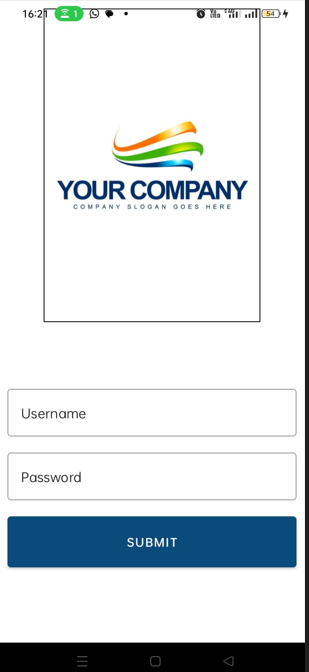
I am learning react native and trying to position the logo and login form one below the other.
Below is my code:
import { StatusBar } from "expo-status-bar";
import { View } from "react-native";
import { HomeStyles as styles } from "../styles/home.css";
import { SafeAreaProvider } from "react-native-safe-area-context";
import { TextInput, Button } from "@react-native-material/core";
import { Image } from "expo-image";
import { Stack, HStack, VStack } from "react-native-flex-layout";

export default function Home() {
  return (
    <SafeAreaProvider>
      <View style={styles.container}>
        <View style={styles.imageWrapper}>
          <Image
            style={styles.image}
            source="https://st2.depositphotos.com/4035913/6124/i/450/depositphotos_61243733-stock-illustration-business-company-logo.jpg"
            contentFit="scale-down"
          />
        </View>
        <View style={styles.form}>
          <TextInput
            style={styles.username}
            label="Username"
            variant="outlined"
          />
          <TextInput
            style={styles.password}
            secureTextEntry={true}
            label="Password"
            variant="outlined"
          />
          <Button style={styles.btnSubmit} title="Submit" />
        </View>
      </View>
    </SafeAreaProvider>
  );
}
And Styles are
import { StyleSheet, Text, View } from "react-native";

export const HomeStyles = StyleSheet.create({
    container: {
      flex: 1,
      backgroundColor: "#fff",
      alignItems: "center",
      justifyContent: "center",
      padding:10
    },
    imageWrapper:{
      flex: 1,
      width:'75%',
      alignItems: "center",
      justifyContent: "center",
      borderWidth:1,
      borderColor:'#000'
    },
    image: {
      flex:1,
      width:'100%',
      height: 100,
      alignItems: "center",
      justifyContent: "center",
    },
    form: {
      flex:1,
      flexGrow:1,
      width:'100%',
      alignItems: "center",
      justifyContent: "center",
    },
    username: {
      alignItems: "center",
      justifyContent: "center",
      marginBottom:15,
      borderColor: '#0a4b7c',
      outlineColor: '#0a4b7c',
    },
    password: {
      alignItems: "center",
      justifyContent: "center",
      marginBottom:15,
    },
    btnSubmit: {
      width:'100%',
      backgroundColor:'#0a4b7c',
      height: 60,
      alignItems: "center",
      justifyContent: "center",
    },
  });
If you see the output, the image occupies 50% of height. How to align the image to occupy only 30% and followed by the form.
You can see the white space. The border around the image is for visual identification.


2
Answers
should to the trick
Both
imageWrapperandformhaveflexset 1, which means that the both views will get 1/2 of the space. Instead setheightto 30% for imageWrapper. Something like this: