skip to Main Content

Hello stack overflow so basically I have something like this.

              <View style={styles.chart}>
                  <Text>{props.unScannedCartons && calculateTotalProgress()}%</Text>
              </View>

My style for "styles.chart" is

  chart: {
    width: 48,
    height: 48,

    justifyContent: "center",
    alignItems: "center",

    borderRadius: 48,
    borderWidth: 4,
    borderColor: Color.opacity(Theme.colors.ink, 0.16),
  },

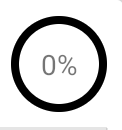
This creates enter image description here

However let’s say I want 25% or 30% of the border color to be red, while the rest of the border stays black. How can I achieve this without a third party package?

2

Answers


  1. Chosen as BEST ANSWER

    Here is what I did to create a simple circular progress:

    type CircularProgressProps = {
      progressPercent: number;
      style?: ViewStyle;
      backgroundCircleColor?: string;
      progressCircleColor?: string;
    };
    
    const CircularProgress = ({
      progressPercent,
      style,
      backgroundCircleColor = Color.opacity(Theme.colors.ink, 0.16),
      progressCircleColor = Theme.colors.positive,
    }: CircularProgressProps) => {
      const radius = (48 - 4) / 2;
      const circum = radius * 2 * Math.PI;
      const svgProgress = 100 - progressPercent;
      const circleSize = 48 / 2;
    
      return (
        <View style={style}>
          <Svg width={48} height={48}>
            <Circle
              stroke={backgroundCircleColor}
              fill="none"
              cx={circleSize}
              cy={circleSize}
              r={radius}
              strokeWidth={4}
            />
            <Circle
              stroke={progressCircleColor}
              fill="none"
              cx={circleSize}
              cy={circleSize}
              r={radius}
              strokeDasharray={progressPercent === 0 ? `${0.01} ${circum}` : `${circum} ${circum}`}
              strokeDashoffset={radius * Math.PI * 2 * (svgProgress / 100)}
              strokeLinecap="round"
              transform={`rotate(-90, ${circleSize}, ${circleSize})`}
              strokeWidth={4}
            />
            <SVGText
              fontSize={Theme.fonts.fontSize.xs}
              x={circleSize}
              y={circleSize + (Theme.fonts.fontSize.xs / 2 - 1)}
              textAnchor="middle"
              fill={Color.secondary(Theme.colors.ink)}
              fontWeight={Theme.fonts.fontWeight.bold}
            >
              {`${progressPercent}%`}
            </SVGText>
          </Svg>
        </View>
      );
    };
    
    export { CircularProgress };
    

  2. You can use a masked view @react-native-masked-view/masked-view

    Here is an example (based on this post)

    import React, { useState, useEffect, useRef } from 'react';
    import {
      SafeAreaView,
      StyleSheet,
      TextInput,
      View,
      Button,
      Animated,
      Easing,
    } from 'react-native';
    import MaskedView from '@react-native-masked-view/masked-view';
    import heartImage from './assets/heart.png';
    
    function App() {
      const openerAnim = useRef(new Animated.Value(0)).current;
      const [animDone, setAnimDone] = useState(false);
    
      const appOpacity = {
        opacity: openerAnim.interpolate({
          inputRange: [0, 15, 30],
          outputRange: [0, 0, 1],
          extrapolate: 'clamp',
        }),
      };
    
      const appScale = {
        transform: [
          {
            scale: openerAnim.interpolate({
              inputRange: [0, 100],
              outputRange: [1.1, 1]
            }),
          },
        ],
      };
    
      const maskScale = {
        transform: [
          {
            scale: openerAnim.interpolate({
              inputRange: [0, 10, 100],
              outputRange: [1, 0.8, 70],
            }),
          },
        ],
      };
    
      useEffect(() => {
        Animated.timing(
          openerAnim,
          {
            toValue: 100,
            duration: 2000,
            easing: Easing.cubic,
            useNativeDriver: true
          }
        ).start(() => {
          setAnimDone(true);
        });
      }, []);
    
    
      return (
        <SafeAreaView style={styles.container}>
          { !animDone ? <View style={[StyleSheet.absoluteFill, styles.backgroundFillBlue]}></View> : null }
          <MaskedView
            style={styles.maskedView}
            maskElement={
              <View style={styles.maskWrapper}>
                <Animated.Image source={heartImage}
                  style={[styles.mask, maskScale]}/>
              </View>
            }>
            { !animDone ? <View style={[StyleSheet.absoluteFill, styles.backgroundFillWhite]}></View> : null }
            <Animated.View style={[styles.loginBox, appScale, appOpacity]}>
              <TextInput
                value=""
                placeholder="Username"
                placeholderTextColor="#666"
                style={styles.input}
              />
              <TextInput
                value=""
                placeholder="Password"
                placeholderTextColor="#666"
                secureTextEntry={true}
                style={styles.input}
              />
              <View style={styles.separator}/>
              <Button title="Login"/>
            </Animated.View>
          </MaskedView>
        </SafeAreaView>
      );
    }
    
    const styles = StyleSheet.create({
      container: {
        flex: 1,
        backgroundColor: '#ff00fff'
      },
      maskedView: {
        flex: 1,
      },
      maskWrapper: {
        flex: 1,
        justifyContent: 'center',
        alignItems: 'center',
      },
      mask: {
        width: 150,
        height: 150,
      },
      loginBox: {
        flex: 1,
        height: '100%',
        justifyContent: 'center',
        backgroundColor: '#eee',
        padding: 40
      },
      backgroundFillBlue: {
        backgroundColor: '#0091ff',
      },
      backgroundFillWhite: {
        backgroundColor: 'white',
      },
      input: {
        borderWidth: 1,
        borderColor: '#aaa',
        borderRadius: 4,
        padding: 12,
        marginBottom: 12,
      },
      separator: {
        height: 20
      }
    });
    
    export default App;


    Maybe you should consider using a library like SKIA

    Login or Signup to reply.
Please signup or login to give your own answer.
Back To Top
Search